

Styles in WPF
Styles in WPF have been introduced to provide a consistent look and feel of the UI. For example, all the buttons in our application should have the same color, height, widht and other properties. Styles are objects that contain setter object (and a trigger that I will dicuss in another article) collections that in turn can be used to assign the properties of a control. Each setter can be used to set the property that needs to be a dependency property. What a CSS in HTML does to control is the same as what a Style does to control in WPF.
We need to take care of the following things when using styles:
- Setting a style or property locally will override the style defined above in the element tree.
- Styles can be set in the following two ways that I will explain later.
Named Style and Targeted Style
- Styles are declared as resources so that they can be used by the elements below them in the element tree.
Named Style
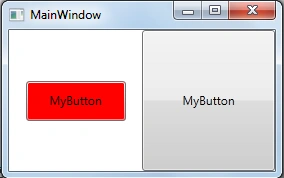
We can always declare a key for the style that can be used in the application down the element tree by specifying the key for the style. An example of the named style in the resource is shown below.
- <Window.Resources>
- <Style x:Key="buttonNamedStyle">
- <Setter Property="Button.Height" Value="40"></Setter>
- <Setter Property="Button.Width" Value="100"></Setter>
- <Setter Property="Button.Background" Value="Red"></Setter>
- </Style>
- </Window.Resources>
- <Grid>
- <Grid.ColumnDefinitions>
- <ColumnDefinition></ColumnDefinition>
- <ColumnDefinition></ColumnDefinition>
- </Grid.ColumnDefinitions>
- <Button Style="{StaticResource ResourceKey=buttonNamedStyle}" Content="MyButton" Grid.Column="0"></Button>
- <Button Content="MyButton" Grid.Column="1"></Button>
- </Grid>
Targeted Styles
This style is desigened to provide a style for some specific type of control only and is applied automatically to the elements of the type below the element tree in the declaration. The following is the code snippet for the targeted style.
- <Style TargetType="Button">
- <Setter Property="Height" Value="40"></Setter>
- <Setter Property="Width" Value="100"></Setter>
- <Setter Property="Background" Value="Red"></Setter>
- </Style>
- There is no x:Key.
- We have used the TargetType attribute.
- In the setter we have removed the class name from the Property attribute.
As soon as we apply this style in the resources section of the window, both of the buttons that we have used in the previous section are changed as shown in the following figure that shows that whatever elements come down in the element tree they take the style by default.
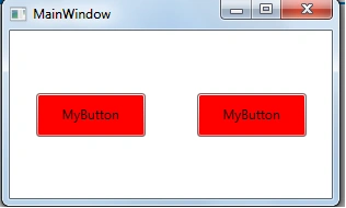
One more change I want you to see is that if we are using a targeted style then there is no need to use the Style attribute for the button as have used for the first button in Named Style.
Style Inheritance
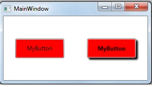
Styles in WPF also support inheritane much like the inheritance in OOP. This can be done using the BasedOn property that must point to another style to inherit from. If there is a target type specified in the base style then it must be specified in the derived style also. Please check the following code snippet to get more about the BasedOn Property.
- <Window.Resources>
- <Style TargetType="Button" x:Key="mybaseStyle">
- <Setter Property="Height" Value="40"></Setter>
- <Setter Property="Width" Value="100"></Setter>
- <Setter Property="Background" Value="Red"></Setter>
- </Style>
- <Style TargetType="Button" x:Key="derivedStyle" BasedOn="{StaticResource ResourceKey=mybaseStyle}">
- <Setter Property="FontWeight" Value="ExtraBold" />
- <Setter Property="Effect">
- <Setter.Value>
- <DropShadowEffect Color="Black" />
- </Setter.Value>
- </Setter>
- </Style>
- </Window.Resources>
However it is not recommended to have more then one level of inheritance since it would be a nightmare to debug the changes if we have multiple levels.
Automatic Style
We can define a specific style for the entire the application for a single control by defining it in the App.xaml as shown below . These styles are created without a key.
- <Application.Resources>
- <Style TargetType="Button">
- <Setter Property="Height" Value="40"></Setter>
- <Setter Property="Width" Value="100"></Setter>
- <Setter Property="Background" Value="Red"></Setter>
- </Style>
- </Application.Resources>
- <Style TargetType="Button" x:Key="myButtonStyle"BasedOn="{StaticResource {x:Type Button}}">
Karthik Muthu KaruppanPosted Apr 13, 2015, 1:34 PM
Good one
Vikram ChaudharyPosted Apr 13, 2015, 3:32 AM
Thank you dear :) Sibeesh Venu
Sibeesh VenuPosted Apr 13, 2015, 1:58 AM
Good one :)
Santhakumar MunuswamyPosted Apr 12, 2015, 11:11 PM
good