Figure 5 - Camera Orbit
Eyedropper
 To copy attributes from a selected object and apply those attributes to another object select the object or objects to which you want to apply attributes. On the Toolbox, click the Eyedropper tool.
Click the object from which you want to copy attributes. The attributes will automatically be applied to the object or objects that you selected.
Paint Bucket

Select the object or objects to which you want to apply attributes. On the Toolbox, click the Paint Bucket tool. Notice that the cursor changes to a paint bucket.
Click an object from which you want to copy attributes, and then click any number of additional objects to apply the attributes. Notice that the attributes stay saved in the Paint Bucket tool until you set different properties in the Properties panel.
Brush Transform

Transform tool to modify the brush.
To transform the fill, stroke, opacity mask, or other brush that is applied to an object, select the brush property in the Properties panel, and then select the Brush Transform tool on the Toolbox.
A brush transform arrow appears on the artboard that you can modify with your mouse pointer. If you are using a gradient brush, the endpoints of the transform arrow correspond to the gradient stops at either end of the color bar.
The Shift key can be used to change the behavior of the transform. See the figure 6 below to see the transform effect after using gradient.
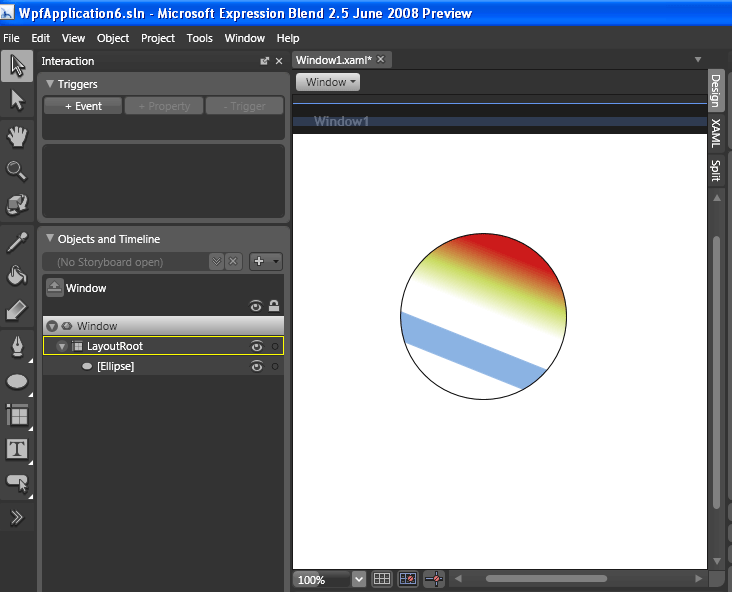
Figure 6 - Brush Transform
Pen/Pencil


Pen / Pencil tools are used to draw paths and curves. Paths flexible vector objects. Paths are a series of connected lines and curves. After drawing paths onto the artboard, you can reshape, combine, and otherwise modify them to create any vector shape. You can draw polygons, which are closed shapes made up of straight, connected lines, as well as polylines, which are unclosed paths made up of straight, connected lines. See the example in the figure 7 below.
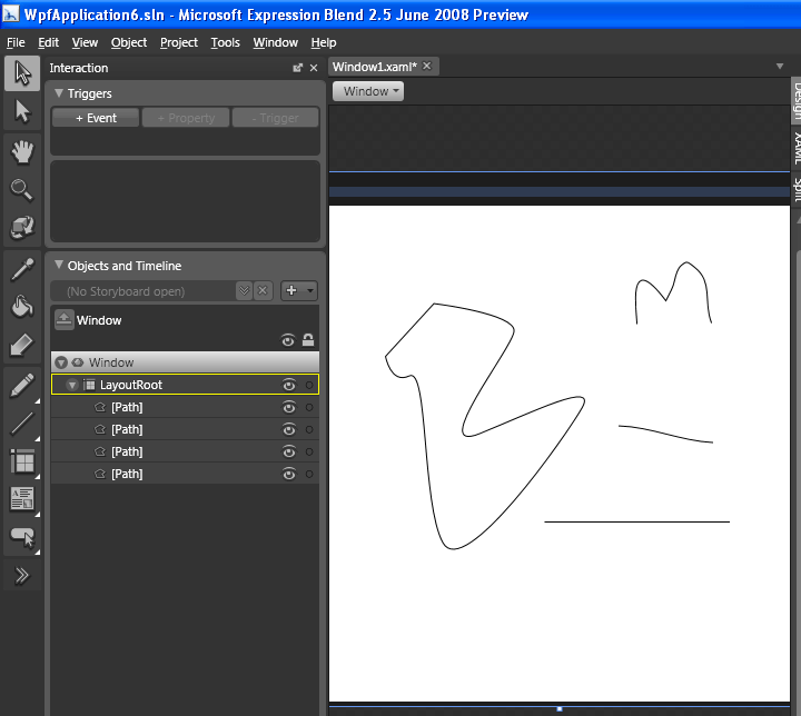
Figure 7 - Pen and Pencil
Rectangle/Ellipse/Line

In the Toolbox, click Rectangle, Ellipse, or Line to draw.
On the artboard, draw the rectangle, ellipse, or line by dragging from any point on the artboard to define the width and height of the rectangle or ellipse or the start and end points of the line. Notice that as you draw the shape, the width and height dimensions appear.
Shift key can be used for more precision while drawing objects. See the example in the figure below.
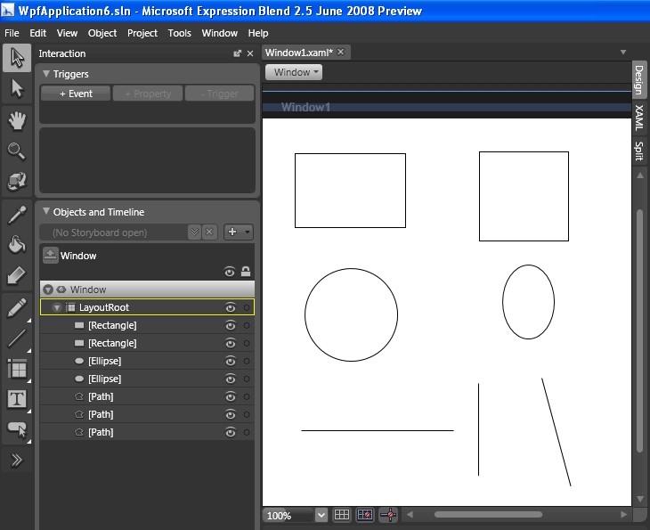
Figure 8 - Rectangle/Ellipse/Line
Grid/Canvas/StackPanel/WrapPanel/DockPanel/ScrollViewer/Border/UniformGrid/ViewBox
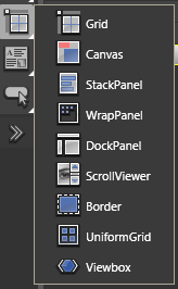
Expression Blend has five primary layout panels, each one designed to manage a different type of layout. The following table describes these layout panels.
Grid Panel

Arranges child elements in a very flexible layout of rows and columns that form a grid.
Canvas Panel

A canvas panel is the simplest layout panel in blend. It supports absolute positioning and does not apply any layout policy to its child elements—it is literally a blank canvas. Use a canvas panel when fixed positioning is paramount. Elements that you place in a canvas panel will not automatically resize when you resize your application as they can with a grid panel.
Add a canvas panel to a document by using the Asset Library or the layout container button on the Toolbox.
Stack Panel

Arranges child elements into a single line that can be oriented, or stacked, horizontally or vertically.
Wrap Panel

Arranges child elements in sequential position from left to right, and then, when it runs out of room at the far-right edge of the panel, wraps the content to the next line, and so on from left-to-right, top-to-bottom. A wrap panel's orientation can also be vertical so that the child elements flow from top-to-bottom, left-to-right.
Dock Panel

Arranges child elements so that they stay, or dock, to one edge of the panel.
Border

A simple element that draws a border, background, or both around an element. Border takes only one child element. You likely will want to position a grid or canvas panel within the border so that you can work with multiple child elements.
UniformGrid

Arranges child elements within equal, or uniform, grid regions. UniformGrid is not a variation of the grid panel; it can be more accurately described as a tiling layout element, because it creates equal spacing between each element that it contains, based on the number of rows and columns you specify. As you add child elements to a UniformGrid, each element is positioned in a region starting from top-left to bottom-right until the grid is filled. This is useful for a control such as an image list.
Viewbox

Scales all its child elements much like a zoom control. Because a view box accepts only a single child element, you will typically position a canvas panel or grid panel in it so that you can take advantage of the zoom effect on more than one child element.
Layout Panels and Other Layout Containers will be discussed in my next article in detail.
TextBox/RichTextBox/TextBlock/PasswordBox/Label/FlowDocumentScrollViewer
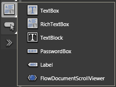

TextBox provides an editable region that accepts text input. Use this control when you want users to be able to enter new text or edit existing text in your application. You can specify the font of the text at design time.
TextBox doesn't supports rich text, shapes, and images. It is editable at runtime.

RichTextBox provides the same functionality as a TextBox object, but supports more text formatting properties and can contain any other type of object, such as an image or shape. Use this control when you want users to be able to enter rich text in multiple fonts with images and other objects.
RichTextBox supports rich text, shapes, and images. It is editable at runtime.

TextBlock provides a block of static text that the users of your application cannot edit. A TextBlock can contain any other type of object, such as an image or shape. Use this control when you must give instructions to your users, or to communicate information that doesn't require editing. Note that although text in this type of control cannot be edited by users of your application, you can change the text through the code-behind file.
TextBox supports rich text, shapes, and images. It is not editable at runtime.

PasswordBox provides basic password functionality. Use this control to promote privacy in your application, so that the text that a user enters in the text control will be masked by using bullet point characters () or another character that you specify in the PasswordChar property, instead of as the characters that the user types.
PasswordBox doesn't supports rich text, shapes, and images. It is editable at runtime.

Label provides a block of static content that you can use for basic labeling of other controls or user interface elements. A Label can contain text or content (such as an image or shape) but not both text and content at the same time. Additionally, this control provides mnemonic support, which offers functionality for keyboard accessibility and navigation through labeled controls that the user can access by pressing the ALT key in Windows-based applications.
Label doesn't supports rich text, shapes, and images. It is not editable at runtime.

FlowDocumentScrollViewer provides a block of static text with a scrollbar that the user can use to navigate through the text, and can contain any other type of object, such as an image or shape. You can set properties for this control under Miscellaneous in the Properties panel to hide or show the vertical and horizontal scrollbars.
FlowDocumentScrollViewer supports rich text, shapes, and images. It is not editable at runtime.
Button/CheckBox/ComboBox/ListBox/RadioButton/ScrollBar/Slider/Tabcontrol/GridSplitter
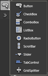
Common controls like Button, CheckBox, ComboBox, ListBox, RadioButton, ScrollBar, Slider, TabControl, GridSplitter will be discussed in my next article in detail.
Asset Library
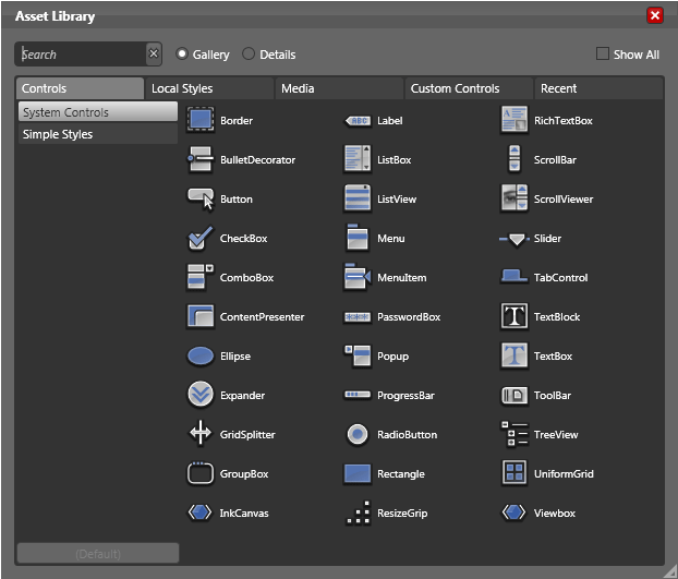
Used to access the Asset Library and to show the most recently used asset from the library.
Asset Library will be discussed in my next article in detail.