Silverlight Button Control
This article demonstrates how to create and use a Button control in Silverlight using XAML and C#.
Creating a Button
The Button element represents a Silverlight Button control in XAML.
<Button/>
The Width and Height attributes of the Button element represent the width and the height of a Button. The Content property of the Button element sets the text of a button. The x:Name attribute represents the name of the control, which is a unique identifier of a control.
The code snippet in Listing 1 creates a Button control and sets the name, height, width, and content of a Button control.
Button x:Name="DrawCircleButton" Height="80" Width="150"
Content="Draw Circle" >
</Button>
Listing 1
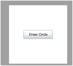
The output looks like Figure 1.

Figure 1
As you can see from Figure 1, by default the Button is place in the center of the page. We can place a Button control where we want by using the Margin, VerticalAlignment and HorizontalAlignment attributes that sets the margin, vertical alignment, and horizontal alignment of a control.
The code snippet in Listing 2 sets the position of the Button control in the left top corner of the page.
<Button x:Name="DrawCircleButton" Height="30" Width="100"
Content="Draw Circle"
Margin="10,10,0,0" VerticalAlignment="Top"
HorizontalAlignment="Left">
</Button>
Listing 2
Adding a Button Click Event Handler
The Click attribute of the Button element adds the click event handler. The following code adds the click event handler for a Button.
<Button x:Name="DrawCircleButton" Click="DrawCircleButton_Click">
</Button>
The code for the click event handler looks like following.
private void DrawCircleButton_Click(object sender, RoutedEventArgs e)
{
}
Now, whatever code you write in the click event handler that will be executed on the Button click. The code listed in Listing 3 creates a circle on the Button click event handler.
private void DrawCircleButton_Click(object sender, RoutedEventArgs e)
{
// creates a Circle
Ellipse circle = new Ellipse();
circle.Width = 200;
circle.Height = 200;
circle.Fill = new SolidColorBrush(Colors.Yellow);
circle.Stroke = new SolidColorBrush(Colors.Black);
circle.StrokeThickness = 4;
LayoutRoot.Children.Add(circle);
}
Listing 3
Formatting a Button
Not let's get a little creative. How about we create a Button control with a border formatting, background, and foreground of the Button?
The BorderBrush property of the Button sets a brush to draw the border of a Button. You may use any brush to fill the border. The following code snippet uses a linear gradient brush to draw the border with a combination of red and blue color.
<Button.BorderBrush>
<LinearGradientBrush StartPoint="0,0" EndPoint="1,1" >
<GradientStop Color="Blue" Offset="0" />
<GradientStop Color="Red" Offset="1.0" />
</LinearGradientBrush>
</Button.BorderBrush>
The Background and Foreground properties of the Button set the background and foreground colors of a Button. You may use any brush to fill the border. The following code snippet uses linear gradient brushes to draw the background and foreground of a Button.
<Button.Background>
<LinearGradientBrush StartPoint="0,0" EndPoint="1,1" >
<GradientStop Color="Blue" Offset="0.1" />
<GradientStop Color="Orange" Offset="0.25" />
<GradientStop Color="Green" Offset="0.75" />
<GradientStop Color="Red" Offset="1.0" />
</LinearGradientBrush>
</Button.Background>
<Button.Foreground>
<LinearGradientBrush StartPoint="0,0" EndPoint="1,1" >
<GradientStop Color="Orange" Offset="0.25" />
<GradientStop Color="Green" Offset="1.0" />
</LinearGradientBrush>
</Button.Foreground>
The new Button looks like Figure 2.

Figure 2
Mouse Rollover Formatting
How about giving some affects to your Button control when a mouse is over the Button and mouse leaves the Button area? We can achieve this by adding MouseEnter and MouseLeave event handler. The code listed in Listing 4 sets the background and foreground colors of a Button on mouse enter and mouse leave event handlers.
private void DrawCircleButton_MouseEnter(object sender, MouseEventArgs e)
{
DrawCircleButton.Background = new SolidColorBrush(Colors.Yellow );
DrawCircleButton.Foreground = new SolidColorBrush(Colors.Green);
}
private void DrawCircleButton_MouseLeave(object sender, MouseEventArgs e)
{
DrawCircleButton.Background = new SolidColorBrush(Colors.Red);
DrawCircleButton.Foreground = new SolidColorBrush(Colors.Purple);
}
Listing 4
Setting Image as Background of a Button
To set an image as background of a Button, we can set an image as the Background of the Button. The following code snippet sets the background of a Button to an image.
<Button.Background>
<ImageBrush ImageSource="dock.jpg" />
</Button.Background>
The new output looks like Figure 3.

Figure 3
Creating a Button Dynamically
The code listed in Listing 5 creates a Button control programmatically. First, it creates a Button object and sets its width, height, contents, background and foreground and later the Button is added to the LayoutRoot.
private void CreateAButton()
{
Button btn = new Button();
btn.Height = 80;
btn.Width = 150;
btn.Content = "Click ME";
btn.Background = new SolidColorBrush(Colors.Orange);
btn.Foreground = new SolidColorBrush(Colors.Black);
LayoutRoot.Children.Add(btn);
}
Listing 5
Summary
In this article, I discussed how we can create a Button control in Silverlight and C#. We also saw how we can format a Button by setting its border, background, and foreground properties. After that, we saw you to set an image as the background of a Button. In the end of this article, we saw how to create a Button dynamically.