Silverlight ListBox Control
A ListBox control is an items control that works as a ListBox control but only one item from the collection is visible at a time and clicking on the ListBox makes the collection visible and allows users to pick an item from the collection. Unlike a ListBox control, a ListBox does not have multiple item selection.
This article demonstrates how to create and use a ListBox control in Silverlight.
Introduction
The ListBox element represents a ListBox control in XAML.
<ListBox></ListBox>
The Width and Height properties represent the width and the height of a ListBox. The x:Name property represents the name of the control, which is a unique identifier of a control. The Margin property sets the location of a ListBox on the parent control. The HorizontalAlignment and VerticalAlignment properties are used to set horizontal and vertical alignments.
The code snippet in Listing 1 creates a ListBox control and sets the name, height, and width of a ListBox control. The code also sets the vertical and horizontal alignment of the ListBox and sets the margin.
<ListBox x:Name="DaysDropDownList" Width="200" Height="200"
VerticalAlignment="Top" HorizontalAlignment="Left"
Margin="10,10,0,0">
</ListBox>
Listing 1
The output looks like Figure 1.
Figure 1
The IsSelected property of the ListBox control sets an item as currently selected item in the ListBox. The following code snippet sets the IsSelected property of a ListBox.
<ListBoxItem Content="Coffie" IsSelected="True" />
Adding ListBox Items
A ListBox control hosts a collection of ListBoxItem. The code snippet in Listing 2 adds items to a ListBox control at design-time using XAML.
<ListBox Margin="10,10,0,13" Name="ListBox1" HorizontalAlignment="Left"
VerticalAlignment="Top" Width="194" Height="200">
<ListBoxItem Content="Coffie"></ListBoxItem>
<ListBoxItem Content="Tea"></ListBoxItem>
<ListBoxItem Content="Orange Juice"></ListBoxItem>
<ListBoxItem Content="Milk"></ListBoxItem>
<ListBoxItem Content="Iced Tea"></ListBoxItem>
<ListBoxItem Content="Mango Shake"></ListBoxItem>
</ListBox>
Listing 2
The above code generates Figure 2.
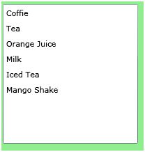
Figure 2
Adding and Deleting ListBox Items at Run-time
In the previous section, we saw how to add items to a ListBox at design-time from XAML. Now we will add items to a ListBox at run-time.
The Items property of the ListBox represents ListBox items, which is an ItemsCollection object. To add and remove items from the collection, we use Add and Remove or RemoveAt methods of the ItemsCollection.
Let’s change our UI and add a TextBox and a button control to the page. The XAML code in Listing 3 adds a TextBox and a Button controls to UI.
<TextBox x:Name="TextBox1" Width="200" Height="25"
Canvas.Left="10" Canvas.Top="10"/>
<Button x:Name="AddButton" Width="80" Height="25"
Canvas.Left="220" Canvas.Top="10" Content="Add Item" />
Listing 3
The final UI looks like Figure 3.
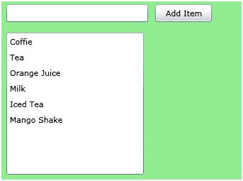
Figure 3
On button click event handler, we add the content of TextBox to the ListBox by calling ListBox.Items.Add method. The code in Listing 4 adds TextBox contents to the ListBox items.
private void AddButton_Click(object sender, RoutedEventArgs e)
{
ListBox1.Items.Add(TextBox1.Text);
}
Listing 4
On button click event handler, we add the content of TextBox to the ListBox by calling ListBox.Items.Add method.
Now if you enter text in the TextBox and click Add Item button, it will add contents of the TextBox to the ListBox. See Figure 4.
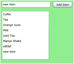
Figure 4
We can use ListBox.Items.Remove or ListBox.Items.RemoveAt method to delete an item from the collection of items in the ListBox. The RemoveAt method takes the index of the item in the collection.
Now, we modify our application and add a new button called Delete Item. The XAML code for this button looks is listed in Listing 5.
<Button x:Name="DeleteButton" Width="80" Height="25"
Canvas.Left="300" Canvas.Top="10"
Click="DeleteButton_Click" Content="Delete Item"/>
Listing 5
The new page looks like Figure 5.
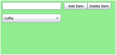
Figure 5
The button click event handler looks like Listing 6. On this button click, we find the index of the selected item and call ListBox.Items.RemoveAt method and pass the selected item of the ListBox. Now if you click on the Delete button click, the selected item will be removed from the ListBox items.
private void DeleteButton_Click(object sender, RoutedEventArgs e)
{
ListBox1.Items.RemoveAt
(ListBox1.Items.IndexOf(ListBox1.SelectedItem));
}
Listing 6
Formatting and Styling ListBox Items
The Foreground and Background attributes of ListBoxItem represents the background and foreground colors of the item. The following code snippet sets background and foreground color of a ListBoxItem.
<ListBoxItem Background="LightCoral" Foreground="Red" Content="Coffie"></ListBoxItem>
The FontFamily, FontSize, and FontWeight are used to set a font of a ListBoxItem. The following code snippet sets font verdana, size 12, and bold of a ListBoxItem.
<ListBoxItem Background="LightCoral" Foreground="Red" Content="Coffie"
FontFamily="Verdana" FontSize="12" FontWeight="Bold"></ListBoxItem>
The code in Listing 7 sets the formatting of the ListBox items.
<ListBoxItem Background="LightCoral" Foreground="Red" Content="Coffie"
FontFamily="Verdana" FontSize="12" FontWeight="Bold" IsSelected="True"></ListBoxItem>
<ListBoxItem Background="LightGray" Foreground="Black" Content="Tea"
FontFamily="Georgia" FontSize="14" FontWeight="Bold"></ListBoxItem>
<ListBoxItem Background="LightBlue" Foreground="Purple" Content="Orange Juice"
FontFamily="Verdana" FontSize="12" FontWeight="Bold"></ListBoxItem>
<ListBoxItem Background="LightGreen" Foreground="Green" Content="Milk"
FontFamily="Georgia" FontSize="14" FontWeight="Bold"></ListBoxItem>
<ListBoxItem Background="LightBlue" Foreground="Blue" Content="Iced Tea"
FontFamily="Verdana" FontSize="12" FontWeight="Bold"></ListBoxItem>
<ListBoxItem Background="LightSlateGray" Foreground="Orange" Content="Mango Shake"
FontFamily="Georgia" FontSize="14" FontWeight="Bold"></ListBoxItem>
Listing 7
The new ListBox looks like Figure 6.
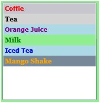
Figure 6
Display Image in ListBox Items
We can put any controls inside a ListBoxItem such as an image and text. To display an image side by side some text, we add an Image and TextBlock control within a StackPanel. The Image.Source property takes the name of the image you would like to display in the Image control and TextBlock.Text property takes a string that you would like to display in the TextBlock.
The code snippet in Listing 8 adds an image and text to a ListBoxItem.
<ListBoxItem Background="LightCoral" Foreground="Red"
FontFamily="Verdana" FontSize="12" FontWeight="Bold">
<StackPanel Orientation="Horizontal">
<Image Source="coffie.jpg" Height="30"></Image>
<TextBlock Text="Coffie"></TextBlock>
</StackPanel>
</ListBoxItem>
Listing 8
The ListBox item with an image looks like Figure 7.
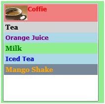
Figure 7
Adding CheckBoxes to the ListBox Items
If you put a CheckBox control inside ListBoxItems, you generate a ListBox control with checkboxes in it. The CheckBox can host controls within it as well. For instance, we can put an image and text block as content of a CheckBox.
The code snippet in Listing 9 adds a CheckBox with an image and text to a ListBoxItem.
<ListBoxItem Background="LightCoral" Foreground="Red"
FontFamily="Verdana" FontSize="12" FontWeight="Bold">
<CheckBox Name="CoffieCheckBox">
<StackPanel Orientation="Horizontal">
<Image Source="coffie.jpg" Height="30"></Image>
<TextBlock Text="Coffie"></TextBlock>
</StackPanel>
</CheckBox>
</ListBoxItem>
Listing 9
Now we can change the code of ListBoxItems and add CheckBoxes and images to all the items as shown in Listing 10. As you may see, we set the name of the CheckBoxes using Name property. If you need to access these CheckBoxes, you may access them in the code using their Name property.
<ListBoxItem Background="LightCoral" Foreground="Red"
FontFamily="Verdana" FontSize="12" FontWeight="Bold">
<CheckBox Name="CoffieCheckBox">
<StackPanel Orientation="Horizontal">
<Image Source="coffie.jpg" Height="30"></Image>
<TextBlock Text="Coffie"></TextBlock>
</StackPanel>
</CheckBox>
</ListBoxItem>
<ListBoxItem Background="LightGray" Foreground="Black"
FontFamily="Georgia" FontSize="14" FontWeight="Bold">
<CheckBox Name="TeaCheckBox">
<StackPanel Orientation="Horizontal">
<Image Source="tea.jpg" Height="30"></Image>
<TextBlock Text="Tea"></TextBlock>
</StackPanel>
</CheckBox>
</ListBoxItem>
<ListBoxItem Background="LightBlue" Foreground="Purple"
FontFamily="Verdana" FontSize="12" FontWeight="Bold">
<CheckBox Name="OrangeJuiceCheckBox">
<StackPanel Orientation="Horizontal">
<Image Source="OrangeJuice.jpg" Height="40"></Image>
<TextBlock Text="OrangeJuice"></TextBlock>
</StackPanel>
</CheckBox>
</ListBoxItem>
<ListBoxItem Background="LightGreen" Foreground="Green"
FontFamily="Georgia" FontSize="14" FontWeight="Bold">
<CheckBox Name="MilkCheckBox">
<StackPanel Orientation="Horizontal">
<Image Source="Milk.jpg" Height="30"></Image>
<TextBlock Text="Milk"></TextBlock>
</StackPanel>
</CheckBox>
</ListBoxItem>
<ListBoxItem Background="LightBlue" Foreground="Blue"
FontFamily="Verdana" FontSize="12" FontWeight="Bold">
<CheckBox Name="IcedTeaCheckBox">
<StackPanel Orientation="Horizontal">
<Image Source="IcedTea.jpg" Height="30"></Image>
<TextBlock Text="Iced Tea"></TextBlock>
</StackPanel>
</CheckBox>
</ListBoxItem>
<ListBoxItem Background="LightSlateGray" Foreground="Orange"
FontFamily="Georgia" FontSize="14" FontWeight="Bold">
<CheckBox Name="MangoShakeCheckBox">
<StackPanel Orientation="Horizontal">
<Image Source="MangoShake.jpg" Height="30"></Image>
<TextBlock Text="Mango Shake"></TextBlock>
</StackPanel>
</CheckBox>
</ListBoxItem>
Listing 10
Now, the new ListBox looks like Figure 8.

Figure 8
Data Binding
The ItemsSource property of ListBox is used to bind a collection of IEnuemerable such as an Array. The code listed in Listing 11 creates an array of strings.
private string [] LoadListBoxData()
{
string[] strArray =
{
"Coffie",
"Tea",
"Orange Juice",
"Milk",
"Mango Shake",
"Iced Tea",
"Soda",
"Water"
};
return strArray;
}
Listing 11
The following line of code sets the ItemsSource property of a ListBox to the array.
ListBox1.ItemsSource = LoadListBoxData();
Summary
In this article, I discussed how to create and use a ListBox control available in Silverlight. We saw how we can add items to a ListBox, change item properties, add images add check boxes. In the end of this article, we saw how data binding works in ListBox.