Introduction
In this article I am explaining controls,Layout Panels,Graphics primitives.Here i am explaining some controls,layout panels and Graphics primitives.
Controls
A Button with Border
The Button tag represents a Button control in XAML.
<Button ></Button>
On the button there is a property called Content that is set as the default content property for the button. This is how the XAML parser knows what to do with the text Hello WPF!
BroderBrush property that draws the outer border color.
<Border BorderBrush="Black" BorderThickness="5" Margin="10" Padding="5">
<Button>Hello WPF!</Button>
</Border>
The Output is :
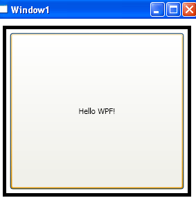
Figure 1
An Ellepse
The Following example shows how to create an ellipse and sets its proporties by using XAML.
<Ellipse Width="300" Height="200">
<Ellipse.Fill>
<LinearGradientBrush>
<GradientStop Offset="0" Color="Blue"/>
<GradientStop Offset="1" Color="Orange"/>
</LinearGradientBrush>
</Ellipse.Fill>
</Ellipse>
The Output is :
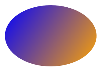
Figure 2
A Button with Ellipse
<Button>
<Ellipse Width="200" Height="150">
<Ellipse.Fill>
<LinearGradientBrush>
<GradientStop Offset="0" Color="Teal"/>
<GradientStop Offset="1" Color="Aqua" />
</LinearGradientBrush>
</Ellipse.Fill>
</Ellipse>
</Button>
The Final Output is :
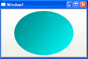
Figure 3
UI Layout :
Layout is the sizing, spacing, and placement of content within a window or page. Effective layout is crucial in helping users find what they are looking for quickly, as well as making the appearance visually appealing. Effective layout can make the difference between designs that users immediately understand and those that leave users feeling puzzled and overwhelmed.
A Stack Panel Layout :
A stack panel allows you to stack elements in an assigned direction. Based on the properties that you define within a stack panel, content can flow both vertically (by default) and horizontally.
The XAML is :
<StackPanel>
<TextBlock>Stack Panel</TextBlock>
<ListBox>
<ListBoxItem>stack 1</ListBoxItem>
<ListBoxItem>stack 2</ListBoxItem>
</ListBox>
<RichTextBox/>
</StackPanel>
The Output is :
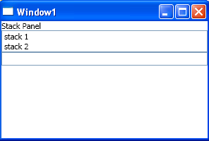
Figure 4
A Grid Layout
I have to declare our rows and columns. In this grid we have Three of each. I have used a grid specific height notation for the rows.
<Grid>
<Grid.RowDefinitions>
<RowDefinition Height="*"/>
<RowDefinition Height="3*"/>
</Grid.RowDefinitions>
<Grid.ColumnDefinitions>
<ColumnDefinition/>
<ColumnDefinition/>
</Grid.ColumnDefinitions>
<TextBlock Grid.ColumnSpan="2">My UI</TextBlock>
<ListBox Grid.Row="1" Grid.Column="0">
<ListBoxItem>Item 1</ListBoxItem>
<ListBoxItem>Item 2</ListBoxItem>
</ListBox>
<RichTextBox Grid.Row="1" Grid.Column="1"/>
</Grid>
The Output is :

Figure 5
Data Binding
Windows Presentation Foundation (WPF) data binding provides a simple and consistent way for applications to present and interact with data. Elements can be bound to data from a variety of data sources in the form of common language runtime (CLR) objects and XML.ContentControls such as Button and ItemsControls such as ListBox and ListView have built-in functionality to enable flexible styling of single data items or collections of data items. Sort, filter, and group views can be generated on top of the data.
The data binding functionality in WPF has several advantages over traditional models, including a broad range of properties that inherently support data binding, flexible UI representation of data, and clean separation of business logic from UI.
The this example I would like to show is a very common scenario. You have some object representing a Person,Customer,Employee , etc. and you want to display their information in the UI for editing purposes. Here is the XAML :
<Grid>
<Grid.RowDefinitions>
<RowDefinition/>
<RowDefinition/>
<RowDefinition/>
<RowDefinition/>
<RowDefinition/>
</Grid.RowDefinitions>
<Grid.ColumnDefinitions>
<ColumnDefinition Width="75"/>
<ColumnDefinition/>
</Grid.ColumnDefinitions>
<Label>First Name:</Label>
<TextBox Grid.Column="1" Text="{Binding Path=FirstName}"/>
<Label Grid.Row="1">Last Name:</Label>
<TextBox Grid.Row="1" Grid.Column="1" Text="{Binding LastName}"/>
<Label Grid.Row="2">Street:</Label>
<TextBox Grid.Row="2" Grid.Column="1" Text="{Binding Address.Street}"/>
<Label Grid.Row="3">City:</Label>
<TextBox Grid.Row="3" Grid.Column="1" Text="{Binding Address.City}"/>
<Label Grid.Row="4">State:</Label>
<TextBox Grid.Row="4" Grid.Column="1" Text="{Binding Address.State}"/>
</Grid>
The Output is :
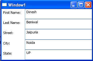
Figure 6
Graphics primitives
A Templated button
Trigger Property in WPF defines properties that correspond to end-user actions, such as the IsMouseOver property that is set to true when the user hovers the cursor over a UIElement or the corresponding IsMouseOver property of a ContentElement. Representing end-user actions in property values, along with the Trigger element, allows WPF styles to change property values based on those end-user actions, all from within markup.
<StackPanel>
<StackPanel.Resources>
<Style TargetType="{x:Type Button}">
<Setter Property="Foreground" Value="white" />
<Setter Property="Margin" Value="1" />
<Setter Property="Template">
<Setter.Value>
<ControlTemplate TargetType="{x:Type Button}">
<Grid>
<Rectangle x:Name="GelBackground"
Opacity="1" RadiusX="9"
RadiusY="9"
Fill="{TemplateBinding Background}"
StrokeThickness="0.35">
<Rectangle.Stroke>
<LinearGradientBrush StartPoint="0,0" EndPoint="0,1">
} <GradientStop Color="White" Offset="0" />
<GradientStop Color="#666666" Offset="1" />
</LinearGradientBrush>
</Rectangle.Stroke>
</Rectangle>
<Rectangle x:Name="GelShine"
Margin="2,2,2,0"
VerticalAlignment="Top"
RadiusX="6"
RadiusY="6"
Opacity="1"
Stroke="Transparent"
Height="15px">
<Rectangle.Fill>
<LinearGradientBrush StartPoint="0,0" EndPoint="0,1">
<GradientStop Color="#ccffffff" Offset="0"/>
<GradientStop Color="Transparent" Offset="1"/>
</LinearGradientBrush>
</Rectangle.Fill>
</Rectangle>
<ContentPresenter VerticalAlignment="Center" HorizontalAlignment="Center"/>
</Grid>
<ControlTemplate.Triggers>
<Trigger Property="IsMouseOver" Value="True">
<Setter Property="Fill" TargetName="GelBackground">
<Setter.Value>
<RadialGradientBrush>
<GradientStop Color="Lime" Offset="0" />
<GradientStop Color="DarkGreen" Offset="1" />
</RadialGradientBrush>
</Setter.Value>
</Setter>
</Trigger>
<Trigger Property="IsPressed" Value="true">
<Setter Property="Fill" TargetName="GelBackground">
<Setter.Value>
<RadialGradientBrush>
<GradientStop Color="#ffcc00" Offset="0"/>
<GradientStop Color="#cc9900" Offset="1"/>
</RadialGradientBrush>
</Setter.Value>
</Setter>
</Trigger>
</ControlTemplate.Triggers>
</ControlTemplate>
</Setter.Value>
</Setter>
<Style.Triggers>
<Trigger Property="IsMouseOver" Value="True">
<Setter Property="Foreground" Value="Black"/>
</Trigger>
<Trigger Property="IsPressed" Value="True">
<Setter Property="Foreground" Value="Black"/>
</Trigger>
</Style.Triggers>
</Style>
</StackPanel.Resources>
<Button Height="35" Width="125" Background="Blue">Normal</Button>
<Button Height="35" Width="125" Background="Blue">Mouse Over</Button>
</StackPanel>
The Output is :

Figure 7