Introduction
The entire Silverlight application involves properties and events. We need to set-up the properties of an element and attach an event handler to their events to play. Ok...let's talk about the topic of a Canvas and it's properties. First the definition; what is a Canvas?
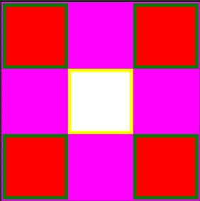
We may define it as a container of many child elements such as rectangles, text blocks etc. but remember it can't contain another canvas. Look at the screenshot below; it has five rectangles and each of them is aligned through its Canvas.Left and Canvas.Top properties.

<UserControl
xmlns="http://schemas.microsoft.com/winfx/2006/xaml/presentation"
xmlns:x="http://schemas.microsoft.com/winfx/2006/xaml"
x:Class="SilverlightApplication1.MainPage"
Width="304" Height="304">
<Canvas>
<Rectangle
Canvas.Left="2" Canvas.Top="2"
Height="100" Width="100"
Stroke="Green"
StrokeThickness="5"
Fill="Red"/>
<Rectangle
Canvas.Left="102" Canvas.Top="102"
Height="100" Width="100"
Stroke="Yellow"
StrokeThickness="5"
Fill="White"/>
<Rectangle
Canvas.Left="202" Canvas.Top="202"
Height="100" Width="100"
Stroke="Green"
StrokeThickness="5"
Fill="Red"/>
<Rectangle
Canvas.Left="202" Canvas.Top="2"
Height="100" Width="100"
Stroke="Green"
StrokeThickness="5"
Fill="Red"/>
<Rectangle
Canvas.Left="2" Canvas.Top="202"
Height="100" Width="100"
Stroke="Green"
StrokeThickness="5"
Fill="Red"/>
<Canvas.Background>
<ImageBrush ImageSource="image.jpg" />
</Canvas.Background>
</Canvas>
</UserControl>
The above canvas has one attribute:
-
Background: It is a brush; in this case we use a plain 'Magenta' color to paint the background of the Canvas.
The above canvas also has five child elements:
-
Rectangle: It is simply a shape that can be drawn inside a canvas; it can't exist without a container. It also has the following attributes:
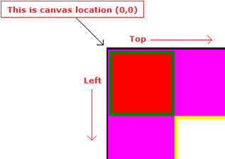
--> Canvas.Left or Canvas.Top: It specifies the position of the control with respect to the Canvas location. Canvas.Left="2" means leave 2 pixels from the left and Canvas.Top="2" means leave 2 pixels from the top. If we apply the same margin for another control then it will overlap one another; look at below:

Canvas Background Implementation
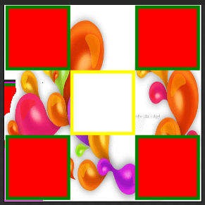
A Canvas is a container so we can apply images or gradient color as its background. Let's apply image to its background. If you wish to apply an image, add the image to the Project Explorer. Remember to upload image in Silverlight Application root not in Silverlight Application Website root. Let's apply the image.

<UserControl
xmlns="http://schemas.microsoft.com/winfx/2006/xaml/presentation"
xmlns:x="http://schemas.microsoft.com/winfx/2006/xaml"
x:Class="SilverlightApplication1.MainPage"
Width="304" Height="304">
<Canvas>
<Rectangle
Canvas.Left="2" Canvas.Top="2"
Height="100" Width="100"
Stroke="Green"
StrokeThickness="5"
Fill="Red"/>
<Rectangle
Canvas.Left="102" Canvas.Top="102"
Height="100" Width="100"
Stroke="Yellow"
StrokeThickness="5"
Fill="White"/>
<Rectangle
Canvas.Left="202" Canvas.Top="202"
Height="100" Width="100"
Stroke="Green"
StrokeThickness="5"
Fill="Red"/>
<Rectangle
Canvas.Left="202" Canvas.Top="2"
Height="100" Width="100"
Stroke="Green"
StrokeThickness="5"
Fill="Red"/>
<Rectangle
Canvas.Left="2" Canvas.Top="202"
Height="100" Width="100"
Stroke="Green"
StrokeThickness="5"
Fill="Red"/>
<Canvas.Background>
<RadialGradientBrush>
<GradientStop Color="Orange" Offset="0.22"/>
<GradientStop Color="Green" Offset="0.959"/>
<GradientStop Color="Orange" Offset="0.588"/>
</RadialGradientBrush>
</Canvas.Background>
</Canvas>
</UserControl>
Remember to delete background color before applying image because there is only single scope of background either use it by image or color/gradient.
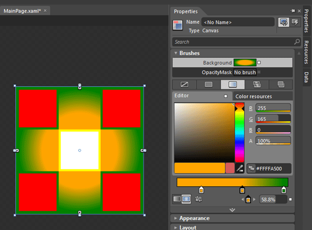
Now, let's apply a gradient to the Canvas but delete the image before proceeding.

I accomplish this using the Properties Explorer of the Canvas and the generated code is as follows:
<UserControl
xmlns="http://schemas.microsoft.com/winfx/2006/xaml/presentation"
xmlns:x="http://schemas.microsoft.com/winfx/2006/xaml"
x:Class="SilverlightApplication1.MainPage"
Width="304" Height="304">
<Canvas>
<Rectangle
Canvas.Left="2" Canvas.Top="2"
Height="100" Width="100"
Stroke="Green"
StrokeThickness="5"
Fill="Red"/>
<Rectangle
Canvas.Left="102" Canvas.Top="102"
Height="100" Width="100"
Stroke="Yellow"
StrokeThickness="5"
Fill="White"/>
<Rectangle
Canvas.Left="202" Canvas.Top="202"
Height="100" Width="100"
Stroke="Green"
StrokeThickness="5"
Fill="Red"/>
<Rectangle
Canvas.Left="202" Canvas.Top="2"
Height="100" Width="100"
Stroke="Green"
StrokeThickness="5"
Fill="Red"/>
<Rectangle
Canvas.Left="2" Canvas.Top="202"
Height="100" Width="100"
Stroke="Green"
StrokeThickness="5"
Fill="Red"/>
<Canvas.Background>
<RadialGradientBrush>
<GradientStop Color="Orange" Offset="0.22"/>
<GradientStop Color="Green" Offset="0.959"/>
<GradientStop Color="Orange" Offset="0.588"/>
</RadialGradientBrush>
</Canvas.Background>
</Canvas>
</UserControl>
That's all about the Canvas; be tuned for the next article.
HAVE A GREAT CODING