

PasswordBox in Windows phone 8.1 has a property called "IsPasswordRevealButtonEnabled " which helps to show password by clicking the check box underneath it.
- <Grid>
- <PasswordBox Background="White"
- BorderBrush="Gray"
- Foreground="Black"
- Header="Password"
- IsPasswordRevealButtonEnabled="True" />
- </Grid>
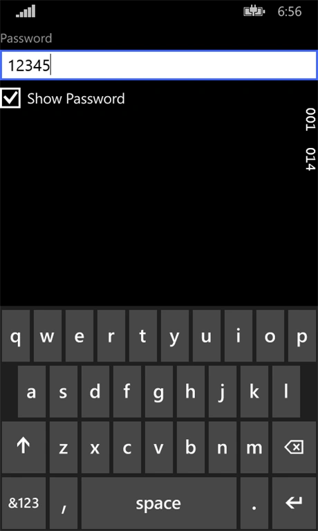
But we can remove checkbox and place toggle button inside passwordbox which looks much better.
Here is the code for CustomPasswordBox,
- <Grid>
- <PasswordBox Background="White"
- BorderBrush="Gray"
- Foreground="Black"
- Header="Password"
- IsPasswordRevealButtonEnabled="True"
- Style="{StaticResource CustomPasswordBoxStyle}" />
- </Grid>
- <Page.Resources>
- <Thickness x:Key="PhoneButtonContentPadding">9.5,0,9.5,3.5</Thickness>
- <Style x:Key="CustomToggleButtonStyle" TargetType="ToggleButton">
- <Setter Property="Background" Value="Transparent"/>
- <Setter Property="Foreground" Value="{ThemeResource PhoneForegroundBrush}"/>
- <Setter Property="FontFamily" Value="{ThemeResource PhoneFontFamilyNormal}"/>
- <Setter Property="FontWeight" Value="{ThemeResource PhoneButtonFontWeight}"/>
- <Setter Property="FontSize" Value="{ThemeResource TextStyleLargeFontSize}"/>
- <Setter Property="Padding" Value="{ThemeResource PhoneButtonContentPadding}"/>
- <Setter Property="MinHeight" Value="{ThemeResource PhoneButtonMinHeight}"/>
- <Setter Property="MinWidth" Value="{ThemeResource PhoneButtonMinWidth}"/>
- <Setter Property="HorizontalAlignment" Value="Left"/>
- <Setter Property="VerticalAlignment" Value="Center"/>
- <Setter Property="Template">
- <Setter.Value>
- <ControlTemplate TargetType="ToggleButton">
- <Grid HorizontalAlignment="Center" Background="Transparent">
- <VisualStateManager.VisualStateGroups>
- <VisualStateGroup x:Name="CommonStates">
- <VisualState x:Name="Normal" />
- <VisualState x:Name="PointerOver" />
- <VisualState x:Name="Pressed" />
- <VisualState x:Name="Disabled">
- <Storyboard>
- <ObjectAnimationUsingKeyFrames Storyboard.TargetName="EnabledBackground" Storyboard.TargetProperty="Visibility">
- <DiscreteObjectKeyFrame KeyTime="0" Value="Collapsed" />
- </ObjectAnimationUsingKeyFrames>
- <ObjectAnimationUsingKeyFrames Storyboard.TargetName="DisabledBackground" Storyboard.TargetProperty="Visibility">
- <DiscreteObjectKeyFrame KeyTime="0" Value="Visible" />
- </ObjectAnimationUsingKeyFrames>
- </Storyboard>
- </VisualState>
- <VisualState x:Name="Checked">
- <Storyboard>
- <ObjectAnimationUsingKeyFrames Storyboard.TargetName="DisabledBackground" Storyboard.TargetProperty="Background">
- <DiscreteObjectKeyFrame KeyTime="0" Value="{ThemeResource PhoneDisabledBrush}" />
- </ObjectAnimationUsingKeyFrames>
- <ObjectAnimationUsingKeyFrames Storyboard.TargetName="DisabledBackground" Storyboard.TargetProperty="BorderBrush">
- <DiscreteObjectKeyFrame KeyTime="0" Value="{ThemeResource PhoneDisabledBrush}" />
- </ObjectAnimationUsingKeyFrames>
- <ObjectAnimationUsingKeyFrames Storyboard.TargetName="DisabledContent" Storyboard.TargetProperty="Foreground">
- <DiscreteObjectKeyFrame KeyTime="0" Value="{ThemeResource PhoneBackgroundBrush}" />
- </ObjectAnimationUsingKeyFrames>
- <ColorAnimation Duration="0"
- Storyboard.TargetName="EnabledContent"
- Storyboard.TargetProperty="(ContentPresenter.Foreground).(SolidColorBrush.Color)"
- To="#00BAF2"
- d:IsOptimized="True" />
- </Storyboard>
- </VisualState>
- <VisualState x:Name="CheckedPointerOver">
- <Storyboard>
- <ObjectAnimationUsingKeyFrames Storyboard.TargetName="DisabledBackground" Storyboard.TargetProperty="Background">
- <DiscreteObjectKeyFrame KeyTime="0" Value="{ThemeResource PhoneDisabledBrush}" />
- </ObjectAnimationUsingKeyFrames>
- <ObjectAnimationUsingKeyFrames Storyboard.TargetName="DisabledBackground" Storyboard.TargetProperty="BorderBrush">
- <DiscreteObjectKeyFrame KeyTime="0" Value="{ThemeResource PhoneDisabledBrush}" />
- </ObjectAnimationUsingKeyFrames>
- <ObjectAnimationUsingKeyFrames Storyboard.TargetName="DisabledContent" Storyboard.TargetProperty="Foreground">
- <DiscreteObjectKeyFrame KeyTime="0" Value="{ThemeResource PhoneBackgroundBrush}" />
- </ObjectAnimationUsingKeyFrames>
- </Storyboard>
- </VisualState>
- <VisualState x:Name="CheckedPressed" />
- <VisualState x:Name="CheckedDisabled">
- <Storyboard>
- <ObjectAnimationUsingKeyFrames Storyboard.TargetName="EnabledBackground" Storyboard.TargetProperty="Opacity">
- <DiscreteObjectKeyFrame KeyTime="0" Value="0.4" />
- </ObjectAnimationUsingKeyFrames>
- </Storyboard>
- </VisualState>
- <VisualState x:Name="Indeterminate" />
- <VisualState x:Name="IndeterminatePointerOver" />
- <VisualState x:Name="IndeterminatePressed" />
- <VisualState x:Name="IndeterminateDisabled">
- <Storyboard>
- <ObjectAnimationUsingKeyFrames Storyboard.TargetName="EnabledBackground" Storyboard.TargetProperty="Visibility">
- <DiscreteObjectKeyFrame KeyTime="0" Value="Collapsed" />
- </ObjectAnimationUsingKeyFrames>
- <ObjectAnimationUsingKeyFrames Storyboard.TargetName="DisabledBackground" Storyboard.TargetProperty="Visibility">
- <DiscreteObjectKeyFrame KeyTime="0" Value="Visible" />
- </ObjectAnimationUsingKeyFrames>
- </Storyboard>
- </VisualState>
- </VisualStateGroup>
- </VisualStateManager.VisualStateGroups>
- <Border x:Name="EnabledBackground"
- Margin="{ThemeResource PhoneTouchTargetOverhang}">
- <ContentPresenter x:Name="EnabledContent"
- Margin="{TemplateBinding Padding}"
- HorizontalAlignment="{TemplateBinding HorizontalContentAlignment}"
- VerticalAlignment="{TemplateBinding VerticalContentAlignment}"
- AutomationProperties.AccessibilityView="Raw"
- Content="{TemplateBinding Content}"
- ContentTemplate="{TemplateBinding ContentTemplate}" />
- </Border>
- <Border x:Name="DisabledBackground"
- Margin="{ThemeResource PhoneTouchTargetOverhang}"
- Background="Transparent"
- IsHitTestVisible="False"
- Visibility="Collapsed">
- <ContentPresenter x:Name="DisabledContent"
- Margin="{TemplateBinding Padding}"
- HorizontalAlignment="{TemplateBinding HorizontalContentAlignment}"
- VerticalAlignment="{TemplateBinding VerticalContentAlignment}"
- AutomationProperties.AccessibilityView="Raw"
- Content="{TemplateBinding Content}"
- ContentTemplate="{TemplateBinding ContentTemplate}"
- Foreground="{ThemeResource ButtonDisabledForegroundThemeBrush}" />
- </Border>
- </Grid>
- </ControlTemplate>
- </Setter.Value>
- </Setter>
- </Style>
- <Style x:Key="CustomPasswordBoxStyle" TargetType="PasswordBox">
- <Setter Property="MinWidth" Value="{ThemeResource TextControlThemeMinWidth}"/>
- <Setter Property="MinHeight" Value="{ThemeResource TextControlThemeMinHeight}"/>
- <Setter Property="Height" Value="67"/>
- <Setter Property="SelectionHighlightColor" Value="{ThemeResource TextSelectionHighlightColorThemeBrush}"/>
- <Setter Property="Foreground" Value="{ThemeResource TextBoxForegroundThemeBrush}"/>
- <Setter Property="Background" Value="{ThemeResource TextBoxBackgroundThemeBrush}"/>
- <Setter Property="BorderBrush" Value="{ThemeResource TextBoxBorderThemeBrush}"/>
- <Setter Property="BorderThickness" Value="{ThemeResource TextControlBorderThemeThickness}"/>
- <Setter Property="FontFamily" Value="{ThemeResource PhoneFontFamilyNormal}"/>
- <Setter Property="FontSize" Value="{ThemeResource ContentControlFontSize}"/>
- <Setter Property="ScrollViewer.HorizontalScrollMode" Value="Auto"/>
- <Setter Property="ScrollViewer.VerticalScrollMode" Value="Auto"/>
- <Setter Property="ScrollViewer.HorizontalScrollBarVisibility" Value="Hidden"/>
- <Setter Property="ScrollViewer.VerticalScrollBarVisibility" Value="Hidden"/>
- <Setter Property="Padding" Value="{ThemeResource TextControlThemePadding}"/>
- <Setter Property="Margin" Value="{ThemeResource TextControlMarginThemeThickness}"/>
- <Setter Property="VerticalAlignment" Value="Top"/>
- <Setter Property="Template">
- <Setter.Value>
- <ControlTemplate TargetType="PasswordBox">
- <Grid Background="Transparent">
- <Grid.RowDefinitions>
- <RowDefinition Height="Auto"/>
- <RowDefinition Height="*"/>
- <RowDefinition Height="Auto"/>
- </Grid.RowDefinitions>
- <VisualStateManager.VisualStateGroups>
- <VisualStateGroup x:Name="CommonStates">
- <VisualState x:Name="Disabled">
- <Storyboard>
- <ObjectAnimationUsingKeyFrames Storyboard.TargetProperty="Background" Storyboard.TargetName="BorderElement">
- <DiscreteObjectKeyFrame KeyTime="0" Value="{ThemeResource TextBoxDisabledBackgroundThemeBrush}"/>
- </ObjectAnimationUsingKeyFrames>
- <ObjectAnimationUsingKeyFrames Storyboard.TargetProperty="BorderBrush" Storyboard.TargetName="BorderElement">
- <DiscreteObjectKeyFrame KeyTime="0" Value="{ThemeResource TextBoxDisabledBorderThemeBrush}"/>
- </ObjectAnimationUsingKeyFrames>
- <ObjectAnimationUsingKeyFrames Storyboard.TargetProperty="Foreground" Storyboard.TargetName="ContentElement">
- <DiscreteObjectKeyFrame KeyTime="0" Value="{ThemeResource TextBoxDisabledForegroundThemeBrush}"/>
- </ObjectAnimationUsingKeyFrames>
- <ObjectAnimationUsingKeyFrames Storyboard.TargetProperty="Foreground" Storyboard.TargetName="PlaceholderTextContentPresenter">
- <DiscreteObjectKeyFrame KeyTime="0" Value="{ThemeResource TextBoxDisabledForegroundThemeBrush}"/>
- </ObjectAnimationUsingKeyFrames>
- <ObjectAnimationUsingKeyFrames Storyboard.TargetProperty="Foreground" Storyboard.TargetName="HeaderContentPresenter">
- <DiscreteObjectKeyFrame KeyTime="0" Value="{ThemeResource TextBoxDisabledHeaderForegroundThemeBrush}"/>
- </ObjectAnimationUsingKeyFrames>
- </Storyboard>
- </VisualState>
- <VisualState x:Name="Normal">
- <Storyboard>
- <DoubleAnimation Duration="0" To="{ThemeResource TextControlBorderThemeOpacity}" Storyboard.TargetProperty="Opacity" Storyboard.TargetName="BorderElement"/>
- </Storyboard>
- </VisualState>
- <VisualState x:Name="PointerOver"/>
- <VisualState x:Name="Focused">
- <Storyboard>
- <ObjectAnimationUsingKeyFrames Storyboard.TargetProperty="BorderBrush" Storyboard.TargetName="BorderElement">
- <DiscreteObjectKeyFrame KeyTime="0" Value="{ThemeResource TextSelectionHighlightColorThemeBrush}"/>
- </ObjectAnimationUsingKeyFrames>
- <DoubleAnimation Duration="0" To="0" Storyboard.TargetProperty="Opacity" Storyboard.TargetName="PlaceholderTextContentPresenter"/>
- <ObjectAnimationUsingKeyFrames Storyboard.TargetProperty="Background" Storyboard.TargetName="BorderElement">
- <DiscreteObjectKeyFrame KeyTime="0" Value="{ThemeResource TextBoxFocusedBackgroundThemeBrush}"/>
- </ObjectAnimationUsingKeyFrames>
- </Storyboard>
- </VisualState>
- </VisualStateGroup>
- <VisualStateGroup x:Name="ButtonStates">
- <VisualState x:Name="ButtonVisible">
- <Storyboard>
- <ObjectAnimationUsingKeyFrames Storyboard.TargetProperty="Visibility" Storyboard.TargetName="RevealButton">
- <DiscreteObjectKeyFrame KeyTime="0" Value="Visible"/>
- </ObjectAnimationUsingKeyFrames>
- <ObjectAnimationUsingKeyFrames Storyboard.TargetProperty="IsChecked" Storyboard.TargetName="RevealButton">
- <DiscreteObjectKeyFrame KeyTime="0" Value="False"/>
- </ObjectAnimationUsingKeyFrames>
- </Storyboard>
- </VisualState>
- <VisualState x:Name="ButtonCollapsed">
- <Storyboard>
- <ObjectAnimationUsingKeyFrames Storyboard.TargetProperty="Visibility" Storyboard.TargetName="RevealButton">
- <DiscreteObjectKeyFrame KeyTime="0" Value="Collapsed"/>
- </ObjectAnimationUsingKeyFrames>
- <ObjectAnimationUsingKeyFrames Storyboard.TargetProperty="IsChecked" Storyboard.TargetName="RevealButton">
- <DiscreteObjectKeyFrame KeyTime="0" Value="False"/>
- </ObjectAnimationUsingKeyFrames>
- </Storyboard>
- </VisualState>
- </VisualStateGroup>
- </VisualStateManager.VisualStateGroups>
- <Border x:Name="BorderElement" BorderBrush="{TemplateBinding BorderBrush}" BorderThickness="{TemplateBinding BorderThickness}" Background="{TemplateBinding Background}" Grid.Row="1"/>
- <ContentPresenter x:Name="HeaderContentPresenter" ContentTemplate="{TemplateBinding HeaderTemplate}" Content="{TemplateBinding Header}" Margin="{ThemeResource TextControlHeaderMarginThemeThickness}" Grid.Row="0" Style="{StaticResource HeaderContentPresenterStyle}"/>
- <ScrollViewer x:Name="ContentElement" AutomationProperties.AccessibilityView="Raw" HorizontalScrollMode="{TemplateBinding ScrollViewer.HorizontalScrollMode}" HorizontalScrollBarVisibility="{TemplateBinding ScrollViewer.HorizontalScrollBarVisibility}" IsTabStop="False" IsHorizontalRailEnabled="{TemplateBinding ScrollViewer.IsHorizontalRailEnabled}" IsVerticalRailEnabled="{TemplateBinding ScrollViewer.IsVerticalRailEnabled}" Margin="{ThemeResource RichEditBoxTextThemeMargin}" MinHeight="{ThemeResource TextControlThemeMinHeight}" Padding="{TemplateBinding Padding}" Grid.Row="1" VerticalScrollBarVisibility="{TemplateBinding ScrollViewer.VerticalScrollBarVisibility}" VerticalScrollMode="{TemplateBinding ScrollViewer.VerticalScrollMode}" ZoomMode="Disabled"/>
- <ContentControl x:Name="PlaceholderTextContentPresenter" Content="{TemplateBinding PlaceholderText}" Foreground="{ThemeResource TextBoxPlaceholderTextThemeBrush}" IsTabStop="False" Margin="{ThemeResource RichEditBoxTextThemeMargin}" Padding="{TemplateBinding Padding}" Grid.Row="1"/>
- <!--<CheckBox x:Name="RevealButton" Foreground="{ThemeResource TextBoxForegroundHeaderThemeBrush}" HorizontalAlignment="Left" IsTabStop="False" Margin="{ThemeResource PasswordBoxCheckBoxThemeMargin}" Grid.Row="2" Visibility="Collapsed" VerticalAlignment="Top"/>-->
- <ToggleButton x:Name="RevealButton"
- Grid.Row="1"
- HorizontalAlignment="Right"
- VerticalAlignment="Top"
- Content="?"
- FontFamily="Segoe UI Symbol"
- Foreground="Gray"
- IsTabStop="False"
- Margin="0,-6.5,-32,0"
- Style="{StaticResource CustomToggleButtonStyle}"
- Visibility="Visible" />
- </Grid>
- </ControlTemplate>
- </Setter.Value>
- </Setter>
- </Style>
- </Page.Resources>
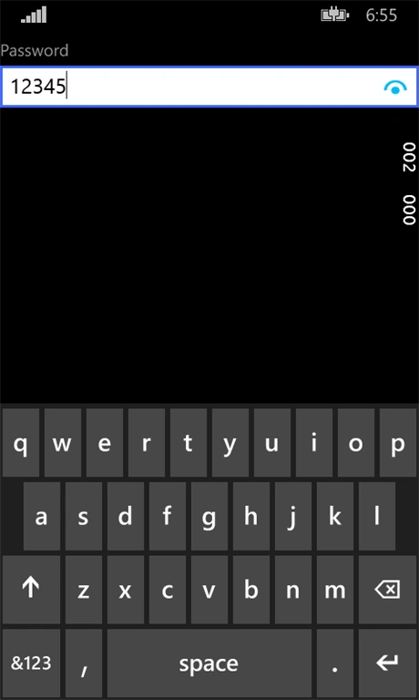
This is how the CustomPasswordBox looks like
Source code is included, if in case of any doubts feel free to ask.
Join the conversation! Your thoughts help the community grow.