

Create a new Windows 10 project to know how to create windows 10 projects refer to my previous article:
Now create one normal button as shown below
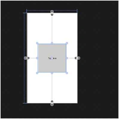
XAML Code.
- <Button Height="200" Width="200" Content="Tap Here" HorizontalAlignment="Center" Click="Button_Click"/>
- <Page
- x:Class="CustomCircleButton.MainPage"
- xmlns="http://schemas.microsoft.com/winfx/2006/xaml/presentation"
- xmlns:x="http://schemas.microsoft.com/winfx/2006/xaml"
- xmlns:local="using:CustomCircleButton"
- xmlns:d="http://schemas.microsoft.com/expression/blend/2008"
- xmlns:mc="http://schemas.openxmlformats.org/markup-compatibility/2006"
- mc:Ignorable="d">
- <Page.Resources>
- <Style x:Key="CircleButton" TargetType="Button">
- <Setter Property="Background">
- <Setter.Value>
- <LinearGradientBrush StartPoint="0.5,0" EndPoint="0.5,1">
- <GradientStop Offset="0" Color="Blue"/>
- <GradientStop Offset="1" Color="BlueViolet"/>
- </LinearGradientBrush>
- </Setter.Value>
- </Setter>
- <Setter Property="Template">
- <Setter.Value>
- <ControlTemplate TargetType="Button">
- <Grid>
- <VisualStateManager.VisualStateGroups>
- <VisualStateGroup x:Name="CommonStates">
- <VisualState x:Name="Disabled"/>
- <VisualState x:Name="Normal"/>
- <VisualState x:Name="MouseOver"/>
- <VisualState x:Name="Pressed">
- <Storyboard>
- <ObjectAnimationUsingKeyFrames Storyboard.TargetName="Inner" Storyboard.TargetProperty="(ScaleTransform.ScaleY)">
- <DiscreteObjectKeyFrame KeyTime="0:0:0.0" Value="1"/>
- </ObjectAnimationUsingKeyFrames>
- <ObjectAnimationUsingKeyFrames Storyboard.TargetName="Outer" Storyboard.TargetProperty="(ScaleTransform.ScaleY)">
- <DiscreteObjectKeyFrame KeyTime="0:0:0.0" Value="-1"/>
- </ObjectAnimationUsingKeyFrames>
- </Storyboard>
- </VisualState>
- </VisualStateGroup>
- <VisualStateGroup x:Name="FocusStates">
- <VisualState x:Name="Focused"/>
- <VisualState x:Name="Unfocused"/>
- </VisualStateGroup>
- </VisualStateManager.VisualStateGroups>
- <Ellipse Margin="4" Fill="{TemplateBinding Background}" RenderTransformOrigin="0.5,0.5">
- <Ellipse.RenderTransform>
- <ScaleTransform ScaleY="1" x:Name="Outer"/>
- </Ellipse.RenderTransform>
- </Ellipse>
- <Ellipse Margin="20" Fill="{TemplateBinding Background}" RenderTransformOrigin="0.5,0.5">
- <Ellipse.RenderTransform>
- <ScaleTransform ScaleY="-1" x:Name="Inner"/>
- </Ellipse.RenderTransform>
- </Ellipse>
- <ContentPresenter x:Name="content" HorizontalAlignment="Center" VerticalAlignment="Center"/>
- </Grid>
- </ControlTemplate>
- </Setter.Value>
- </Setter>
- </Style>
- </Page.Resources>
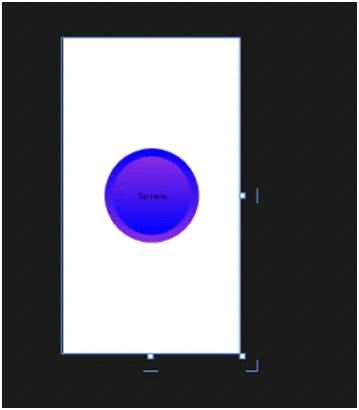
- <Button Height="200" Width="200" Content="Tap Here" HorizontalAlignment="Center" Style="{StaticResource CircleButton}" Click="Button_Click"/>
- </Grid>
Join the conversation! Your thoughts help the community grow.