

Introduction
This article demonstrates how to create and use a Custom Entry control in Xamarin.Forms, XAML, and C#. This article starts with the introduction of the Custom Entry tag in XAML. After that, it demonstrates how to set BorderColor, BorderWidth, CornerRadius, and IsCurvedEnabled of a Custom Entry. In the end, the article discusses how to create a button at run-time.

Implementation
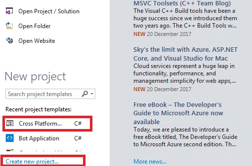
Open Visual Studio and select a New Project.
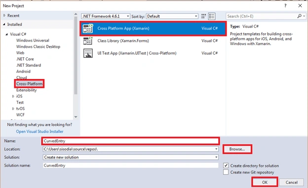
Now, select Cross Platform App, give the project a name, and set the project path. Then, click OK.
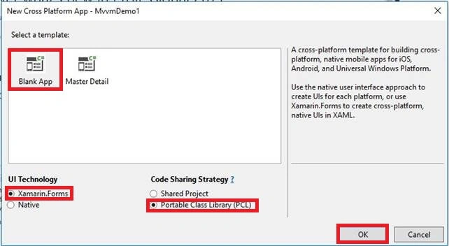
Select the template as "Blank App" and code sharing as "PCL".
Right-click on PCL Project and select Add >> New Item or Add >> Class.
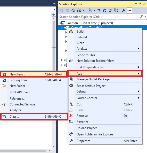
We are creating a class CustomEntry.cs and writing the following C# code.
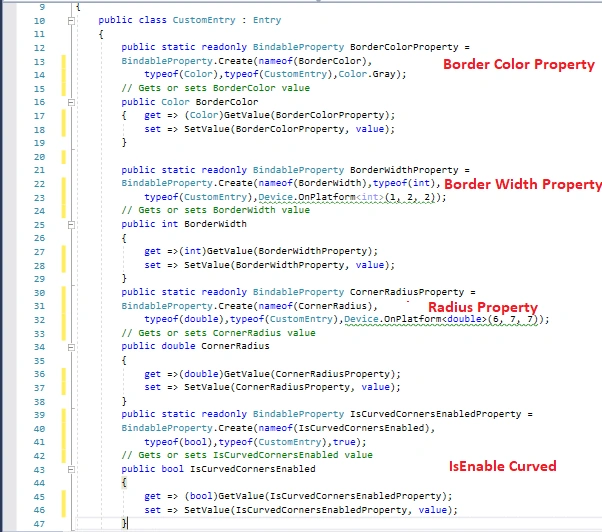
This property is set in the Android project as well as in iOS project.
CustomEntry.cs
- public class CustomEntry : Entry
- {
- public static readonly BindableProperty BorderColorProperty =
- BindableProperty.Create(nameof(BorderColor),
- typeof(Color),typeof(CustomEntry),Color.Gray);
- // Gets or sets BorderColor value
- public Color BorderColor
- { get => (Color)GetValue(BorderColorProperty);
- set => SetValue(BorderColorProperty, value);
- }
- public static readonly BindableProperty BorderWidthProperty =
- BindableProperty.Create(nameof(BorderWidth),typeof(int),
- typeof(CustomEntry),Device.OnPlatform<int>(1, 2, 2));
- // Gets or sets BorderWidth value
- public int BorderWidth
- {
- get =>(int)GetValue(BorderWidthProperty);
- set => SetValue(BorderWidthProperty, value);
- }
- public static readonly BindableProperty CornerRadiusProperty =
- BindableProperty.Create(nameof(CornerRadius),
- typeof(double),typeof(CustomEntry),Device.OnPlatform<double>(6, 7, 7));
- // Gets or sets CornerRadius value
- public double CornerRadius
- {
- get =>(double)GetValue(CornerRadiusProperty);
- set => SetValue(CornerRadiusProperty, value);
- }
- public static readonly BindableProperty IsCurvedCornersEnabledProperty =
- BindableProperty.Create(nameof(IsCurvedCornersEnabled),
- typeof(bool),typeof(CustomEntry),true);
- // Gets or sets IsCurvedCornersEnabled value
- public bool IsCurvedCornersEnabled
- {
- get => (bool)GetValue(IsCurvedCornersEnabledProperty);
- set => SetValue(IsCurvedCornersEnabledProperty, value);
- }
- }
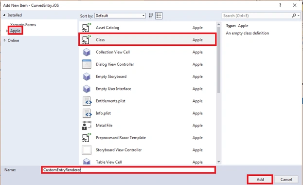
Now, it's time to go to the iOS project. Again, set the PCL(CustomEntry) property in IOS Project…. We are creating a Class, so right click on iOS Project and select Apple. Then, select "Class" and give this class a name as CustomEntryRendered.cs.
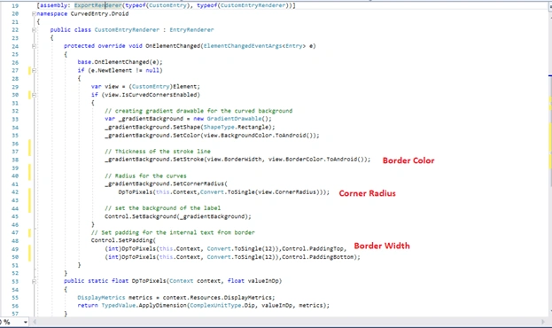
Now, let us write some code for Entry and Set Property.
CustomEntryRenderer.cs
- public class CustomEntryRenderer : EntryRenderer
- {
- protected override void OnElementChanged(ElementChangedEventArgs<Entry> e)
- {
- base.OnElementChanged(e);
- if (e.NewElement != null)
- {
- var view = (CustomEntry)Element;
- if (view.IsCurvedCornersEnabled)
- {
- // creating gradient drawable for the curved background
- var _gradientBackground = new GradientDrawable();
- _gradientBackground.SetShape(ShapeType.Rectangle);
- _gradientBackground.SetColor(view.BackgroundColor.ToAndroid());
- // Thickness of the stroke line
- _gradientBackground.SetStroke(view.BorderWidth, view.BorderColor.ToAndroid());
- // Radius for the curves
- _gradientBackground.SetCornerRadius(
- DpToPixels(this.Context,Convert.ToSingle(view.CornerRadius)));
- // set the background of the
- Control.SetBackground(_gradientBackground);
- }
- // Set padding for the internal text from border
- Control.SetPadding(
- (int)DpToPixels(this.Context, Convert.ToSingle(12)),Control.PaddingTop,
- (int)DpToPixels(this.Context, Convert.ToSingle(12)),Control.PaddingBottom);
- }
- }
- public static float DpToPixels(Context context, float valueInDp)
- {
- DisplayMetrics metrics = context.Resources.DisplayMetrics;
- return TypedValue.ApplyDimension(ComplexUnitType.Dip, valueInDp, metrics);
- }
- }
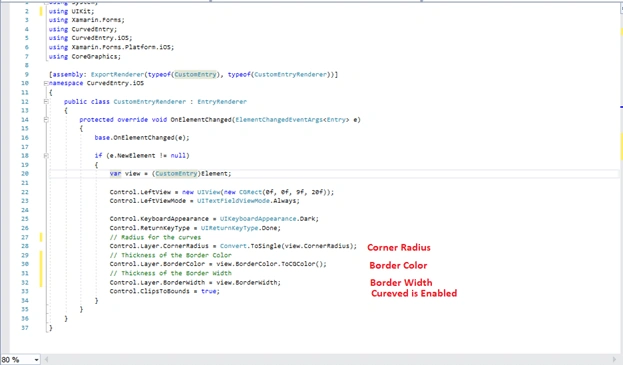
CustomEntryRenderer.cs
- public class CustomEntryRenderer : EntryRenderer
- {
- protected override void OnElementChanged(ElementChangedEventArgs<Entry> e)
- {
- base.OnElementChanged(e);
- if (e.NewElement != null)
- {
- var view = (CustomEntry)Element;
- Control.LeftView = new UIView(new CGRect(0f, 0f, 9f, 20f));
- Control.LeftViewMode = UITextFieldViewMode.Always;
- Control.KeyboardAppearance = UIKeyboardAppearance.Dark;
- Control.ReturnKeyType = UIReturnKeyType.Done;
- // Radius for the curves
- Control.Layer.CornerRadius = Convert.ToSingle(view.CornerRadius);
- // Thickness of the Border Color
- Control.Layer.BorderColor = view.BorderColor.ToCGColor();
- // Thickness of the Border Width
- Control.Layer.BorderWidth = view.BorderWidth;
- Control.ClipsToBounds = true;
- }
- }
- }
Now, go to the PCL Project and write this code in MainPage.xaml.
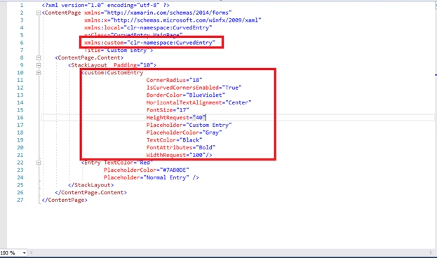
As you can see in the above code, we have to set the view reference in xmlns:custom="clr-namespace:CurvedEntry" MainPage.xaml.
MainPage.xaml
- <custom:CustomEntry
- CornerRadius="18"
- IsCurvedCornersEnabled="True"
- BorderColor="BlueViolet"
- HorizontalTextAlignment="Center"
- FontSize="17"
- HeightRequest="40"
- Placeholder="Custom Entry"
- PlaceholderColor="Gray"
- TextColor="Black"
- FontAttributes="Bold"
- WidthRequest="100"/>
Now, you will have your Custom Entry working!!
Features of CustomEntry controls
- Custom Border Color Property=(CustomBorderColor="#24C4FF")
- Custom Corner Radius Property=(CustomBorderRadius="4")
- Custom Border Width Property=(CustomBorderWidth="4")
- Custom IsCurvedCornersEnabled =(IsCurvedCornersEnabled ="True")
Mike DonnerPosted Feb 22, 2020, 11:13 PM
Device.OnPlatform<double>(6, 7, 7) is deprecated. How would you fix this?
Karteek PandaPosted Jan 21, 2020, 2:37 AM
Its continiously shows error even if u copy paste and add the references on the constructor pls give a solution and can u pls let me know a solution . type initialization exception
Abirami JothiPosted Jan 20, 2020, 11:04 AM
Want to add image in right in entry box
Jean Arielle SantosPosted Nov 22, 2018, 9:24 AM
I tried to change the backcolor for this custome renderer. In IOS, it worked as fine. But in android, the background color overlaps the rounded corner.
Rakesh NekentiPosted Oct 27, 2018, 6:06 AM
How to set the padding of customentry to zero i tried setting 12 to 0 but it doesnt work any help will be appreciated
Fernando SanchezPosted Jul 5, 2018, 10:51 AM
For the vertions 3.1 install the next nuget https://www.nuget.org/packages/Xam.Plugins.Forms.CustomReturnEntry/3.1.1-pre1
Sadhasivan ChettyPosted Jun 3, 2018, 4:36 AM
Hi It doesnt seem to work with Forms 3. Please verify. Thanks
hasini dPosted Apr 19, 2018, 2:20 AM
Clear example. I was tried several method at last this solution worked for me.Thank You!!!