

Introduction
In this article, we will visualize coronavirus (COVID-19) cases geographically using Python.
Steps
Install the chart_studio in your environment. Now Plotly is a part of chart_studio
- pip install chart_studio
The data is picked from here. * I am using it for demo purposes.
Import all the necessary libraries and setup your jupyter notebook for offline plotly usage
- import pandas as pd
- import chart_studio.plotly as py
- import plotly.graph_objs as go
- from plotly.offline import download_plotlyjs, init_notebook_mode, plot, iplot
- init_notebook_mode(connected=True)
- # Lets get data from that url
- df = pd.read_html('https://www.worldometers.info/coronavirus/#countries')
- # data is imported as a list
- # use the indexing to get your dataframe
- df = df[0]
- type(df)
- df.info()
You will find lot of NA values. Let's clean up the data and also rename columns and change datatype
- df.rename(columns = {"Country,Other": "COUNTRY"}, inplace=True)
- # fill NaN and Change columntype
- df["NewCases"] = df["NewCases"].fillna(0).astype('int')
- df["TotalDeaths"] = df["TotalDeaths"].fillna(0).astype('int')
- df["NewDeaths"] =df["NewDeaths"].fillna(0).astype('int')
- df["TotalRecovered"] = df["TotalRecovered"].fillna(0).astype('int')
- df["ActiveCases"] = df["ActiveCases"].fillna(0).astype('int')
- df["Serious,Critical"] =df["Serious,Critical"].fillna(0).astype('int')
- df.info()
Now, we will create a new column text to get all this information as a string in single column so that when you hover over a country, it's easy to display.
- df['text'] = df.apply(lambda r : "Deaths: " + str(r.TotalDeaths + r.NewDeaths) + " Suspected: " + " " + str(r.NewCases + r.ActiveCases),
- axis = 1)
Now, when you see the head of this dataframe, you will get a data like below.
| COUNTRY | TotalCases | NewCases | TotalDeaths | NewDeaths | ActiveCases | TotalRecovered | Serious,Critical | text | |
| 0 | China | 79252 | 428 | 2835 | 47 | 37323 | 39094 | 7664 | Deaths: 2882 Suspected: 37751 |
| 1 | S. Korea | 2931 | 594 | 17 | 1 | 2890 | 24 | 7 | Deaths: 18 Suspected: 3484 |
| 2 | Italy | 889 | 0 | 21 | 0 | 822 | 46 | 64 | Deaths: 21 Suspected: 822 |
| 3 | Diamond Princess | 705 | 0 | 6 | 0 | 689 | 10 | 36 | Deaths: 6 Suspected: 689 |
| 4 | Iran | 388 | 0 | 34 | 0 | 281 | 73 | 0 | Deaths: 34 Suspected: 281 |
Now lets replace the countries with their respective codes. This countrycode.csv is attached in the code zip file.
- country_code=pd.read_csv("countrycode.csv")
- # Convert the dataframe to dictionary
- country_code.set_index('COUNTRY', inplace=True)
- dict_country_code = country_code.to_dict()
- REPLACE_LIST = dict_country_code['CODE']
- # Replace Country with Codes
- df.replace(REPLACE_LIST, inplace=True)
Now we need to begin to build our data dictionary. The easiest way to do this is to use the dict() function of the general form:
- type = 'choropleth',
- locations = country code
- colorscale= Either a predefined string: 'pairs' | 'Greys' | 'Greens' | 'Bluered' | 'Hot' | 'Picnic' | 'Portland' | 'Jet' | 'RdBu' | 'Blackbody'
- | 'Earth' | 'Electric' | 'YIOrRd' | 'YIGnBu'
- or create a custom colorscale
- text= list or array of text to display per point
- z= array of values on z axis (color of state)
- colorbar = {'title':'Colorbar Title'})
- data = dict(
- type = 'choropleth',
- colorscale = 'ylorrd',
- locations = df['COUNTRY'].values,
- z = df['TotalCases'],
- text = df['text'],
- colorbar = {'title' : 'Corona Total Cases'},
- )
Then we create the layout nested dictionary and Then we use
- go.Figure(data = [data],layout = layout)
To set up the object that finally gets passed into iplot()
- layout = dict(
- title = 'Global Corona stats',
- geo = dict(
- showframe = False,
- projection = {'type':'natural earth'}
- )
- )
- choromap = go.Figure(data = [data],layout = layout)
- iplot(choromap)
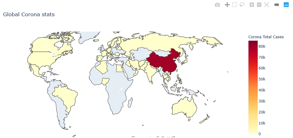
You will see the geographical map as we aimed for.
When you hover over each country, you will see data as in our text column.
Along with this, plotly has commands to hover, zoom in, zoom out, and save pictures.
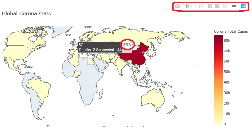
From the data, only the Diamond Princess data is not shown.
The 'type' property is an enumeration that may be specified as ['equirectangular', 'mercator', 'orthographic', 'natural earth', 'kavrayskiy7', 'miller', 'robinson', 'eckert4', 'azimuthal equal area', 'azimuthal equidistant', 'conic equal area', 'conic conformal', 'conic equidistant', 'gnomonic', 'stereographic', 'mollweide', 'hammer', 'transverse mercator', 'albers usa', 'winkel tripel', 'aitoff', 'sinusoidal']
With any other data that is across the globe, you can create geographical charts. Plotly is just one of the ways, but it can be done in many other ways.
Jacob GrossPosted Mar 2, 2020, 2:05 PM
Very interesting article, I would like to learn how to program geographical applications in Python such as this.