

Introduction
Ngx-Bootstrap has given a package for an open-source tool which a native Angular directive for Bootstrap 3 and 4. It contains all core components powered by Angular. In this article, we will learn about the Modal component, which is a cool feature of Ngx-bootstrap.
What is a Modal Popup?
A modal is a component that is displayed as a popup dialog box over the page.
Prerequisites
- Basic knowledge of Angular
- Visual Studio Code must be installed
- Angular CLI must be installed
- Node JS must be installed
Step 1
ng new modal-example
Step 2
Now, let's create a new component using the following command:
ng g c ngx-bootstrap-modal
Step 3
Install
ngx-bootstrap from npm using the following command:- npm install ngx-bootstrap --save
Or
ng add ngx-bootstrap --component modal
This will be added to our root module
Step 4
Now let's add bootstrap styles in our index.html file.
For Bootstrap 3
<linkhref="https://maxcdn.bootstrapcdn.com/bootstrap/3.3.7/css/bootstrap.min.css"rel="stylesheet">
For Bootstrap 4
<linkhref="https://maxcdn.bootstrapcdn.com/bootstrap/4.0.0/css/bootstrap.min.css"rel="stylesheet">
Step 5
Let add the template in our ngx-bootstrap-modal.component.html.
- <h2 style="text-align: center;">Example of Ngx-Bootstrap Modal</h2>
- <div style="width: fit-content;margin: auto;margin-top: 18px;">
- <button type="button" class="btn btn-primary" (click)="openModalWithClass(template)">Open modal</button>
- </div>
- <br>
- <ng-template #template>
- <div class="modal-header">
- <h4 class="modal-title pull-left">Modal</h4>
- <button type="button" class="close pull-right" aria-label="Close" (click)="modalRef.hide()">
- <span aria-hidden="true">×</span>
- </button>
- </div>
- <div class="modal-body">
- <h3>List of my upcomming articles in C# Corner</h3>
- <ul>
- <li>Use of Ngx-Bootstrap Modal in Angular 8</li>
- <li>Use of Ngx-Bootstrap Progres Bar in Angular 8</li>
- <li>Use of Ngx-Bootstrap Datepicker in Angular 8</li>
- <li>Use of Ngx-Bootstrap Timepicker in Angular 8</li>
- <li>Use of Ngx-Bootstrap Dropdown in Angular 8</li>
- <li>Use of Ngx-Bootstrap Sortable in Angular 8</li>
- <li>Use of Ngx-Bootstrap Collapse in Angular 8</li>
- <li>Use of Ngx-Bootstrap Carousel in Angular 8</li>
- <li>Use of Ngx-Bootstrap Typehead in Angular 8</li>
- </ul>
- <h3>You can check my all C# Corner Articles <a href="https://www.c-sharpcorner.com/members/siddharth-gajbhiye">here</a></h3>
- </div>
- <div class="modal-footer">
- <button type="button" class="btn btn-default" (click)="modalRef.hide()">Close</button>
- </div>
- </ng-template>
Step 6
Now, open the ngx-bootstrap-modal.component.ts file and add the following code in this file:
- import { Component, OnInit, TemplateRef } from '@angular/core';
- import { BsModalService, BsModalRef } from 'ngx-bootstrap/modal';
- @Component({
- selector: 'app-modal-popup',
- templateUrl: './modal-popup.component.html',
- styleUrls: ['./modal-popup.component.css']
- })
- export class ModalPopupComponent implements OnInit {
- modalRef: BsModalRef;
- constructor(private modalService: BsModalService) { }
- ngOnInit() {
- }
- openModalWithClass(template: TemplateRef<any>) {
- this.modalRef = this.modalService.show(
- template,
- Object.assign({}, { class: 'gray modal-lg' })
- );
- }
- }
- this.modalRef = this.modalService.show(template)
- this.modalRef.hide();
Here #template is the template reference which works like a trigger for the modal popup. With that, the template reference name modal is popping up.
Step 7
Now, open the app.component.html file and add the following code:
- <app-modal-popup></app-modal-popup>
Step 8
Let's open the app.module.ts file and add the following code:
- import { BrowserModule } from '@angular/platform-browser';
- import { NgModule } from '@angular/core';
- import { FormsModule, ReactiveFormsModule } from '@angular/forms';
- import { AppComponent } from './app.component';
- import { ModalPopupComponent } from './modal-popup/modal-popup.component';
- import { ModalModule } from 'ngx-bootstrap/modal';
- @NgModule({
- declarations: [
- AppComponent,
- ModalPopupComponent
- ],
- imports: [
- BrowserModule,
- ModalModule.forRoot(),
- FormsModule,
- ReactiveFormsModule,
- ],
- bootstrap: [AppComponent]
- })
- export class AppModule { }
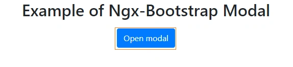
Now its time for the Output:

Conclusion
In this article, we have seen the Ngx-Bootstrap Modal Popup in Angular 8 Application.
Please give your valuable feedback/comments/questions about this article, and please let me know how to improve it.
Siddharth GajbhiyePosted Jun 1, 2020, 7:14 AM
Hello Techie Viking,for this you want to keep it in one common component and share this component wherever you are using it .So if where ever you want to use just give the selector name of it and use accordingly
Techie VikingPosted Jun 1, 2020, 6:55 AM
Hey Siddharth, Thank you for the tutorial. Could you please explain how we gonna make use of one common modal for different components? I have a requirement where I wanna keep one modal for my rest of the components to show data. Any help would be appreciated. Thank you :)