

PnP React Controls
Patterns and Practices (PnP) provides a list of reusable React controls to developers for building solutions such as webparts and extensions using SharePoint Framework.
Refer to this link to get the list of React controls for SPFx.
You will see how to use the PnP People Picker control in SPFx webpart.
PnP People Picker Control
This control renders a People Picker field which can be used to select one or more users from a SharePoint group or site. The control can be configured as mandatory. It will show a custom error message if the field is empty. Refer to this link for more details.
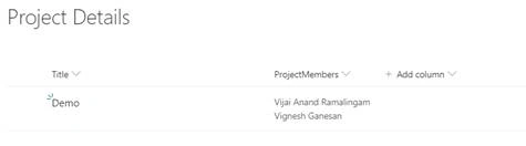
I have created a simple custom list which contains the following fields.
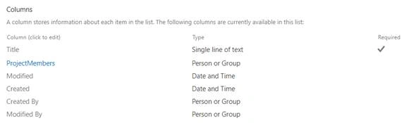
Person or group Field settings
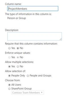
- Field Display Name: ProjectMembers
- Field Internal Name: ProjectMembers
Note
When you are setting the value using PnP js the field name should be <fieldInternalName>Id. Example - ProjectMembersId
In this article, you will see how to perform the following tasks,
- Prerequisites
- Create SPFx solution
- Implement People Picker Control solution
- Deploy the solution
- Test the webpart
Prerequisites
Create SPFx solution
Open Node.js command prompt.
Create a new folder.
>md spfx-pnpreact-peoplepicker
Navigate to the folder.
> cd spfx-pnpreact-peoplepicker
Execute the following command to create SPFx webpart.
>yo @microsoft/sharepoint
Enter all the required details to create a new solution. Yeoman generator will perform the scaffolding process and once it is completed, lock down the version of project dependencies by executing the following command.
>npm shrinkwrap
Execute the following command to open the solution in the code editor.
>code .
Implement People Picker Control solution
Execute the following command to install the PnP React Controls NPM package.
>npm install @pnp/spfx-controls-react –save
Execute the following command to install the pnp sp library.
>npm install @pnp/sp –save
Create a new ts file named as “IPeoplepickercontrolState.ts” under Components folder (src\webparts\peoplepickercontrol\components\IPeoplepickercontrolState.ts) and update the code as shown below.
- import { MessageBarType } from 'office-ui-fabric-react';
- export interface IPeoplepickercontrolState {
- title: string;
- users: number[];
- showMessageBar: boolean;
- messageType?: MessageBarType;
- message?: string;
- }
Open the props file (src\webparts\peoplepickercontrol\components\IPeoplepickercontrolProps.ts) and update the code as shown below.
- import { WebPartContext } from "@microsoft/sp-webpart-base";
- export interface IPeoplepickercontrolProps {
- description: string;
- context: WebPartContext;
- }
Open the webpart file “src\webparts\datetimepickercontrol\DatetimepickercontrolWebPart.ts” and update the render method.
- public render(): void {
- const element: React.ReactElement<IPeoplepickercontrolProps> = React.createElement(
- Peoplepickercontrol,
- {
- description: this.properties.description,
- context: this.context
- }
- );
- ReactDom.render(element, this.domElement);
Open the component file “src\webparts\peoplepickercontrol\components\Peoplepickercontrol.tsx” and import the following modules.
- import { IPeoplepickercontrolState } from './IPeoplepickercontrolState';
- import { IButtonProps, DefaultButton } from 'office-ui-fabric-react/lib/Button';
- import { TextField } from 'office-ui-fabric-react/lib/TextField';
- import { autobind } from 'office-ui-fabric-react';
- import { MessageBar, MessageBarType, IStackProps, Stack } from 'office-ui-fabric-react';
- import { PeoplePicker, PrincipalType } from "@pnp/spfx-controls-react/lib/PeoplePicker";
- import { sp } from "@pnp/sp";
- import "@pnp/sp/webs";
- import "@pnp/sp/lists";
- import "@pnp/sp/items";
Update the render method as shown below.
- public render(): React.ReactElement<IPeoplepickercontrolProps> {
- return (
- <div className={styles.peoplepickercontrol}>
- {
- this.state.showMessageBar
- ?
- <div className="form-group">
- <Stack {...verticalStackProps}>
- <MessageBar messageBarType={this.state.messageType}>{this.state.message}</MessageBar>
- </Stack>
- </div>
- :
- null
- }
- <TextField label="Title" required onChanged={this._onchangedTitle} />
- <PeoplePicker
- context={this.props.context}
- titleText="Project Members"
- personSelectionLimit={3}
- showtooltip={true}
- isRequired={true}
- disabled={false}
- selectedItems={this._getPeoplePickerItems}
- showHiddenInUI={false}
- ensureUser={true}
- principalTypes={[PrincipalType.User]}
- resolveDelay={1000} />
- <DefaultButton text="Submit" onClick={this._createItem} />
- </div>
- );
- }
Note
Make sure in the people picker control ensureUser is set to true or else you will not be able to set the values. When ensure user property is true, it will return the local user ID on the current site when doing a tenant wide search.
Create the constructor in the component file.
- constructor(props: IPeoplepickercontrolProps, state: IPeoplepickercontrolState) {
- super(props);
- sp.setup({
- spfxContext: this.props.context
- });
- this.state = {
- title: '',
- users: [],
- showMessageBar: false
- };
- }
Create the helper methods in the component file.
- constructor(props: IPeoplepickercontrolProps, state: IPeoplepickercontrolState) {
- super(props);
- sp.setup({
- spfxContext: this.props.context
- });
- this.state = {
- title: '',
- users: [],
- showMessageBar: false
- };
- }
- reate the helper methods in the component file.
- @autobind
- private _getPeoplePickerItems(items: any[]) {
- let getSelectedUsers = [];
- for (let item in items) {
- getSelectedUsers.push(items[item].id);
- }
- this.setState({ users: getSelectedUsers });
- }
- @autobind
- private _onchangedTitle(title: string) {
- this.setState({ title: title });
- }
- @autobind
- private async _createItem() {
- try {
- await sp.web.lists.getByTitle("Project Details").items.add({
- Title: this.state.title,
- ProjectMembersId: { results: this.state.users }
- });
- this.setState({
- message: "Item: " + this.state.title + " - created successfully!",
- showMessageBar: true,
- messageType: MessageBarType.success
- });
- }
- catch (error) {
- this.setState({
- message: "Item " + this.state.title + " creation failed with error: " + error,
- showMessageBar: true,
- messageType: MessageBarType.error
- });
- }
- }
Update React component (src\webparts\peoplepickercontrol\components\Peoplepickercontrol.tsx),
- import * as React from 'react';
- import styles from './Peoplepickercontrol.module.scss';
- import { escape } from '@microsoft/sp-lodash-subset';
- import { IPeoplepickercontrolProps } from './IPeoplepickercontrolProps';
- import { IPeoplepickercontrolState } from './IPeoplepickercontrolState';
- import { IButtonProps, DefaultButton } from 'office-ui-fabric-react/lib/Button';
- import { TextField } from 'office-ui-fabric-react/lib/TextField';
- import { autobind } from 'office-ui-fabric-react';
- import { MessageBar, MessageBarType, IStackProps, Stack } from 'office-ui-fabric-react';
- import { PeoplePicker, PrincipalType } from "@pnp/spfx-controls-react/lib/PeoplePicker";
- import { sp } from "@pnp/sp";
- import "@pnp/sp/webs";
- import "@pnp/sp/lists";
- import "@pnp/sp/items";
- const verticalStackProps: IStackProps = {
- styles: { root: { overflow: 'hidden', width: '100%' } },
- tokens: { childrenGap: 20 }
- };
- export default class Peoplepickercontrol extends React.Component<IPeoplepickercontrolProps, IPeoplepickercontrolState> {
- constructor(props: IPeoplepickercontrolProps, state: IPeoplepickercontrolState) {
- super(props);
- sp.setup({
- spfxContext: this.props.context
- });
- this.state = {
- title: '',
- users: [],
- showMessageBar: false
- };
- }
- public render(): React.ReactElement<IPeoplepickercontrolProps> {
- return (
- <div className={styles.peoplepickercontrol}>
- {
- this.state.showMessageBar
- ?
- <div className="form-group">
- <Stack {...verticalStackProps}>
- <MessageBar messageBarType={this.state.messageType}>{this.state.message}</MessageBar>
- </Stack>
- </div>
- :
- null
- }
- <TextField label="Title" required onChanged={this._onchangedTitle} />
- <PeoplePicker
- context={this.props.context}
- titleText="Project Members"
- personSelectionLimit={3}
- showtooltip={true}
- isRequired={true}
- disabled={false}
- selectedItems={this._getPeoplePickerItems}
- showHiddenInUI={false}
- ensureUser={true}
- principalTypes={[PrincipalType.User]}
- resolveDelay={1000} />
- <DefaultButton text="Submit" onClick={this._createItem} />
- </div>
- );
- }
- @autobind
- private _getPeoplePickerItems(items: any[]) {
- let getSelectedUsers = [];
- for (let item in items) {
- getSelectedUsers.push(items[item].id);
- }
- this.setState({ users: getSelectedUsers });
- }
- @autobind
- private _onchangedTitle(title: string) {
- this.setState({ title: title });
- }
- @autobind
- private async _createItem() {
- try {
- await sp.web.lists.getByTitle("Project Details").items.add({
- Title: this.state.title,
- ProjectMembersId: { results: this.state.users }
- });
- this.setState({
- message: "Item: " + this.state.title + " - created successfully!",
- showMessageBar: true,
- messageType: MessageBarType.success
- });
- }
- catch (error) {
- this.setState({
- message: "Item " + this.state.title + " creation failed with error: " + error,
- showMessageBar: true,
- messageType: MessageBarType.error
- });
- }
- }
- }
Deploy the solution
Execute the following commands to bundle and package the solution.
>gulp bundle --ship
>gulp package-solution --ship
Navigate to tenant app catalog – Example - https://c986.sharepoint.com/sites/appcatalog/SitePages/Home.aspx
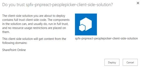
Go to Apps for SharePoint library and upload the package file (sharepoint\solution\spfx-pnpreact-peoplepicker.sppkg). Click Deploy.
Test the webpart
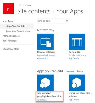
Navigate to the SharePoint site and add the app.
Result
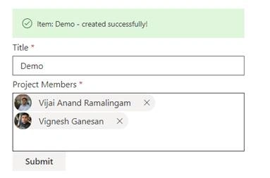
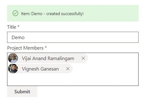
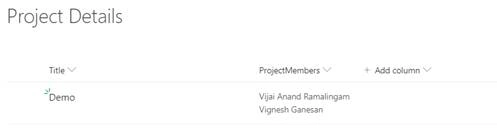
Navigate to the page and add the webpart. Enter all the details and click submit, a new item gets created in the SharePoint list.
Summary
Thus, in this article, you saw how to use PnP People Picker Control in SharePoint Framework.
Andreas LuxPosted Feb 1, 2023, 3:46 PM
No longer working - outdated
Kshitij GuptaPosted May 5, 2022, 7:37 AM
Item [object Object] creation failed with error: TypeError: Converting circular structure to JSON --> starting at object with constructor 'wc' | property 'stateNode' -> object with constructor 'HTMLInputElement' --- property '__reactInternalInstance$srf9idzzz6' closes the circle ------getting this error, not able to find where I'm making the mistake.
uday kumarPosted Jan 20, 2021, 10:48 AM
If you anyone getting error, please let me know i have resolved couple of issues
Senthil Kumar ParthasarathyPosted Jul 20, 2020, 12:48 PM
susam sarkar: I got same error, but it was fixed once I enable "Allow multiple selections to YES" for that peoplepicker column. Try it once
Vipul JainPosted Jun 8, 2020, 3:12 AM
To execute the above code, styles.peoplepickercontrol property is not defined. It should be defined in .scss file, else you will get build error.
susam sarkarPosted May 21, 2020, 1:00 PM
Not working.. throwing parsers.js:130 Uncaught (in promise) Error: Error making HttpClient request in queryable [400] ::> {"odata.error":{"code":"-1, Microsoft.SharePoint.Client.InvalidClientQueryException","message":{"lang":"en-US","value":"A node of type 'StartArray' was read from the JSON reader when trying to read a value of a property; however, a 'PrimitiveValue' or 'StartObject' node was expected."}}} error