


Blazor is a modern web framework developed by Microsoft that is changing the way developers build interactive web applications. Blazor lets you build rich client-side web experiences using C# and .NET instead of JavaScript. One of the most powerful features of Blazor is its component-based architecture, which encourages the reuse of code and modular design. This article will show you how to create a reusable dynamic pagination component with Blazor, ensuring minimal changes and maximum flexibility.
To learn more about Blazor Web Development, click here.
Understanding Blazor and Its Component-Based Architecture
Blazor is part of the ASP.NET Core framework, and it allows you to develop full-stack web applications with .NET. Blazor provides a unified programming model that lets you use your .NET skills across the stack, whether you’re building server-side or client-side applications.
Blazor differs from traditional web frameworks by running .NET code in the browser (Blazor WebAssembly) or on the server with SignalR (Blazor Server). This removes the need for JavaScript in many scenarios, providing a more seamless development experience for .NET developers.
Component-Based Framework
- Blazor is a component-based framework at its core. In Blazor, everything is a component, from a simple button to a complex data grid. Components are self-contained units of user interface and behavior that can be reused throughout the entire application. They allow developers to encapsulate their HTML, CSS, and C# code in one location, which promotes reusability, maintainability, and testability.
- Components can be nested, set parameters, and even share data with each other. This makes Blazor an ideal framework for building modular and dynamic web applications. Once created, components can be used anywhere in the application and are written as .razor files.
- In this article, we create a pagination component that can be reused across the application dynamically for any list or collection.
Pagination in Web Applications
- In web applications that deal with large amounts of data, pagination is a common feature. This enables you to split your data into pages so that users can browse more easily without overwhelming them with lengthy lists. Correct pagination improves the user experience because it improves performance, reduces page loading time, and makes data easier to digest.
- You can implement both client-side and server-side pagination approaches in Blazor. In this article, our focus will be on the creation of a reusable client-side pagination component that can be easily integrated into any Blazor application.
Complete Source Code: https://github.com/rijwanansari/DynamicPagination
Creating a Reusable Dynamic Pagination Component
Let’s walk through the process of building a reusable pagination component in Blazor that supports dynamic page size selection and navigation.
Create a Blazor Web App project template using Visual Studio or VS Code and give a name.
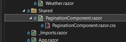
You can choose any .NET Core framework. However, for this article, I have used .NET 8.
Defining the Pagination Component
Create a Blazor component in a shared folder or any folder of your choice where you can share across the project easily.
The first step is to define the pagination component. This component will handle the pagination logic and display the necessary controls, such as page numbers and page size options.
PaginationComponent.razor
@typeparam TItem
<div>
    <table class="table">
        <thead>
            @ChildContentHeader
        </thead>
        <tbody>
            @foreach (var item in PaginatedData)
            {
                @ChildContentRow(item)
            }
        </tbody>
    </table>

    <div class="pagination-controls">
        <!-- Page Size Dropdown -->
        <label for="pageSize">Page Size: </label>
        <select @bind="PageSize" id="pageSize">
            @foreach (var size in PageSizes)
            {
                <option value="@size">@size</option>
            }
        </select>

        <!-- Previous Page Button -->
        <button @onclick="PreviousPage" disabled="@IsPreviousDisabled">Previous</button>

        <!-- Page Number Buttons -->
        @foreach (var pageNumber in Enumerable.Range(1, TotalPages))
        {
            <button @onclick="() => GoToPage(pageNumber)" class="@(CurrentPage == pageNumber ? "active" : "")">
                @pageNumber
            </button>
        }

        <!-- Next Page Button -->
        <button @onclick="NextPage" disabled="@IsNextDisabled">Next</button>
    </div>
</div>

@code {
    [Parameter] public IEnumerable<TItem> Items { get; set; }
    [Parameter] public int DefaultPageSize { get; set; } = 10;
    [Parameter] public RenderFragment ChildContentHeader { get; set; }
    [Parameter] public RenderFragment<TItem> ChildContentRow { get; set; }

    private int PageSize { get; set; }
    private List<TItem> PaginatedData => Items.Skip((CurrentPage - 1) * PageSize).Take(PageSize).ToList();
    private int CurrentPage { get; set; } = 1;

    private readonly int[] PageSizes = new[] { 5, 10, 20, 50 };

    protected override void OnInitialized()
    {
        PageSize = DefaultPageSize;
    }

    private void NextPage()
    {
        if (CurrentPage < TotalPages)
        {
            CurrentPage++;
        }
    }

    private void PreviousPage()
    {
        if (CurrentPage > 1)
        {
            CurrentPage--;
        }
    }

    private void GoToPage(int pageNumber)
    {
        CurrentPage = pageNumber;
    }

    private int TotalPages => (int)Math.Ceiling(Items.Count() / (double)PageSize);

    private bool IsPreviousDisabled => CurrentPage == 1;
    private bool IsNextDisabled => CurrentPage == TotalPages;
}
In this component, we have the following items.
@typeparam TItem
This allows the component to be generic, meaning it can work with any data type (TItem). It makes the component flexible and reusable with different types of data, such as Product, Employee, etc.
Items, ChildContentHeader, and ChildContentRow Parameters.
- Items: This is a collection of data (IEnumerable<TItem>) passed into the component. The component uses this data to display paginated content.
- ChildContentHeader: This is a render fragment for the table header. It allows the parent component to define how the header should be rendered.
- ChildContentRow: This is a render fragment for each row of data. It takes a TItem and allows the parent component to define how each item should be displayed.
Pagination Logic
The component calculates which items to display based on the current page and page size.
- PaginatedData: This property uses LINQ to skip items and take only those that should be displayed on the current page.
- PageSize and PageSizes: PageSize controls how many items are displayed per page, and PageSizes defines the available options for page size.
- NextPage, PreviousPage, and GoToPage: These methods handle navigation between pages.
Pagination Controls
The component includes buttons for navigating between pages (Next and Previous) and buttons for selecting specific pages. There’s also a dropdown for selecting the page size.
We will CSS file for this component as shown to add style for the controls like page, page buttons, previous and next buttons, and below pagination sections.

CSS for this pagination control is shared below.
.pagination-controls {
    display: flex;
    align-items: center;
    justify-content: center;
    margin-top: 20px;
}

.pagination-controls button {
    background-color: #f8f9fa;
    border: 1px solid #dee2e6;
    color: #007bff;
    padding: 5px 10px;
    margin: 0 5px;
    border-radius: 4px;
    cursor: pointer;
    transition: background-color 0.3s ease, color 0.3s ease;
}

.pagination-controls button:hover {
    background-color: #007bff;
    color: white;
}

.pagination-controls button.active {
    background-color: #007bff;
    color: white;
    font-weight: bold;
}

.pagination-controls button:disabled {
    background-color: #e9ecef;
    color: #6c757d;
    cursor: not-allowed;
    border-color: #ced4da;
}

.pagination-controls select {
    margin-right: 15px;
    padding: 5px;
    border-radius: 4px;
    border: 1px solid #dee2e6;
}

.pagination-controls label {
    margin-right: 5px;
    font-weight: bold;
}
This CSS ensures that the pagination controls have a clean, modern look with smooth transitions when users interact with them.
Using the Pagination Component
Once the PaginationComponent is defined, you can easily integrate it into your Blazor pages or components. Here’s an example of how to use it with a list of products.
public class Product
{
    public int Id { get; set; }
    public string Name { get; set; }
    public decimal Price { get; set; }
}

//sample dummy data
public class ProductService
{
    public List<Product> GetProducts()
    {
        // Sample data
        return Enumerable.Range(1, 100).Select(i => new Product
        {
            Id = i,
            Name = $"Product {i}",
            Price = i * 10
        }).ToList();
    }
}
We can use the pagination component as illustrated.
@page "/"
@using DynamicPagination.Components.Shared
@using DynamicPagination.Model
@inject ProductService ProductService
@rendermode RenderMode.InteractiveServer

<h3>Product List</h3>

<PaginationComponent TItem="Product" Items="Products" DefaultPageSize="10">
    <ChildContentHeader>
        <tr>
            <th>Id</th>
            <th>Name</th>
            <th>Price</th>
        </tr>
    </ChildContentHeader>
    <ChildContentRow Context="product">
        <tr>
            <td>@product.Id</td>
            <td>@product.Name</td>
            <td>@product.Price</td>
        </tr>
    </ChildContentRow>
</PaginationComponent>

@code {
    private List<Product> Products;

    protected override void OnInitialized()
    {
        Products = ProductService.GetProducts();
    }
}
How Does It Work?
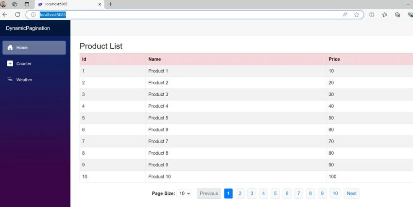
In the above sample, the PaginationComponent takes in a list of products and renders a paginated table. The ChildContentHeader defines the table’s headers, while ChildContentRow specifies how each row of data should be rendered. The component handles the pagination logic, allowing users to navigate through pages and change the number of items displayed per page.
Output
Benefits of a Reusable Pagination Component
- Consistency: Once the component is defined, it can be reused across multiple pages, ensuring a consistent pagination experience throughout the application.
- Customization: The component can be easily customized to fit different use cases by modifying parameters such as page size, styling, or behavior.
- Maintenance: Any changes to the pagination logic or design need to be made only once within the component, reducing maintenance overhead.
Complete Source Code: https://github.com/rijwanansari/DynamicPagination
Bottom Line
The component-based architecture of Blazor allows developers to create modular, reusable components that can significantly streamline the development process. You can improve the user experience of your application and make your code more maintainable by creating a reusable dynamic pagination component. This approach allows you to focus on delivering value to your users, ensuring that your Blazor application is both efficient and easy to scale.
The principles outlined here will help you create flexible, reusable components that can adapt to different scenarios, whether you’re working on a small project or a large enterprise application. Stay tuned for the next article, where we’ll explore building a server-side pagination component.
Join the conversation! Your thoughts help the community grow.