

Introduction
This article demonstrates how to create and use a Customize Slider control in Xamarin.Forms, XAML, and C#. This article starts with the introduction of the Customize Slider tag in XAML. After that, it demonstrates how to set MaxColor, MinColor, ThumbColor, and ThumbImage of a CustomSlider. In the end, the article
discusses how to create a Slider at run-time.

Implementation
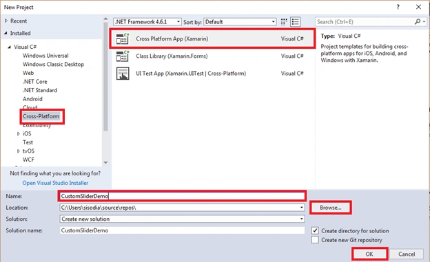
Open Visual Studio and select a New Project.

Now, select Cross Platform App, give the project a name, and set the project path. Then, click OK.
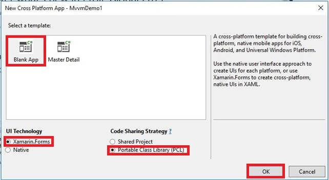
Select the template as "Blank App" and code sharing as "PCL".
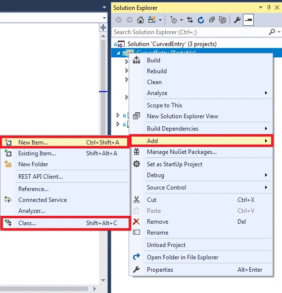
Right-click on PCL Project and select Add >> New Item or Add >> Class.
We are creating a class CustomSlider.cs and writing the following C# code.
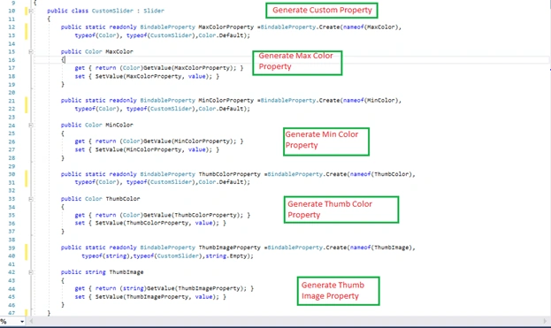
CustomSlider.cs
- public class CustomSlider : Slider
- {
- public static readonly BindableProperty MaxColorProperty =BindableProperty.Create(nameof(MaxColor),
- typeof(Color), typeof(CustomSlider),Color.Default);
- public Color MaxColor
- {
- get { return (Color)GetValue(MaxColorProperty); }
- set { SetValue(MaxColorProperty, value); }
- }
- public static readonly BindableProperty MinColorProperty =BindableProperty.Create(nameof(MinColor),
- typeof(Color), typeof(CustomSlider),Color.Default);
- public Color MinColor
- {
- get { return (Color)GetValue(MinColorProperty); }
- set { SetValue(MinColorProperty, value); }
- }
- public static readonly BindableProperty ThumbColorProperty =BindableProperty.Create(nameof(ThumbColor),
- typeof(Color), typeof(CustomSlider),Color.Default);
- public Color ThumbColor
- {
- get { return (Color)GetValue(ThumbColorProperty); }
- set { SetValue(ThumbColorProperty, value); }
- }
- public static readonly BindableProperty ThumbImageProperty =BindableProperty.Create(nameof(ThumbImage),
- typeof(string),typeof(CustomSlider),string.Empty);
- public string ThumbImage
- {
- get { return (string)GetValue(ThumbImageProperty); }
- set { SetValue(ThumbImageProperty, value); }
- }
- }
This properties is set in the Android project as well as in iOS project.
Let us start with Android. We are creating a Class in Android Project and rendering the slider.
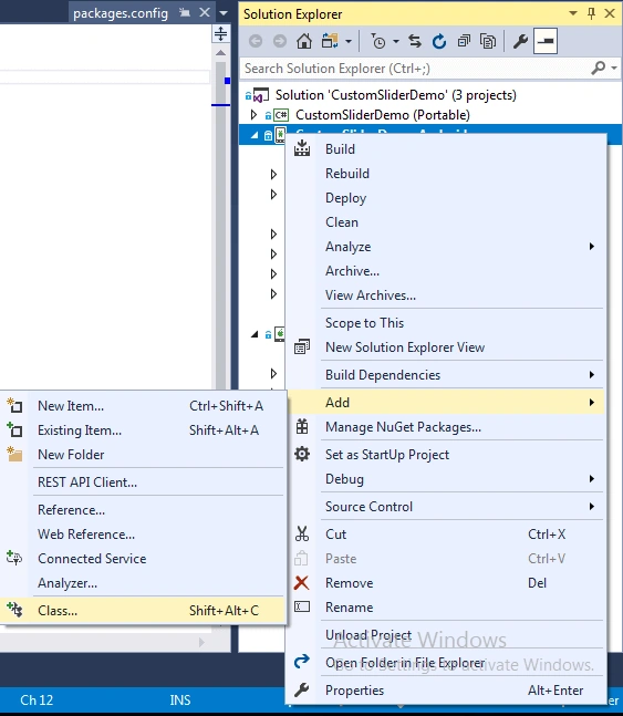
Then, set all the properties when generat in PCL Project. and you Please make sure of the dependency
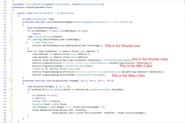
MySliderRenderer.cs
- public class MySliderRenderer : SliderRenderer
- {
- private CustomSlider view;
- protected override void OnElementChanged(ElementChangedEventArgs<Xamarin.Forms.Slider> e)
- {
- base.OnElementChanged(e);
- if (e.OldElement != null || e.NewElement == null)
- return;
- view = (CustomSlider)Element;
- if (!string.IsNullOrEmpty(view.ThumbImage))
- { // Set Thumb Icon
- Control.SetThumb(Resources.GetDrawable(view.ThumbImage));
- }
- else if (view.ThumbColor != Xamarin.Forms.Color.Default ||
- view.MaxColor != Xamarin.Forms.Color.Default ||
- view.MinColor != Xamarin.Forms.Color.Default)
- Control.Thumb.SetColorFilter(view.ThumbColor.ToAndroid(), PorterDuff.Mode.SrcIn);
- Control.ProgressTintList = Android.Content.Res.ColorStateList.ValueOf(view.MinColor.ToAndroid());
- Control.ProgressTintMode = PorterDuff.Mode.SrcIn;
- //this is for Maximum Slider line Color
- Control.ProgressBackgroundTintList = Android.Content.Res.ColorStateList.ValueOf(view.MaxColor.ToAndroid());
- Control.ProgressBackgroundTintMode = PorterDuff.Mode.SrcIn;
- }
- protected override void OnLayout(bool changed, int l, int t, int r, int b)
- {
- base.OnLayout(changed, l, t, r, b);
- if (Android.OS.Build.VERSION.SdkInt >= Android.OS.BuildVersionCodes.JellyBean)
- {
- if (Control == null)
- { return;}
- SeekBar ctrl = Control;
- Drawable thumb = ctrl.Thumb;
- int thumbTop = ctrl.Height / 2 - thumb.IntrinsicHeight / 2;
- thumb.SetBounds(thumb.Bounds.Left, thumbTop,
- thumb.Bounds.Left + thumb.IntrinsicWidth, thumbTop + thumb.IntrinsicHeight);
- }
- }
- }
Now, it's time to go with iOS project. Now you set the PCL(CustomSlider) property in IOS Project…. We are creating a Class, so right click on iOS Project and select Apple. Then, select "Class" and give this class a name as MySliderRenerer.cs.
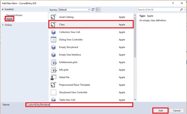
Now, let us write some code for Slider and Set Property.
MySliderRenderer.cs
- [assembly: ExportRenderer(typeof(CustomSlider), typeof(MySliderRenderer))]
- namespace CustomSliderDemo.iOS
- {
- public class MySliderRenderer : SliderRenderer
- {
- private CustomSlider view;
- protected override void OnElementChanged(ElementChangedEventArgs<Xamarin.Forms.Slider> e)
- {
- base.OnElementChanged(e);
- if (e.OldElement != null || e.NewElement == null)
- return;
- view = (CustomSlider)Element;
- if (!string.IsNullOrEmpty(view.ThumbImage))
- {
- //Assigns a thumb image to the specified control states.
- Control.SetThumbImage(UIImage.FromFile(view.ThumbImage), UIControlState.Normal);
- }
- else if (view.ThumbColor != Xamarin.Forms.Color.Default ||
- view.MaxColor != Xamarin.Forms.Color.Default ||
- view.MinColor != Xamarin.Forms.Color.Default)
- // Set Progress bar Thumb color
- Control.ThumbTintColor = view.ThumbColor.ToUIColor();
- //this is for Minimum Slider line Color
- Control.MinimumTrackTintColor = view.MinColor.ToUIColor();
- //this is for Maximum Slider line Color
- Control.MaximumTrackTintColor = view.MaxColor.ToUIColor();
- }
- }
- }
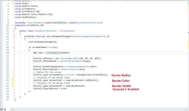
MySliderRenderer.cs
- public class MySliderRenderer : SliderRenderer
- {
- protected override void OnElementChanged(ElementChangedEventArgs<Xamarin.Forms.Slider> e)
- {
- base.OnElementChanged(e);
- if (e.OldElement != null || e.NewElement == null)
- return;
- var view = (CustomSlider)Element;
- if (!string.IsNullOrEmpty(view.ThumbImage))
- {
- //Assigns a thumb image to the specified control states.
- Control.SetThumbImage(UIImage.FromFile(view.ThumbImage), UIControlState.Normal);
- }
- else if (view.ThumbColor != Xamarin.Forms.Color.Default ||
- view.MaxColor != Xamarin.Forms.Color.Default ||
- view.MinColor != Xamarin.Forms.Color.Default)
- // Set Progress bar Thumb color
- Control.ThumbTintColor = view.ThumbColor.ToUIColor();
- //this is for Minimum Slider line Color
- Control.MinimumTrackTintColor = view.MinColor.ToUIColor();
- //this is for Maximum Slider line Color
- Control.MaximumTrackTintColor = view.MaxColor.ToUIColor();
- }
- }
Write the following code for CustomSider.
MainPage.xaml
- <StackLayout Padding="20">
- <Label Text="Custom Slider" FontSize="Large"/>
- <cs:CustomSlider x:Name="customSlider"
- MaxColor="Red" MinColor="Yellow"
- ThumbColor="Green" />
- <cs:CustomSlider MaxColor="Red" MinColor="Yellow"
- ThumbColor="Black" ThumbImage="icon.png"/>
- </StackLayout>
Relaterd Video Click,
Features of CustomSlide controls
- Custom Max Color Property=(MaxColor="#24C4FF")
- Custom Min Color Property=(MinColor="Red")
- Custom Thumb Color Property=(ThumbColor="Green")
- Custom ThumbImage=(ThumbImage="icon")
Shivanju VarshneyPosted May 11, 2018, 3:32 AM
Hi, thanks for posting. could you please help me for positioning the image. slider bar is coming in the middle of the image. but i want it to be in the bottom of image.
Reihaneh KhaksaranPosted Apr 14, 2018, 11:21 PM
Hi thank you for your great article, do you happen to know how to have a circular slider? If you do, will you pleeease share your knowledge? thanks again