

Introduction
In this article, you will learn about Controls and Layout in WPF.
Overview
- To design the tile for "VehicalPurchaseManagement system" dashboard by using builtin controls and layout
- Learn to customize built-in controls and Layout
Prerequisites
- Visual Studio 2010 or above
- Before starting with this article, please download the code from my previous article.
Demo Steps
Step 1
Open the VehicalPurchaseManagement.sln and go to the VehicalPurchaseManagement.xaml file and add the below code.
In this demo application, Grid is considered as the root layout and other layouts can be added as child layouts.
- <Grid x:Name="LayoutRoot" Background="Transparent">
- <Grid.RowDefinitions>
- <RowDefinition Height="20*" />
- <RowDefinition Height="90*" />
- <RowDefinition Height="8*" />
- <RowDefinition Height="150*" />
- <RowDefinition Height="5*" />
- <RowDefinition Height="150*" />
- <RowDefinition Height="5*" />
- <RowDefinition Height="150*" />
- <RowDefinition Height="20*" />
- </Grid.RowDefinitions>
- <Grid.ColumnDefinitions>
- <ColumnDefinition Width="20*" />
- <ColumnDefinition Width="150*" />
- <ColumnDefinition Width="5*" />
- <ColumnDefinition Width="150*" />
- <ColumnDefinition Width="30*"/>
- <ColumnDefinition Width="150*" />
- <ColumnDefinition Width="30*" />
- <ColumnDefinition Width="150*" />
- <ColumnDefinition Width="20*" />
- </Grid.ColumnDefinitions>
- </Grid>
- <Grid></Grid> = It is the default layout control. It helps you to design the UI in rows and columns.
- x:Name = Name can be given to a Grid using x:Name property (Observe that x is a reference to the Window) like any other controls and you can set Background property for Grid. In this case, it is set to transparent.
- By default, a Grid has one row & one column. To add more rows, you can define RowDefinition element for each row inside <Grid.RowDefinitions>. To add more columns, you can define ColumnDefinition element for each column inside the <Grid.ColumnDefinitions> . Here, the grid is divide into 9 rows & 9 columns to achieve the required dashboard design
- WPF supports other layouts such as StackPanel, Canvas, WrapPanel & DockPanel. There can be only one root level layout inside a <Window>.
Step 2
Create a folder to add the images required for this demo. To do this, right-click on project name ->Add ->New Folder as shown below and name it as Images.
Note
You can download the images from the attached project zip file.
Step 3
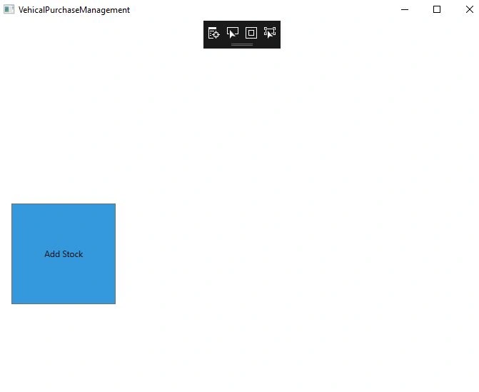
Add the button AddCart, as shown below:
- <Button Grid.Column="1" Grid.Row="5" Background="#FF3598DC" HorizontalAlignment="Stretch" VerticalAlignment="Stretch"
- Content="Add Stock" Tag="Images\Addcart.png" />
This button is positioned at the 5th row and 1st column of the Grid.
Observe the other properties of a Button such as HorizontalAlignment, VerticalAlignment & Background. Try to change the values of these properties & understand the impact.
Properties such as Grid.Row and Grid.Column that doesn’t belong to the Button but has been used to position the control in Grid layout is called Attached properties.
Observe that, the Content property of the button is displaying only text on the button(Tile) but not the image. In this context, the Content property of the button class is used as an Attribute.
Step 4
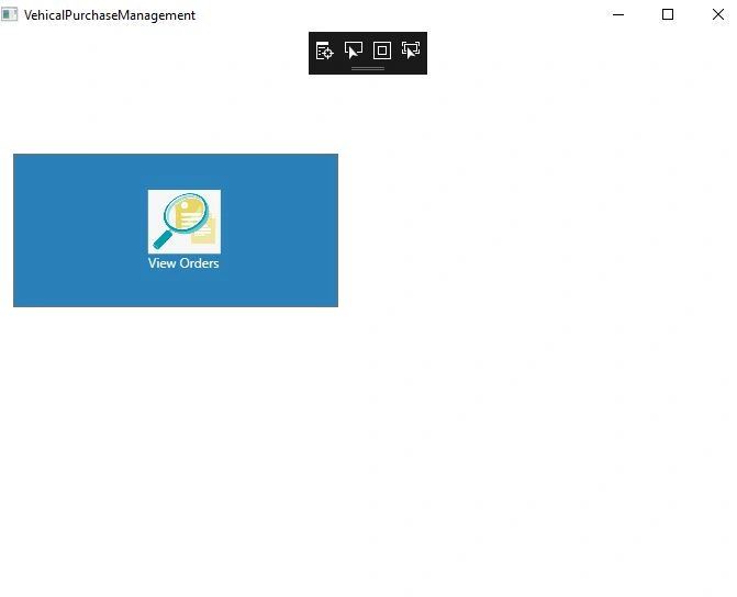
You can add images and text on the button by declaring the Content property of the button as an element, as highlighted below:
- <Button Grid.Column="1" Grid.Row="3" Grid.ColumnSpan="3" Background="#FF2A80B9" HorizontalAlignment="Stretch" VerticalAlignment="Stretch">
- <Button.Content>
- <Grid>
- <Grid.RowDefinitions>
- <RowDefinition Height="28*"/>
- <RowDefinition Height="64*"/>
- <RowDefinition Height="50*"/>
- <RowDefinition Height="8*"/>
- </Grid.RowDefinitions>
- <Grid.ColumnDefinitions>
- <ColumnDefinition Width="15"/>
- <ColumnDefinition Width="28*"/>
- <ColumnDefinition Width="64*"/>
- <ColumnDefinition Width="43*"/>
- </Grid.ColumnDefinitions>
- <Image Source="Images\ViewCart.png" HorizontalAlignment="Center" VerticalAlignment="Center" Grid.Row="1" Grid.Column="2" />
- <TextBlock Text="View Orders" Foreground="White" HorizontalAlignment="Left" VerticalAlignment="Bottom" Grid.Row="2" Grid.Column="1" Grid.ColumnSpan="2" />
- </Grid>
- </Button.Content>
- </Button>
-
In WPF, properties can be declared as both attributes and elements but for each instance, you can configure the properties only once.
-
To display the content (Image along with text) on the button, Grid layout is used.
-
Image control is used to define the image & TextBlock control is to display text on the button.
Step 5
Run the Application and see the output screen:
Step 6
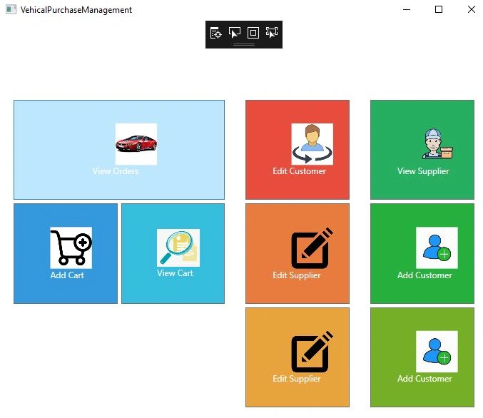
Similarly, add other required buttons, as shown below:
- <Button Grid.Column="1" Grid.Row="3" Grid.ColumnSpan="3" Background="#FF2A80B9" HorizontalAlignment="Stretch" VerticalAlignment="Stretch">
- <Button.Content>
- <Grid>
- <Grid.RowDefinitions>
- <RowDefinition Height="28*"/>
- <RowDefinition Height="64*"/>
- <RowDefinition Height="50*"/>
- <RowDefinition Height="8*"/>
- </Grid.RowDefinitions>
- <Grid.ColumnDefinitions>
- <ColumnDefinition Width="15"/>
- <ColumnDefinition Width="28*"/>
- <ColumnDefinition Width="64*"/>
- <ColumnDefinition Width="43*"/>
- </Grid.ColumnDefinitions>
- <Image Source="Images\Car2.png" HorizontalAlignment="Center" VerticalAlignment="Center" Grid.Row="1" Grid.Column="2" />
- <TextBlock Text="View Orders" Foreground="White" HorizontalAlignment="Left" VerticalAlignment="Bottom" Grid.Row="2" Grid.Column="1" Grid.ColumnSpan="2" />
- </Grid>
- </Button.Content>
- </Button>
- <Button Grid.Column="1" Grid.Row="5" Background="#FF3598DC" HorizontalAlignment="Stretch" VerticalAlignment="Stretch">
- <Button.Content>
- <Grid>
- <Grid.RowDefinitions>
- <RowDefinition Height="28*"/>
- <RowDefinition Height="64*"/>
- <RowDefinition Height="50*"/>
- <RowDefinition Height="8*"/>
- </Grid.RowDefinitions>
- <Grid.ColumnDefinitions>
- <ColumnDefinition Width="15"/>
- <ColumnDefinition Width="28*"/>
- <ColumnDefinition Width="64*"/>
- <ColumnDefinition Width="43*"/>
- </Grid.ColumnDefinitions>
- <Image Source="Images\Addcart.png" HorizontalAlignment="Center" VerticalAlignment="Center" Grid.Row="1" Grid.Column="2" />
- <TextBlock Text="Add Cart" Foreground="White" HorizontalAlignment="Left" VerticalAlignment="Bottom" Grid.Row="2" Grid.Column="1" Grid.ColumnSpan="2" />
- </Grid>
- </Button.Content>
- </Button>
- <Button Grid.Column="3" Grid.Row="5" Background="#FF36BCDC" HorizontalAlignment="Stretch" VerticalAlignment="Stretch">
- <Button.Content>
- <Grid>
- <Grid.RowDefinitions>
- <RowDefinition Height="28*"/>
- <RowDefinition Height="64*"/>
- <RowDefinition Height="50*"/>
- <RowDefinition Height="8*"/>
- </Grid.RowDefinitions>
- <Grid.ColumnDefinitions>
- <ColumnDefinition Width="15"/>
- <ColumnDefinition Width="28*"/>
- <ColumnDefinition Width="64*"/>
- <ColumnDefinition Width="43*"/>
- </Grid.ColumnDefinitions>
- <Image Source="Images\ViewCart.png" HorizontalAlignment="Center" VerticalAlignment="Center" Grid.Row="1" Grid.Column="2" />
- <TextBlock Text="View Cart" Foreground="White" HorizontalAlignment="Left" VerticalAlignment="Bottom" Grid.Row="2" Grid.Column="1" Grid.ColumnSpan="2" />
- </Grid>
- </Button.Content>
- </Button>
- <Button Grid.Column="5" Grid.Row="3" Background="#FFE84C3D" HorizontalAlignment="Stretch" VerticalAlignment="Stretch">
- <Button.Content>
- <Grid>
- <Grid.RowDefinitions>
- <RowDefinition Height="28*"/>
- <RowDefinition Height="64*"/>
- <RowDefinition Height="50*"/>
- <RowDefinition Height="8*"/>
- </Grid.RowDefinitions>
- <Grid.ColumnDefinitions>
- <ColumnDefinition Width="15"/>
- <ColumnDefinition Width="28*"/>
- <ColumnDefinition Width="64*"/>
- <ColumnDefinition Width="43*"/>
- </Grid.ColumnDefinitions>
- <Image Source="Images\EditCustomer.png" HorizontalAlignment="Center" VerticalAlignment="Center" Grid.Row="1" Grid.Column="2" />
- <TextBlock Text="Edit Customer" Foreground="White" HorizontalAlignment="Left" VerticalAlignment="Bottom" Grid.Row="2" Grid.Column="1" Grid.ColumnSpan="2" />
- </Grid>
- </Button.Content>
- </Button>
- <Button Grid.Column="5" Grid.Row="5" Background="#FFE87B3E" HorizontalAlignment="Stretch" VerticalAlignment="Stretch">
- <Button.Content>
- <Grid>
- <Grid.RowDefinitions>
- <RowDefinition Height="28*"/>
- <RowDefinition Height="64*"/>
- <RowDefinition Height="50*"/>
- <RowDefinition Height="8*"/>
- </Grid.RowDefinitions>
- <Grid.ColumnDefinitions>
- <ColumnDefinition Width="15"/>
- <ColumnDefinition Width="28*"/>
- <ColumnDefinition Width="64*"/>
- <ColumnDefinition Width="43*"/>
- </Grid.ColumnDefinitions>
- <Image Source="Images\EditSupplier.png" HorizontalAlignment="Center" VerticalAlignment="Center" Grid.Row="1" Grid.Column="2" />
- <TextBlock Text="Edit Supplier" Foreground="White" HorizontalAlignment="Left" VerticalAlignment="Bottom" Grid.Row="2" Grid.Column="1" Grid.ColumnSpan="2" />
- </Grid>
- </Button.Content>
- </Button>
- <Button Grid.Column="5" Grid.Row="7" Background="#FFE8A33E" HorizontalAlignment="Stretch" VerticalAlignment="Stretch">
- <Button.Content>
- <Grid>
- <Grid.RowDefinitions>
- <RowDefinition Height="28*"/>
- <RowDefinition Height="64*"/>
- <RowDefinition Height="50*"/>
- <RowDefinition Height="8*"/>
- </Grid.RowDefinitions>
- <Grid.ColumnDefinitions>
- <ColumnDefinition Width="15"/>
- <ColumnDefinition Width="28*"/>
- <ColumnDefinition Width="64*"/>
- <ColumnDefinition Width="43*"/>
- </Grid.ColumnDefinitions>
- <Image Source="Images\EditSupplier.png" HorizontalAlignment="Center" VerticalAlignment="Center" Grid.Row="1" Grid.Column="2" />
- <TextBlock Text="Edit Supplier" Foreground="White" HorizontalAlignment="Left" VerticalAlignment="Bottom" Grid.Row="2" Grid.Column="1" Grid.ColumnSpan="2" />
- </Grid>
- </Button.Content>
- </Button>
- <Button Grid.Column="7" Grid.Row="3" Background="#FF27AE61" HorizontalAlignment="Stretch" VerticalAlignment="Stretch">
- <Button.Content>
- <Grid>
- <Grid.RowDefinitions>
- <RowDefinition Height="28*"/>
- <RowDefinition Height="64*"/>
- <RowDefinition Height="50*"/>
- <RowDefinition Height="8*"/>
- </Grid.RowDefinitions>
- <Grid.ColumnDefinitions>
- <ColumnDefinition Width="15"/>
- <ColumnDefinition Width="28*"/>
- <ColumnDefinition Width="64*"/>
- <ColumnDefinition Width="43*"/>
- </Grid.ColumnDefinitions>
- <Image Source="Images\ViewSupplier.png" HorizontalAlignment="Center" VerticalAlignment="Center" Grid.Row="1" Grid.Column="2" />
- <TextBlock Text="View Supplier" Foreground="White" HorizontalAlignment="Left" VerticalAlignment="Bottom" Grid.Row="2" Grid.Column="1" Grid.ColumnSpan="2" />
- </Grid>
- </Button.Content>
- </Button>
- <Button Grid.Column="7" Grid.Row="5" Background="#FF27AF3E" HorizontalAlignment="Stretch" VerticalAlignment="Stretch">
- <Button.Content>
- <Grid>
- <Grid.RowDefinitions>
- <RowDefinition Height="28*"/>
- <RowDefinition Height="64*"/>
- <RowDefinition Height="50*"/>
- <RowDefinition Height="8*"/>
- </Grid.RowDefinitions>
- <Grid.ColumnDefinitions>
- <ColumnDefinition Width="15"/>
- <ColumnDefinition Width="28*"/>
- <ColumnDefinition Width="64*"/>
- <ColumnDefinition Width="43*"/>
- </Grid.ColumnDefinitions>
- <Image Source="Images\AddCustomer.png" HorizontalAlignment="Center" VerticalAlignment="Center" Grid.Row="1" Grid.Column="2" />
- <TextBlock Text="Add Customer" Foreground="White" HorizontalAlignment="Left" VerticalAlignment="Bottom" Grid.Row="2" Grid.Column="1" Grid.ColumnSpan="2" />
- </Grid>
- </Button.Content>
- </Button>
- <Button Grid.Column="7" Grid.Row="7" Background="#FF75AF27" HorizontalAlignment="Stretch" VerticalAlignment="Stretch">
- <Button.Content>
- <Grid>
- <Grid.RowDefinitions>
- <RowDefinition Height="28*"/>
- <RowDefinition Height="64*"/>
- <RowDefinition Height="50*"/>
- <RowDefinition Height="8*"/>
- </Grid.RowDefinitions>
- <Grid.ColumnDefinitions>
- <ColumnDefinition Width="15"/>
- <ColumnDefinition Width="28*"/>
- <ColumnDefinition Width="64*"/>
- <ColumnDefinition Width="43*"/>
- </Grid.ColumnDefinitions>
- <Image Source="Images\AddCustomer.png" HorizontalAlignment="Center" VerticalAlignment="Center" Grid.Row="1" Grid.Column="2" />
- <TextBlock Text="Add Customer" Foreground="White" HorizontalAlignment="Left" VerticalAlignment="Bottom" Grid.Row="2" Grid.Column="1" Grid.ColumnSpan="2" />
- </Grid>
- </Button.Content>
- </Button>
Step 7
Run the application and observe the screen:
Step 8
Also, maximize the window and observe that all buttons are resized as per the window.
Observation
The same properties with the same value such as HorizontalAlignment="Stretch", VerticalAlignment="Stretch" are repetitive.
-
A similar code is repeated for all the tiles with a change in image source and text inside <Button.Content>
-
The text size on the tile is not resized as per the window size
To reduce the repetition of the same code and to apply common appearance, you can use Template and Styles. In the next article, you will learn to customize the button template & apply styles.
Summary
In this article, we discussed the built-in controls and layouts, and customization of built-in controls and layouts. Please find the attached code for better understanding and let me know if you have any questions/queries regarding the article. Cheers 
Join the conversation! Your thoughts help the community grow.