

Xamarin.Android has native user interface controls. These controls can be easily added to Xamarin.Android apps either using the Android Designer or programmatically via XML layout files. Xamarin.Android exposes all of the user interface object properties and methods in C#.
In this module, I will show you the basic controls in Xamarin and Visual Studio Toolbox mostly used in Xamarin.Android and how to build a sample app.
Download Source Code
Click Here>>
Important Lists Of UI controls
WebView
WebView is a UI element that allows you to create your own window for viewing the web page. Also, you can develop a complete browser.
ViewPager
The ViewPager is a layout manager that allows the user to flip left and right through pages of data.
Toolbar
The Toolbar widget (introduced in Android 5.0 Lollipop) can be thought of as a generalization of the action bar interface – it is intended to replace the action bar. The Toolbar can be used anywhere in an app layout, and it is much more customizable than an action bar.
TextureView
TextureView is a view that uses hardware-accelerated 2D rendering to enable a video or OpenGL content stream to be displayed.
Switch
Switch is a UI element that allows a user to toggle between two states, such as ON or OFF. The Switch default value is OFF.
Spinner
Spinner is a UI element that provides a quick way to select one value from a set. It is similar to a dropdown list.
AutoComplete
AutoCompleteTextView is an editable text view element that shows completion suggestions automatically while the user is typing. The list of suggestions is displayed in a drop-down menu from which the user can choose an item to replace the content of the edit box with.
Popup Menu
PopupMenu is used for displaying popup menus that are attached to a particular view.
Pickers
Pickers are UI elements that allow the user to pick a date or a time using dialogs that are provided by Android.
Navigation Bar
The Navigation Bar provides navigation controls on devices that do not include hardware buttons for Home, Back, and Menu.
Gallery
Gallery is a layout widget that is used to display items in a horizontally scrolling list; it positions the current selection at the center of the view.
Edit Text
EditText is a UI element that is used for entering and modifying text.
CardView
CardView is a UI component that presents text and image content in views that resemble cards. CardView is implemented as a FrameLayout widget with rounded corners and a shadow. Typically, aCardView is used to present a single row item in a ListView or GridView view group.
Action Bar
ActionBar is a toolbar that displays the activity title, navigation interfaces, and other interactive items. Typically, the action bar appears at the top of an activity's window.
Calendar
The Calendar class is used for converting a specific instance in time to values such as year, month, hour, a day of the month, and the date of the next week. Calendar supports and provides options with calendar data, including the ability to read and write events, attendees, and reminders. By using the calendar provider in your application, data you add through the API will appear in the built-in calendar app that comes with Android.
Buttons
Buttons are UI elements that the user taps to perform an action.

Toolbox In Visual Studio

Toolbox In Xamarin
Let's Create a Basic App
Step-1

Create an Android app project named "SatyaprakashAndroidApp1".
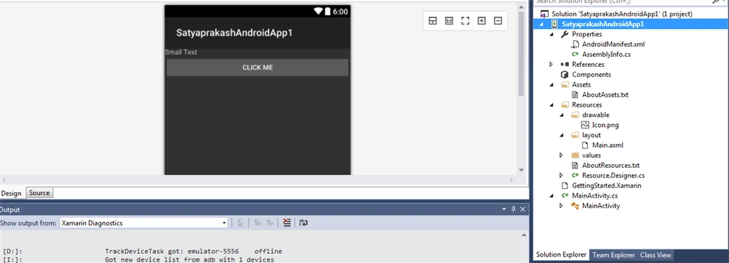
Project Structure
AndroidManifest.xml
Every Android project must contain this file. The manifest lets you define the metadata of your application like Application Name, Package Name, Required Permissions, Activities etc. This is similar to the App.config or Web.Config files but differs in certain ways. In Xamarin, you can easily edit manifest information by going to the properties of the project. Please note that there are other values that are auto-generated by Xamarin from the attributes that you define in classes.
It’s a good practice to keep non-code resources like images, icons, and constants external to your code. Android expects you to store them in specific subfolders within the resources folder. Notice 6 different Drawable folders which are kept separated based on the DPI displays. These folders will include respective sized bitmaps & PNG images. Perhaps the most powerful Resource to be noted is the Layouts.
Layouts
Layout is the User Interface – Yes, that’s right! Whatever user sees is what is designed inside layout files. These are XML based and have the extension .axml. It decouples the presentation layer – much similar to XAML in Windows Phone.
Activity is the class responsible for setting the UI content for the users to interact! You can consider this as a code-behind for the Layout written in the resources. So the activity class will contain the presentation logic of your view. It is the class that is referenced by the Android system to do the user interaction. Activities are created or destroyed by the Android system. It’s important to understand the Active Life Cycle to effectively handle user data in the changing states such as Running, Paused, Backgrounded & Stopped. For the TripXpense app, I am yet to implement this feature. Here’s an example of an Activity.
- Creating Views
- Initializing variables
- Binding static data to lists
To get the reference of the button placed in the layout, use the helper method FindByViewId<T>() and pass the Id of the button you set in the resource. Once you get the handle, just add the event to the Click handler.
To navigate to another screen and pass some extra information along, use StartActivity() with an intent that contains the extra information. Extra information is nothing but the data that you want to pass between your screens.
Code Ref Main.axml
Open Main.axml in Resources >> Layout folder.
- <?xml version="1.0" encoding="utf-8"?>
- <LinearLayout xmlns:android="http://schemas.android.com/apk/res/android"
- android:orientation="vertical"
- android:layout_width="match_parent"
- android:layout_height="match_parent"
- android:minWidth="25px"
- android:minHeight="25px">
- <TextView
- android:text="Small Text"
- android:textAppearance="?android:attr/textAppearanceSmall"
- android:layout_width="match_parent"
- android:layout_height="wrap_content"
- android:id="@+id/textView1" />
- <Button
- android:text="Click Me"
- android:layout_width="match_parent"
- android:layout_height="wrap_content"
- android:id="@+id/button1" />
- </LinearLayout>
- <TextView
- android:text="Small Text"
- android:textAppearance="?android:attr/textAppearanceSmall"
- android:layout_width="match_parent"
- android:layout_height="wrap_content"
- android:id="@+id/textView1" />
- <Button
- android:text="Click Me"
- android:layout_width="match_parent"
- android:layout_height="wrap_content"
- android:id="@+id/button1" />
- <LinearLayout xmlns:android="http://schemas.android.com/apk/res/android"
- android:orientation="vertical"
- android:layout_width="match_parent"
- android:layout_height="match_parent"
- android:minWidth="25px"
- android:minHeight="25px">
- using System;
- using Android.App;
- using Android.Content;
- using Android.Runtime;
- using Android.Views;
- using Android.Widget;
- using Android.OS;
- namespace SatyaprakashAndroidApp1
- {
- [Activity(Label = "SatyaprakashAndroidApp1", MainLauncher = true, Icon = "@drawable/icon")]
- public class MainActivity : Activity
- {
- int count = 1;
- protected override void OnCreate(Bundle bundle)
- {
- base.OnCreate(bundle);
- // Set our view from the "main" layout resource
- SetContentView(Resource.Layout.Main);
- Button btn = FindViewById<Button>(Resource.Id.button1);
- TextView tv = FindViewById<TextView>(Resource.Id.textView1);
- btn.Click += delegate { tv.Text = "Satyaprakash Samantaray First Xamarin Android App"; };
- }
- }
- }
- using System;
- using Android.App;
- using Android.Content;
- using Android.Runtime;
- using Android.Views;
- using Android.Widget;
- using Android.OS;
- [Activity(Label = "SatyaprakashAndroidApp1", MainLauncher = true, Icon = "@drawable/icon")]
- public class MainActivity : Activity
- {
- }
- [Activity (Name="Satyapprakash.My.activity")]
- public class MyActivity : Activity
- {
- }
- [Activity(Label = "SatyaprakashAndroidApp1", MainLauncher = true, Icon = "@drawable/icon")]
- [Activity(Label = "SatyaprakashAndroidApp1", MainLauncher = true)]
- public class MainActivity : Activity
- {
- }
- <activity android:label="SatyaprakashAndroidApp1"
- android:name="md5a7a3c803e481ad8926683588c7e9031b.MainActivity">
- <intent-filter>
- <action android:name="android.intent.action.MAIN" />
- <category android:name="android.intent.category.LAUNCHER" />
- </intent-filter>
- </activity>
By default, your activity will be given the default launcher icon provided by the system. To use a custom icon, first, add your .png to Resources/drawable, set its Build Action to AndroidResource, then use the Icon property to specify the icon to use.
- [Activity(Label = "SatyaprakashAndroidApp1", MainLauncher = true, Icon = "@drawable/icon")]
- <?xml version="1.0" encoding="utf-8"?>
- <manifest xmlns:android="http://schemas.android.com/apk/res/android" package="SatyaprakashAndroidApp1.SatyaprakashAndroidApp1" android:versionCode="1" android:versionName="1.0">
- <uses-sdk android:minSdkVersion="16" />
- <uses-permission android:name="android.permission.INTERNET" />
- <application android:label="SatyaprakashAndroidApp1"></application>
- </manifest>
To edit Android Manifest permissions for your project using Visual Studio -
- Right-click on your Android project and select Properties.
- Select Android Manifest in the window that opens.
- Check the permissions that you want to require in the list of permissions.
- INTERNET – for accessing network resources.
- ACCESS_COARSE_LOCATION and ACCESS_FINE_LOCATION – for location services.
- CAMERA – to access the camera.
AndroidManifest.xml is generated as part of the build process, and the XML found within Properties/AndroidManifest.xml is merged with XML that is generated from custom attributes. The resulting merged AndroidManifest.xml resides in the obj subdirectory; for example, it resides at obj/Debug/android/AndroidManifest.xml for Debug builds. The merging process is trivial: it uses custom attributes within the code to generate XML elements, and inserts those elements into AndroidManifest.xml.
- protected override void OnCreate(Bundle bundle)
- {
- base.OnCreate(bundle);
- SetContentView(Resource.Layout.Main);
- Button btn = FindViewById<Button>(Resource.Id.button1);
- TextView tv = FindViewById<TextView>(Resource.Id.textView1);
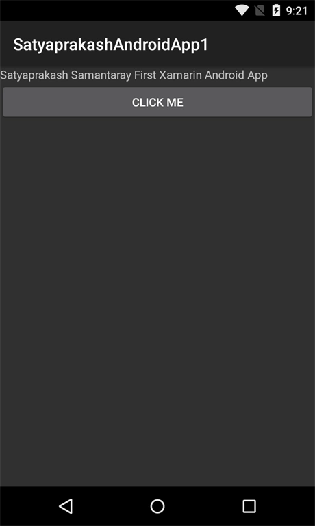
- btn.Click += delegate { tv.Text = "Satyaprakash Samantaray First Xamarin Android App"; };
We have learned the following in this article.
- UI Controls In Xamarn.Android
- Basic on AndroidManifest
- Basic App using Xamarin.Android.
- Check if your app is installed in App List.
Ravi Polara PatidarPosted Nov 18, 2017, 1:07 AM
I am interesting to learning xamarin.
Ravi Polara PatidarPosted Nov 18, 2017, 1:05 AM
Very Good Article.