

Introduction
This is a simple application for beginners showing how to create transformations of a shape using HTML 5 and CSS tools. We know that HTML 5 is the advanced version of HTML. Basically HTML 5 can be used to develop 3D applications. This article is intended to help with the use of HTML5 tools to develop transformations of shape in applications. CSS is the acronym for Cascading Style Sheet that is used for design. CSS defines how HTML elements are to be displayed. The <section> tag defines sections in a document, such as chapters, headers, footers, or any other sections of the document. I hope this article helps to develop transformations of a shape using HTML 5 and CSS tools.
Step 1: Open Visual Studio.
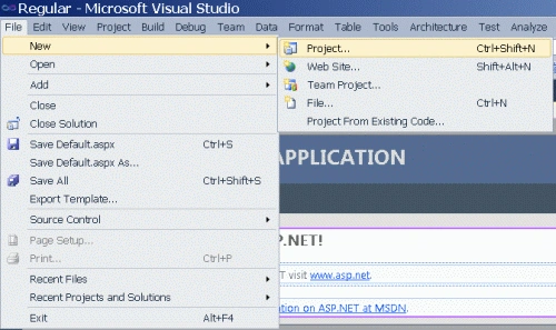
- Go to file -> New->Projects.
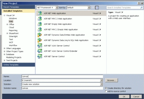
- Create an ASP. NET Web Application.
- Name of "Shape.aspx".
- Right-click on the Solution Explorer.
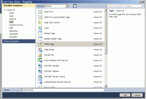
- Add->add new item->HTML form.
- The Name of the HTML form is "Transform.html".
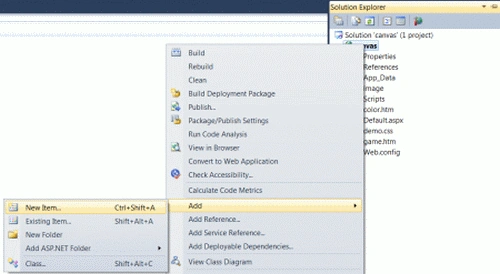
- Right-click on the Solution Explorer.
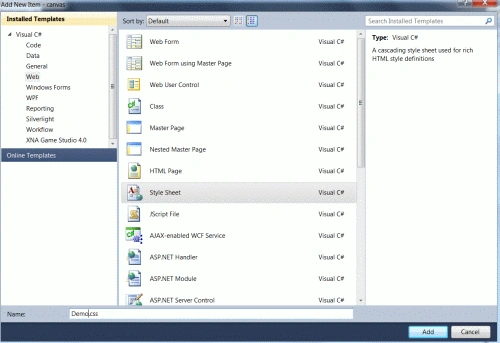
- Add-> Add New Item.
- Add the style sheet.
- Set the name of the style sheet is a "Style.css".
Code
- body
- {
- font-family: "Helvetica Neue";
- font-size: 20px;
- line-height: 30px;
- color: Teal;
- }
- body
- {
- padding: 20px;
- }
- h1
- {
- margin-bottom: 20px;
- }
Step 4: In this section we set styles of a container; they are height, width and border margin of a shape. The container is used to display a shape.
Code
- .con {
- width: 400px;
- height: 400px;
- border: 1px solid #0000FF;
- margin: 40px;
- }
- .con figure {
- display: block;
- width: 100px;
- height: 100px;
- float: left;
- margin: 15px;
- }
Step 5: In this section we set a shape background color and degree. Degrees are used to set how many degrees to rotate a shape.
Code
- #red figure {
- background: red;
- -webkit-transform: perspective( 400px ) rotateX(120deg );
- -moz-transform: perspective( 400px ) rotateX(120deg );
- -ms-transform: perspective( 400px ) rotateX(120deg );
- -o-transform: perspective( 400px ) rotateX(120deg );
- transform: perspective( 400px ) rotateX(120deg );
- }
- #Yellow {
- -webkit-perspective: 400px;
- -moz-perspective: 400px;
- -ms-perspective: 400px;
- -o-perspective: 400px;
- perspective: 400px;
- }
Step 6: In this section we set a body content of a transformations shape page. Now we also set a figure that is used to display in a container.
Code
- <body bgcolor="#ffcccc">
- <h1 style="background-color: #FF99FF"> Used HTML5 and CSS</h1>
- <section id="red" class="con">
- <figure></figure>
- <figure></figure>
- <figure></figure>
- <figure></figure>
- <figure></figure>
- </section>
- </body>
- </html>
Step 7: Now in this section we set a complete code demo of a transformations shape page.
Code
- <html>
- <head>
- <title>Tom application</title>
- <link href="Sheet1.css" rel="stylesheet" type="text/css" />
- <style type="text/css">
- .con {
- width: 400px;
- height: 400px;
- border: 1px solid #0000FF;
- margin: 40px;
- }
- .con figure {
- display: block;
- width: 100px;
- height: 100px;
- float: left;
- margin: 15px;
- }
- #red figure {
- background: red;
- -webkit-transform: perspective( 400px ) rotateX(120deg );
- -moz-transform: perspective( 400px ) rotateX(120deg );
- -ms-transform: perspective( 400px ) rotateX(120deg );
- -o-transform: perspective( 400px ) rotateX(120deg );
- transform: perspective( 400px ) rotateX(120deg );
- }
- #Yellow {
- -webkit-perspective: 400px;
- -moz-perspective: 400px;
- -ms-perspective: 400px;
- -o-perspective: 400px;
- perspective: 400px;
- }
- </style>
- </head>
- <body bgcolor="#ffcccc">
- <h1 style="background-color: #FF99FF">
- Used HTML5 and CSS
- </h1>
- <section id="red" class="con">
- <figure></figure>
- <figure></figure>
- <figure></figure>
- <figure></figure>
- <figure></figure>
- </section>
- </body>
- </html>
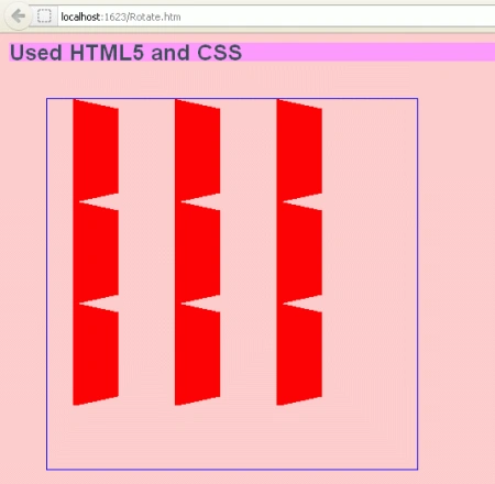
Step 8: Press "Ctrl+F5" to run the application in a browser.
Output
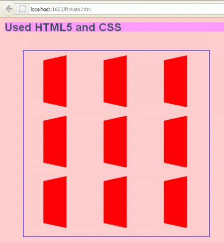
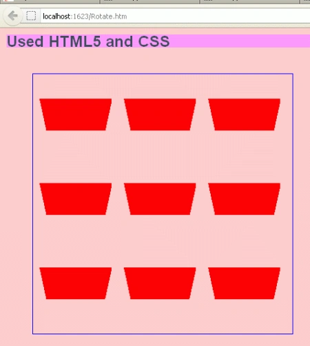
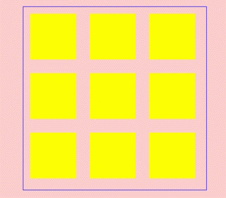
Change a rotation degree; after that 2 different transformation shapes are given below.
Here are some useful resources:
Gowtham RajamanickamPosted Apr 11, 2015, 1:12 PM
ll explained
Gowtham RajamanickamPosted Apr 11, 2015, 1:12 PM
nice