

This chapter is taken from book "Programming Windows Phone 7" by Charles Petzold published by Microsoft press. http://www.charlespetzold.com/phone/index.html
You've probably noticed a new style of toggle button in some Windows Phone 7 screens. Here they are on the page that lets you set date and time, blown up to almost double size:
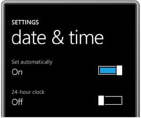
If you experiment with these controls a bit, you'll find that you can toggle the switch just by tapping it, but you can also move the larger block back and forth with your finger, although it will tend to snap into position either at the left or right.
I'm not going to try to duplicate that more complex movement. My version will respond only to taps. For that reason I call it TapSlideToggle. The button is a UserControl derivative in the Petzold.Phone.Silverlight library. (I should note that something similar could be implemented entirely in a template applied to the existing ToggleButton, and the Silverlight for Windows Phone Toolkit implements this control under the name ToggleSwitchButton .) Here's the complete XAML file of my version:
<UserControl
x:Class="Petzold.Phone.Silverlight.TapSlideToggle"
xmlns="http://schemas.microsoft.com/winfx/2006/xaml/presentation"
xmlns:x="http://schemas.microsoft.com/winfx/2006/xaml"
xmlns:d="http://schemas.microsoft.com/expression/blend/2008"
xmlns:mc="http://schemas.openxmlformats.org/markup-compatibility/2006"
mc:Ignorable="d"
d:DesignHeight="36"
d:DesignWidth="96">
<Grid
x:Name="LayoutRoot"
Background="Transparent"
Width="96"
Height="36">
<Border
BorderBrush="{StaticResource
PhoneForegroundBrush}"
BorderThickness="2"
Margin="4
2"
Padding="4">
<Rectangle
Name="fillRectangle"
Fill="{StaticResource
PhoneAccentBrush}"
Visibility="Collapsed"
/>
</Border>
<Border
Name="slideBorder"
BorderBrush="{StaticResource
PhoneBackgroundBrush}"
BorderThickness="4
0"
HorizontalAlignment="Left">
<Rectangle
Stroke="{StaticResource
PhoneForegroundBrush}"
Fill="White"
StrokeThickness="2"
Width="20"
/>
</Border>
</Grid>
</UserControl>
To somewhat mimic the normal ToggleButton (but without the three-state
option) the code-behind file defines an IsChecked dependency property of type
bool and two events named Checked and Unchecked. One or the other of these
events is fired when the IsChecked property changes value:
namespace
Petzold.Phone.Silverlight
{
public partial
class TapSlideToggle
: UserControl
{
public static
readonly
DependencyProperty IsCheckedProperty =
DependencyProperty.Register("IsChecked",
typeof(bool),
typeof(TapSlideToggle),
new
PropertyMetadata(false,
OnIsCheckedChanged));
public event
RoutedEventHandler Checked;
public event
RoutedEventHandler Unchecked;
public TapSlideToggle()
{
InitializeComponent();
}
public bool
IsChecked
{
set { SetValue(IsCheckedProperty,
value); }
get {
return (bool)GetValue(IsCheckedProperty);
}
}
static void
OnIsCheckedChanged(DependencyObject obj,
DependencyPropertyChangedEventArgs args)
{
(obj as
TapSlideToggle).OnIsCheckedChanged(args);
}
void OnIsCheckedChanged(DependencyPropertyChangedEventArgs
args)
{
fillRectangle.Visibility = IsChecked ?
Visibility.Visible :
Visibility.Collapsed;
slideBorder.HorizontalAlignment = IsChecked ?
HorizontalAlignment.Right :
HorizontalAlignment.Left;
if (IsChecked && Checked !=
null)
Checked(this, new
RoutedEventArgs());
if (!IsChecked && Unchecked !=
null)
Unchecked(this,
new RoutedEventArgs());
}
}
}
The static property-changed handler calls an instance handler of the same
name, which alters the visuals in the XAML just a little bit and then fires one
of the two events. The only methods missing from the code above are the
overrides of two Manipulation events. Here they are:
protected
override
void
OnManipulationStarted(ManipulationStartedEventArgs
args)
{
args.Handled =
true;
base.OnManipulationStarted(args);
}
protected
override
void
OnManipulationCompleted(ManipulationCompletedEventArgs
args)
{
Point
pt = args.ManipulationOrigin;
if
(pt.X > 0 && pt.X < this.ActualWidth
&&
pt.Y > 0 && pt.Y <
this.ActualHeight)
IsChecked ^=
true;
args.Handled =
true;
base.OnManipulationCompleted(args);
}
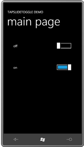
The TapSlideToggleDemo program tests it out. The content area defines two
instances of TapSlideToggle and two TextBlock element to display their current
state:
<Grid
x:Name="ContentPanel"
Grid.Row="1"
Margin="12,0,12,0">
<Grid.RowDefinitions>
<RowDefinition
Height="Auto" />
<RowDefinition
Height="Auto" />
</Grid.RowDefinitions>
<Grid.ColumnDefinitions>
<ColumnDefinition
Width="*" />
<ColumnDefinition
Width="*" />
</Grid.ColumnDefinitions>
<TextBlock
Name="option1TextBlock"
Grid.Row="0"
Grid.Column="0"
Text="off"
Margin="48"
VerticalAlignment="Center"
/>
<petzold:TapSlideToggle
Name="slideToggle1"
Grid.Row="0"
Grid.Column="1"
Margin="48"
HorizontalAlignment="Right"
Checked="OnSlideToggle1Checked"
Unchecked="OnSlideToggle1Checked"
/>
<TextBlock
Name="option2TextBlock"
Grid.Row="1"
Grid.Column="0"
Text="off"
Margin="48"
VerticalAlignment="Center"
/>
<petzold:TapSlideToggle
Name="slideToggle2"
Grid.Row="1"
Grid.Column="1"
Margin="48"
HorizontalAlignment="Right"
Checked="OnSlideToggle2Checked"
Unchecked="OnSlideToggle2Checked"
/>
</Grid>
Each of the two TapSlideToggle instances has both its Checked and Unchecked events set to the same handler, but different handlers are used for the two instances. This allows each handler to determine the state of the button by obtaining the IsChecked property and accessing the corresponding TextBlock:
namespace
TapSlideToggleDemo
{
public partial
class MainPage
: PhoneApplicationPage
{
public MainPage()
{
InitializeComponent();
slideToggle2.IsChecked = true;
}
void OnSlideToggle1Checked(object
sender, RoutedEventArgs args)
{
TapSlideToggle toggle = sender
as TapSlideToggle;
option1TextBlock.Text = toggle.IsChecked ?
"on" : "off";
}
void OnSlideToggle2Checked(object
sender, RoutedEventArgs args)
{
TapSlideToggle toggle = sender
as TapSlideToggle;
option2TextBlock.Text = toggle.IsChecked ?
"on" : "off";
}
}
}
And here's the result:
Panels with Properties
The Windows Presentation Foundation has a panel I often find useful called UniformGrid. As the name suggests, the UniformGrid divides its area into cells, each of which has the same dimensions.
By default, UniformGrid automatically determines a number of rows and columns by taking the ceiling of the square root of the number of children. For example, if there are 20 children, UniformGrid calculates 5 rows and columns (even though it might make more sense to have 5 rows and 4 columns, or 4 rows and 5 columns). You can override this calculation by explicitly setting the Rows or Columns property of UniformGrid to a non-zero number.
My version of UniformGrid is called UniformStack. It doesn't have a Rows or Columns property but it does have an Orientation property—the same property defined by StackPanel-to indicate whether the children of the panel will be arranged vertically or horizontally.
Here's the portion of the UniformStack class that defines the single dependency property and the property-changed handler:
public
class
UniformStack
: Panel
{
public
static
readonly
DependencyProperty
OrientationProperty =
DependencyProperty.Register("Orientation",
typeof(Orientation),
typeof(UniformStack),
new
PropertyMetadata(Orientation.Vertical,
OnOrientationChanged));
public
Orientation
Orientation
{
set { SetValue(OrientationProperty,
value);
}
get {
return
(Orientation)GetValue(OrientationProperty);
}
}
static
void
OnOrientationChanged(DependencyObject
obj,
DependencyPropertyChangedEventArgs args)
{
(obj
as
UniformStack).InvalidateMeasure();
}
....
}
Well, it's not entirely clear. Certainly the panel has no choice but to offer to each child a Width of infinity. After that, one reasonable solution is to return a size from MeasureOverride with a Width that is five times the Width of the widest child.
That's what I do here:
protected
override
Size
MeasureOverride(Size
availableSize)
{
if
(Children.Count == 0)
return
new
Size();
Size availableChildSize =
new
Size();
Size
maxChildSize = new
Size();
Size compositeSize =
new
Size();
//
Calculate an available size for each child
if
(Orientation == Orientation.Horizontal)
availableChildSize =
new
Size(availableSize.Width
/ Children.Count,
availableSize.Height);
else
availableChildSize = new
Size(availableSize.Width,
availableSize.Height / Children.Count);
//
Enumerate the children, and find the widest width and the highest height
foreach
(UIElement
child in
Children)
{
child.Measure(availableChildSize);
maxChildSize.Width =
Math.Max(maxChildSize.Width,
child.DesiredSize.Width);
maxChildSize.Height =
Math.Max(maxChildSize.Height,
child.DesiredSize.Height);
}
// Now
determine a composite size that depends on infinite available width or height
if
(Orientation == Orientation.Horizontal)
{
if (Double.IsPositiveInfinity(availableSize.Width))
compositeSize
= new
Size(maxChildSize.Width
* Children.Count,
maxChildSize.Height);
else
compositeSize = new
Size(availableSize.Width,
maxChildSize.Height);
}
else
{
if (Double.IsPositiveInfinity(availableSize.Height))
compositeSize = new
Size(maxChildSize.Width,
maxChildSize.Height * Children.Count);
else
compositeSize = new
Size(maxChildSize.Width,
availableSize.Height);
}
return
compositeSize;
}
The method begins by diving out if the panel has no children; this avoids division by zero later on.
The ArrangeOverride method calls Arrange on each child with the same size (called finalChildSize in the method) but with different x and y positions relative to the panel depending on orientation:
protected
override
Size
ArrangeOverride(Size
finalSize)
{
if
(Children.Count > 0)
{
Size finalChildSize =
new
Size();
double x = 0;
double y = 0;
if (Orientation ==
Orientation.Horizontal)
finalChildSize = new
Size(finalSize.Width
/ Children.Count,
finalSize.Height);
else
finalChildSize = new
Size(finalSize.Width,
finalSize.Height / Children.Count);
foreach (UIElement
child in
Children)
{
child.Arrange(new
Rect(new
Point(x,
y), finalChildSize));
if (Orientation ==
Orientation.Horizontal)
x += finalChildSize.Width;
else
y += finalChildSize.Height;
}
}
return
base.ArrangeOverride(finalSize);
}
Let's use the UniformStack to make a bar chart!
The QuickBarChart program actually uses three UniformStack panels:
<Grid
x:Name="ContentPanel"
Grid.Row="1"
Margin="12,0,12,0">
<petzold:UniformStack
Orientation="Vertical">
<petzold:UniformStack
x:Name="barChartPanel"
Orientation="Horizontal" />
<petzold:UniformStack
Orientation="Horizontal">
<Button
Content="Add 10 Items"
HorizontalAlignment="Center"
VerticalAlignment="Center"
Click="OnButtonClick" />
<TextBlock
Name="txtblk"
Text="0"
HorizontalAlignment="Center"
VerticalAlignment="Center"
/>
</petzold:UniformStack>
</petzold:UniformStack>
</Grid>
The first UniformStack with a Vertical orientation simply divides the content area into two equal areas. (See how much easier it is to use than a regular Grid?) The top half contains another UniformStack with nothing in it (yet). The bottom one contains a UniformStack with a Horizontal orientation for a Button and a TextBlock.
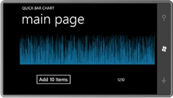
Clicking the Button causes the code-behind file to add 10 more Rectangle elements to the UniformStack named barChartPanel:
namespace
QuickBarChart
{
public partial
class MainPage
: PhoneApplicationPage
{
Random rand =
new Random();
public MainPage()
{
InitializeComponent();
}
void OnButtonClick(object
sender, RoutedEventArgs args)
{
for (int
i = 0; i < 10; i++)
{
Rectangle rect =
new Rectangle();
rect.Fill = this.Resources["PhoneAccentBrush"]
as Brush;
rect.VerticalAlignment =
VerticalAlignment.Bottom;
rect.Height = barChartPanel.ActualHeight * rand.NextDouble();
rect.Margin = new
Thickness(0, 0, 0.5, 0);
barChartPanel.Children.Add(rect);
}
txtblk.Text = barChartPanel.Children.Count.ToString();
}
}
}
Notice that each Rectangle has a little half-pixel Margin on the right so there's at least some spacing between the bars. Still, I think you'll be surprised how many you can put in there before the display logic gives up:
Attached Properties
You now know almost everything you need to define your own attached properties. The project named CanvasCloneDemo contains a class named CanvasClone. The class defines two DependencyProperty fields named LeftProperty and TopProperty:
public
class
CanvasClone
: Panel
{
public
static
readonly
DependencyProperty
LeftProperty =
DependencyProperty.RegisterAttached("Left",
typeof(double),
typeof(CanvasClone),
new
PropertyMetadata(0.0,
OnLeftOrTopPropertyChanged));
public
static
readonly
DependencyProperty
TopProperty =
DependencyProperty.RegisterAttached("Top",
typeof(double),
typeof(CanvasClone),
new
PropertyMetadata(0.0,
OnLeftOrTopPropertyChanged));
....
}
After defining the DependencyProperty fields, you need static methods to access the attached properties. These method names begin with Set and Get followed by the attached property names, in this case, Left and Top,
public
static
void
SetLeft(DependencyObject
obj, double
value)
{
obj.SetValue(LeftProperty, value);
}
public
static
double
GetLeft(DependencyObject
obj)
{
return
(double)obj.GetValue(LeftProperty);
}
public
static
void
SetTop(DependencyObject
obj, double
value)
{
obj.SetValue(TopProperty, value);
}
public
static
double
GetTop(DependencyObject
obj)
{
return
(double)obj.GetValue(TopProperty);
}
These methods get called either explicitly from code or implicitly from the XAML parser. The first argument will be the object on which the attached property is being set—in other words, the first argument will probably be a child of CanvasClone. The body of the method uses that argument to call SetValue and GetValue on the child. These are the same methods defined by DependencyObject to set and get dependency properties.
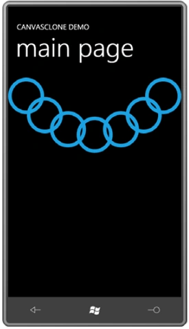
The XAML file in CanvasCloneDemo is the same as the one
in the EllipseChain
except that Canvas
has been replaced with
CanvasClone:
<Grid
x:Name="ContentPanel"
Grid.Row="1">
<local:CanvasClone>
<local:CanvasClone.Resources>
<Style
x:Key="ellipseStyle"
TargetType="Ellipse">
<Setter
Property="Width"
Value="100" />
<Setter
Property="Height"
Value="100" />
<Setter
Property="Stroke"
Value="{StaticResource
PhoneAccentBrush}" />
<Setter
Property="StrokeThickness"
Value="10" />
</Style>
</local:CanvasClone.Resources>
<Ellipse
Style="{StaticResource
ellipseStyle}"
local:CanvasClone.Left="0"
local:CanvasClone.Top="0"
/>
<Ellipse
Style="{StaticResource
ellipseStyle}"
local:CanvasClone.Left="52"
local:CanvasClone.Top="53"
/>
<Ellipse
Style="{StaticResource
ellipseStyle}"
local:CanvasClone.Left="116"
local:CanvasClone.Top="92"
/>
<Ellipse
Style="{StaticResource
ellipseStyle}"
local:CanvasClone.Left="190"
local:CanvasClone.Top="107"
/>
<Ellipse
Style="{StaticResource
ellipseStyle}"
local:CanvasClone.Left="263"
local:CanvasClone.Top="92"
/>
<Ellipse
Style="{StaticResource
ellipseStyle}"
local:CanvasClone.Left="326"
local:CanvasClone.Top="53"
/>
<Ellipse
Style="{StaticResource
ellipseStyle}"
local:CanvasClone.Left="380"
local:CanvasClone.Top="0"
/>
</local:CanvasClone>
</Grid>
With much elation, we discover that the display looks the same as the earlier program:
Join the conversation! Your thoughts help the community grow.