Introduction
In this article I will be discussing about different States of a Control, States represent MouseOver, MousePressed, etc. I will be creating a custom Button and we will see how we can change the animation of different states.
Creating a Simple Silverlight Application
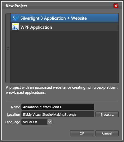
Open up Blend 3 and Create a new Silverlight Application.
Creating Custom Button
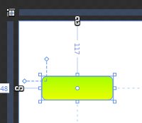
Draw a Rectangle of your desirable size.
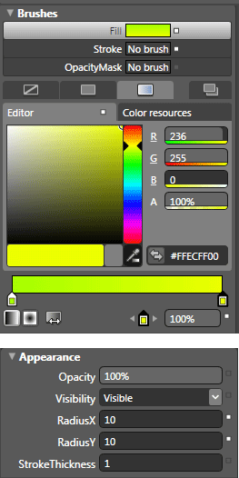
I have changed the Background as Gradient and changed the RadiusX and RadiusY to 10 each.
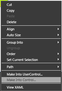
Now we will create this Rectangle as a Control. Right Click on the Rectangle and choose Make Into Control from the menu as shown below.
After clicking Make Into Control you can see a dialog box pop up as shown below.
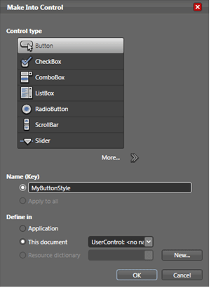
Give a name to your Button style; in this case MyButtonStyle and click OK.
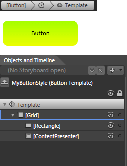
Now you can see a content presenter is added to the control and now we are in Editing the Template mode. The following figures will describe what just happened.
Now if will notice the States pane, you can see different states associated with a button. Like the following figure.
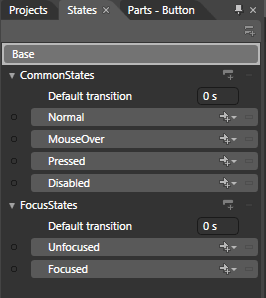
As the above figure says, we have a Base state. Base state is the original state of the Control. And further we have two different categories of states called as Common States and Focus States.
There is a property called Default transition, and by default it is 0.

You can change your desired transition delay, based on your imagination.
Now we will change some of the States like MouseOver and Pressed.
Click on MouseOver and you can see the recording is on now for MouseOver State.
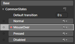
I will just change the gradient to see the MouseOver effect.
After you change something the following changes will be affected.
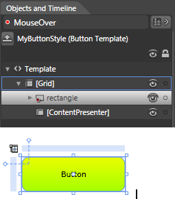
Now we will change the Pressed State as above.
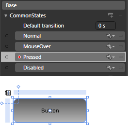
Stop the recording and click either of the following two to go back to end editing the template.
 In this case Click Button.
 In this case Click Up Arrow.
That's it you have successfully used the States to change a Custom Button effect. Play around with it more so that you will have a grip on it.
Enjoy Animating.