

Introduction
The Xamarin.Forms TabbedPage consists of a list of tabs and a larger detailed area, with each tab loading content into the detail area. But If we want to add some extra controls top of tabbed page or bottom of the tabbed page we can't; in that case, we need to create our own custom tabs. So, this article will explain to you how we can create our own custom tabbed page.
Requirements
- This article's source code is prepared by using Visual Studio with MAC machine. And it is better to install the latest Visual Studio updates from here.
- This application is targeted for Android, iOS. And tested on Android device & iOS simulator.
- This project is Xamarin.Forms PCL project.
Description
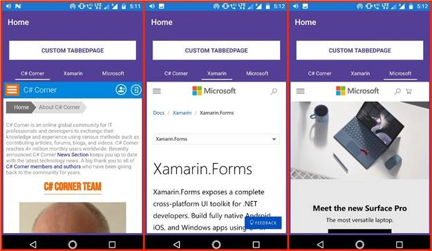
In this article, we going to create three custom tabs such as C# Corner, Xamarin, Microsoft.
Let's start creating Custom TabbedView.
Step 1
First, follow the below steps to create the new Xamarin.Forms project.
- Open Visual Studio for Mac.
- Click on the File menu, and select New Solution.
- In the left pane of the dialog, let's select the type of templates to display. Multiplatform > App > Xamarin.Forms > Blank Forms App and click on Next.
-
Next Enter your app name (Ex: CustomTabbedPage). At the bottom select target platforms to Android & iOS and shared code to Portable Class Library and click on Next button.
- Then choose project location with the help of Bbowse button and click on create.
Now, the project structure will be created like below.
- CustomTabbedPage
It is for Shared Code - CustomTabbedPage.Droid
It is for Android. - CustomTabbedPage.iOS
It is for iOS
PCL
Create a class with RibbonView name it should inherit from ContentView and place it inside ControlsToolkit -->Custom folder and add code.
RibbonView.cs
- using System;
- using System.Collections;
- using System.Collections.Generic;
- using System.Linq;
- using System.Windows.Input;
- using Xamarin.Forms;
- namespace CustomRabbedPageControlsToolkit.Custom {
- public class RibbonView: ContentView {
- #region ItemsSource property
- public static readonly BindableProperty ItemsSourceProperty = BindableProperty.Create(nameof(ItemsSource), typeof(IList), typeof(RibbonView), null, propertyChanged: OnItemsSourceModified);
- public IList ItemsSource {
- get {
- return (IList) GetValue(ItemsSourceProperty);
- }
- set {
- SetValue(ItemsSourceProperty, value);
- }
- }
- private static void OnItemsSourceModified(object sender, object oldValue, object newValue) {
- RibbonView rv = (RibbonView) sender;
- rv._itemsContainerLayout.Children.Clear();
- IEnumerator iter = ((IList)newValue).GetEnumerator();
- int index = 0;
- while (iter.MoveNext()) {
- String label = (String)iter.Current;
- StackLayout layout = new StackLayout() {
- Orientation = StackOrientation.Vertical,
- VerticalOptions = LayoutOptions.FillAndExpand,
- HorizontalOptions = LayoutOptions.FillAndExpand,
- Padding = new Thickness(10, 10, 10, 0),
- };
- Label titleLabel = new Label() {
- Text = label,
- TextColor = rv.TextColor,
- FontSize = rv.FontSize,
- Style = rv.Style,
- VerticalTextAlignment = TextAlignment.Center,
- HorizontalTextAlignment = TextAlignment.Center,
- VerticalOptions = LayoutOptions.FillAndExpand,
- HorizontalOptions = LayoutOptions.FillAndExpand
- };
- BoxView box = new BoxView() {
- BackgroundColor = rv.BarColor,
- VerticalOptions = LayoutOptions.EndAndExpand,
- HeightRequest = 2,
- HorizontalOptions = LayoutOptions.FillAndExpand
- };
- layout.Children.Add(titleLabel);
- layout.Children.Add(box);
- layout.GestureRecognizers.Add(new TapGestureRecognizer() {
- Command = new Command((obj) => {
- rv.OnSelectedItem(label);
- })
- });
- ++index;
- rv._itemsContainerLayout.Children.Add(layout);
- }
- rv.OnSelectedItem(((List<String>)rv.ItemsSource).ElementAt(rv.SelectedItemIndex));
- }
- #endregion
- #region Textcolor property
- public static readonly BindableProperty TextColorProperty = BindableProperty.Create(nameof(TextColor), typeof(Color), typeof(RibbonView), Color.Black);
- public Color TextColor {
- get {
- return (Color)GetValue(TextColorProperty);
- }
- set {
- SetValue(TextColorProperty, value);
- }
- }
- #endregion
- public static new readonly BindableProperty StyleProperty = BindableProperty.Create(nameof(Style), typeof(Style), typeof(RibbonView), null);
- public new Style Style {
- get {
- return (Style)GetValue(StyleProperty);
- }
- set {
- SetValue(StyleProperty, value);
- }
- }
- #region Barcolor property
- public static readonly BindableProperty BarColorProperty = BindableProperty.Create(nameof(BarColor), typeof(Color), typeof(RibbonView), Color.Black);
- public Color BarColor {
- get {
- return (Color) GetValue(BarColorProperty);
- }
- set {
- SetValue(BarColorProperty, value);
- }
- }
- #endregion
- #region FontSize property
- public static readonly BindableProperty FontSizeProperty = BindableProperty.Create(nameof(FontSize), typeof(int), typeof(RibbonView), 13);
- public int FontSize {
- get {
- return (int) GetValue(FontSizeProperty);
- }
- set {
- SetValue(FontSizeProperty, value);
- }
- }
- #endregion
- #region SelectedItemIndex property
- public static readonly BindableProperty SelectedItemIndexProperty = BindableProperty.Create(nameof(SelectedItemIndex), typeof(int), typeof(RibbonView), 0);
- public int SelectedItemIndex {
- get {
- return (int) GetValue(SelectedItemIndexProperty);
- }
- set {
- SetValue(SelectedItemIndexProperty, value);
- }
- }
- #endregion
- #region ItemSelected property
- public static readonly BindableProperty ItemSelectedProperty = Create(nameof(ItemSelected), typeof(ICommand), typeof(RibbonView), null);
- public ICommand ItemSelected {
- get {
- return (ICommand) GetValue(ItemSelectedProperty);
- }
- set {
- SetValue(ItemSelectedProperty, value);
- }
- }
- #endregion
- StackLayout _mainLayout;
- StackLayout _itemsContainerLayout;
- public RibbonView() {
- _mainLayout = new StackLayout() {
- HorizontalOptions = LayoutOptions.FillAndExpand,
- Padding = new Thickness(0),
- Spacing = 0
- };
- _itemsContainerLayout = new StackLayout() {
- Orientation = StackOrientation.Horizontal,
- HorizontalOptions = LayoutOptions.FillAndExpand,
- VerticalOptions = LayoutOptions.FillAndExpand,
- Padding = new Thickness(5, 5, 5, 0),
- Spacing = 0
- };
- _mainLayout.Children.Add(_itemsContainerLayout);
- // _mainLayout.Children.Add(new BoxView() { HeightRequest = 1, BackgroundColor = Color.Silver, HorizontalOptions = LayoutOptions.FillAndExpand });
- Content = _mainLayout;
- }
- private void OnSelectedItem(String labelTitle) {
- int i = 0;
- IEnumerator iter = ItemsSource.GetEnumerator();
- if (this.SelectedItemIndex > -1) {
- StackLayout itemStack = (StackLayout) _itemsContainerLayout.Children.ToArray()[this.SelectedItemIndex];
- BoxView bv = (BoxView)itemStack.Children.ToArray()[1];
- bv.BackgroundColor = this.BackgroundColor;
- }
- while (iter.MoveNext()) {
- StackLayout itemStack = (StackLayout) _itemsContainerLayout.Children.ToArray()[i];
- BoxView bv = (BoxView) itemStack.Children.ToArray()[1];
- if (((string) iter.Current).CompareTo(labelTitle) == 0) {
- bv.BackgroundColor = this.BarColor;
- this.SelectedItemIndex = i;
- } else {
- bv.BackgroundColor = this.BackgroundColor;
- }
- i += 1;
- }
- if (ItemSelected != null) {
- ItemSelected.Execute(this.SelectedItemIndex);
- }
- }
- }
- }
Step 3
Create your own Xaml page named HomePage.xaml, and make sure to refer to "RibbonView" class in Xaml by declaring a namespace for its location and using the namespace prefix on the control element. The following code example shows how the "RibbonView" ContentView can be consumed by a XAML page:
HomePage.xaml
- <?xml version="1.0" encoding="UTF-8"?>
- <ContentPage xmlns="http://xamarin.com/schemas/2014/forms"
- xmlns:x="http://schemas.microsoft.com/winfx/2009/xaml"
- x:Class="CustomTabbedPage.Views.HomePage"
- Title="Home"
- BackgroundColor="#533F95"
- xmlns:toolkitcustom="clr-namespace:CustomTabbedPage.ControlsToolkit.Custom">
- <ContentPage.Resources>
- <ResourceDictionary>
- <Style x:Key="DisplayDataValueStyle" TargetType="Label">
- <Setter Property="FontFamily" Value="Times New Roman" /><Setter Property="TextColor" Value="#1B3B5F" /><Setter Property="FontSize" Value="15" />
- </Style>
- </ResourceDictionary>
- </ContentPage.Resources>
- <ContentPage.Content>
- <Grid HorizontalOptions="FillAndExpand" BackgroundColor="Transparent" VerticalOptions="FillAndExpand" RowSpacing="0" Padding="0,0,0,0">
- <Grid.RowDefinitions>
- <RowDefinition Height="Auto" />
- <RowDefinition Height="Auto" />
- <RowDefinition Height="*" /> </Grid.RowDefinitions>
- <Grid Grid.Row="0" Padding="20,20,20,10">
- <Button BackgroundColor="White" TextColor="#533F95" FontSize="15" FontAttributes="Bold" BorderRadius="0" Text="Custom TabbedPage" HorizontalOptions="FillAndExpand" /> </Grid>
- <toolkitcustom:RibbonView x:Name="ribbonViews" Padding="20,0,20,0" Row="1" HorizontalOptions="FillAndExpand" BackgroundColor="Transparent" BarColor="White" TextColor="White" Style="{StaticResource DisplayDataValueStyle}" ItemsSource="{Binding RibbonOptions}" ItemSelected="{Binding OptionSelectionChangedCommand}" />
- <WebView x:Name="webview" Source="{Binding LoadURI}" BackgroundColor="White" Margin="5" Grid.Row="2" HorizontalOptions="FillAndExpand" VerticalOptions="FillAndExpand" />
- <ActivityIndicator IsRunning="{Binding IsBusy}" IsVisible="{Binding IsBusy}" Grid.Row="2" HeightRequest="50" WidthRequest="50" Color="Maroon" HorizontalOptions="CenterAndExpand" VerticalOptions="CenterAndExpand" /> </Grid>
- </ContentPage.Content>
- </ContentPage>
Note
The "xmlns:toolkitcustom" namespace prefix can be named anything. However, the clr-namespace and assembly values must match the details of the ContentView class. Once the namespace is declared the prefix is used to reference the custom View/control/layout
HomePage.xaml.cs
- using CustomTabbedPage.ViewModels;
- using Xamarin.Forms;
- namespace CustomTabbedPage.Views {
- public partial class HomePage: ContentPage {
- public HomePage() {
- InitializeComponent();
- var homePageViewModel = new HomePageViewModel();
- BindingContext = homePageViewModel;
- webView.Navigated += (sender, e) => {
- if (e.Url != null) {
- homePageViewModel.IsBusy = false;
- }
- };
- }
- }
- }
Here we gave ViewModel object to BindingContext to the view. And BindingContext will help to get or set an object that contains the properties that will be targeted by the bound properties that belong to this BindingContext.
HomePageViewModel.cs
In this, we need to create the following properties and commands.
Properties
- RibbonOptions(for tabs list).
- LoadURI(for dynamic WebView URL based on tab selection).
- IsBusy(for ActivityIndicator).
Commands
- OptionSelectionChangedCommand(for tab selection)
- using System;
- using System.Collections;
- using System.Collections.Generic;
- using System.ComponentModel;
- using System.Runtime.CompilerServices;
- using System.Windows.Input;
- using Xamarin.Forms;
- namespace CustomTabbedPage.ViewModels {
- public class HomePageViewModel: INotifyPropertyChanged {
- private IList _ribbonOptions;
- public IList RibbonOptions {
- get {
- return _ribbonOptions;
- }
- set {
- SetProperty(ref _ribbonOptions, value);
- }
- }
- private string _loadURI;
- public string LoadURI {
- get {
- return _loadURI;
- }
- set {
- SetProperty(ref _loadURI, value);
- }
- }
- private bool _isBusy;
- public bool IsBusy {
- get {
- return _isBusy;
- }
- set {
- if (_isBusy == value) return;
- _isBusy = value;
- OnPropertyChanged("IsBusy");
- }
- }
- private ICommand _optionSelectionChangedCommand;
- public ICommand OptionSelectionChangedCommand {
- get {
- return _optionSelectionChangedCommand;
- }
- set {
- SetProperty(ref _optionSelectionChangedCommand, value);
- }
- }
- protected bool SetProperty<T>(ref T backingStore, T value, [CallerMemberName] string propertyName = "", Action onChanged = null) {
- if (EqualityComparer<T>.Default.Equals(backingStore, value))
- return false;
- backingStore = value;
- onChanged?.Invoke();
- OnPropertyChanged(propertyName);
- return true;
- }
- public event PropertyChangedEventHandler PropertyChanged;
- protected void OnPropertyChanged([CallerMemberName] string propertyName = "") {
- var changed = PropertyChanged;
- if (changed == null)
- return;
- changed.Invoke(this, new PropertyChangedEventArgs(propertyName));
- }
- public HomePageViewModel() {
- List<String> lst = new List<String>() {
- "C# Corner",
- "Xamarin",
- "Microsoft"
- };
- this.RibbonOptions = lst;
- LoadURI = "https://www.c-sharpcorner.com/resources/aboutus.aspx";
- IsBusy = true;
- this.OptionSelectionChangedCommand = new Command((obj) => {
- var selectedItemRibbonIndex = obj.ToString();
- IsBusy = true;
- if (selectedItemRibbonIndex == "0") {
- LoadURI = "https://www.c-sharpcorner.com/resources/aboutus.aspx";
- } else if (selectedItemRibbonIndex == "1") {
- LoadURI = "https://docs.microsoft.com/en-us/xamarin/xamarin-forms/";
- } else {
- LoadURI = "https://www.microsoft.com/en-in?SilentAuth=1&wa=wsignin1.0";
- }
- });
- }
- }
- }
In HomeViewModel constructor we are assigning items to listTabs; it will return the number of tabs, so, however many tabs we want for displaying those items, we need to add to listTabs.
Note
In OptionSelectionChangedcommand we will get the SelectedTab index and based on that index we need to change the content of the detail area for each tab. In this article, we are changing the Web Source. For example, if we want to display the listview with a different source for each tab in that case just change the ItemsSource based on selected item index. And one more example is if want to display different UI for each tab just make a design with StackLayout and based on tab selection index, with the help of IsVisible Binding for layout we can display different UI for each tab.
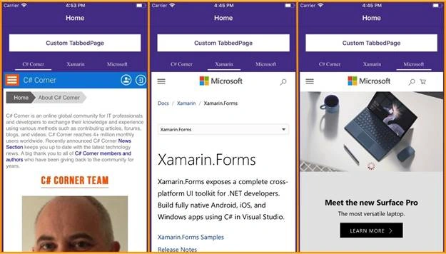
Output:
iOS
Please, download the sample from here.
Jordan HewittPosted Jun 14, 2018, 12:14 PM
What would you do if you want to have page controls along with their own view models consisting as the content you are displaying when a different tab is selected?
Ike BarrettPosted May 28, 2018, 9:11 AM
This version worked great...but I am new and still struggle a little with MVVM and am trying to use a stacklayout. I started an ugly workaround, but I think I am overcomplicating this. What I did is where you have "webview" I changed to a stacklayout linking to three separate content views (pages I created elsewhere) and I was hoping to add a IsVisible property. But where I am struggling is what do I change the webview.Navigated to be able to send the selection and to what...and how do I bind back to a property in the ViewModel? I am sure there is something simple, but just missing it. Either way, this is a giant leap in the progress of my app and pretty good...to bad Xamarin doesn't support this natively better.