Introduction
We've all had that problem - designing our web sites to have a certain look and feel. Unfortunately, not every visitor will view the site the way you intended. This is due to the fact that different operating systems render native browser controls differently. The buttons in OS X have the aqua look while the buttons in Windows 2000 look gray and outdated.
Using the AnyButton
Until now, to enforce a consistent look, a popular option is using images as buttons. This is a great alternative except that when it comes time to add new buttons or modify existing ones, you better have Photoshop [and the time] handy to get it done.
I've created a control called the AnyButton which derives from System.Web.UI.WebControls.ImageButton. This button uses image templates as skins. It will take a .jpg, .gif or .png as a template. It is really easy to use, and best of all, looks just like a real button.
The control takes in a single image as a template. The button supports 3 different states - default, hover, and press. Moreover, each button supports 3 different skins - 1 for each state. This allows you to create as many types of buttons as you'd like by subclassing the base Button class. For instance, you could have an XPButton, AquaButton, AmazonComButton, etc. The best part is, you don't have to use Photoshop to create your buttons - if you see a button on a site you like, screen shot it, crop out the middle part and you're pretty much ready to go.
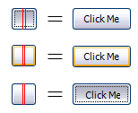
Here's an example using the XP button as a skin:
This is the default state template that I will assign to the button

This is the hover state template that I will assign to the button

And this is the press state template that I will assign to the button

As you can see, the red lines dictate how to slice the button. These lines must be the exact RGB color 255, 0, 0 or #FF0000.
Each button has a ButtonConfig class as a property. The ButtonConfig class contains all the information about the button templates. Here's an example using all button states, generating a button that resembles the XP Silver button:
// <summary>
/// Default button templated to resemble the XP Button
/// </summary>
public class XPButton : AnyButton
{
public XPButton()
{
this.EnableHover = true;
this.EnablePress = true;
}
public XPButton(Page page)
{
this.Page = page;
this.EnableHover = true;
this.EnablePress = true;
}
protected override void OnInit(EventArgs e)
{
Initialize();
base.OnInit(e);
}
protected override void OnLoad(EventArgs e)
{
base.OnLoad(e);
}
protected void Initialize()
{
Font f = new Font("Tahoma", 8, FontStyle.Regular);
ButtonConfig buttonConfig = new ButtonConfig();
buttonConfig.TemplatePath = this.AbsResourcesPath + "/default.png";
buttonConfig.Font = f;
buttonConfig.VerticalTextOffset = 1;
buttonConfig.FontColor = Color.Black;
this.Config = buttonConfig;
ButtonConfig hoverConfig = new ButtonConfig();
hoverConfig.TemplatePath = this.AbsResourcesPath + "/hover.png";
hoverConfig.Font = buttonConfig.Font;
hoverConfig.VerticalTextOffset = buttonConfig.VerticalTextOffset;
hoverConfig.FontColor = buttonConfig.FontColor;
this.HoverConfig = hoverConfig;
ButtonConfig pressConfig = new ButtonConfig();
pressConfig.TemplatePath = this.AbsResourcesPath + "/press.png";
pressConfig.VerticalTextOffset = buttonConfig.VerticalTextOffset + 1;
pressConfig.HorizontalTextOffset = buttonConfig.VerticalTextOffset + 1;
pressConfig.Font = hoverConfig.Font;
pressConfig.FontColor = buttonConfig.FontColor;
his.PressConfig = pressConfig;
}
}
This example is pretty straight forward. One thing to note is the VerticalTextOffset and HorizontalTextOffset properties being utilized in the press config. To get a true pressed effect, the text should move to the bottom right 1 pixel by 1 pixel.
This XPButton class comes packaged along with the AnyButton assembly. When the buttons are requested, they need to be saved to a directory. The path to this output directory is defined in the web.config file as follows:
<
appSettings>
<add key="Oxford.Web.AnyButton.OutputPath" value="~/resources/" />
</appSettings>
In this example, I'm setting the output path to be the in the /resources folder of my web application root. This setting must exist or a null reference exception will be thrown. The ASPNET user must have read/write access to this directory.
So far so good, right? Using the control is the easiest part. Have a look:
<%@ Register TagPrefix="btn" Namespace="MyNamespace" Assembly="MyAssembly" %>
<btn:XPButton Runat="server" Text="Click Me"/>
The last thing you need to do is add This is the result of the previous call:


As you can see, 3 images where created; 1 for each state. Any subsequent requests for an XPButton with text "Click Me" will now be redirected to the already-generated button image. To clear the cache of images, simply delete the output directory.
Additional Properties:
AlphaPng
If you are using png files and you want to enforce transparency, set the AlphaPng setting to true. This is necessary because IE does not support alpha png (right on MS). When AlphaPng is true, a special css filter will be added only to IE users (Firefox, Safari, etc users will not be affected).
TextWidth
Use this property when you want to enforce a certain width regardless of actual width of the text.
OnClientClick
Handy little property that can be set in the markup adding client side function call when the button is pressed.
AntiAliasText
True by default, applies anti-aliasing and ClearType effect.
CausesPostback
By default, an ImageButton (from which this control derrives) is a submit button. To disable posting back, set this CausesPostback to false.