

Introduction
According to Microsoft, Power View can be defined as:
Power View is an interactive data exploration, visualization and presentation experience that encourages intuitive ad-hoc reporting. Power View is a feature of Microsoft Excel 2013 and of Microsoft SharePoint Server 2010 and 2013 as part of the SQL Server 2012 Service Pack 1 Reporting Services Add-in for Microsoft SharePoint Server Enterprise Edition.
Use the following procedure to create a Power View report.
Step 1
- Open Microsoft Excel 2013 and create a new workbook. Go to the Power Pivot tab and click on Manage Data Model. Click Get External Data and navigate to From Data Service and select From Microsoft Azure Marketplace option.
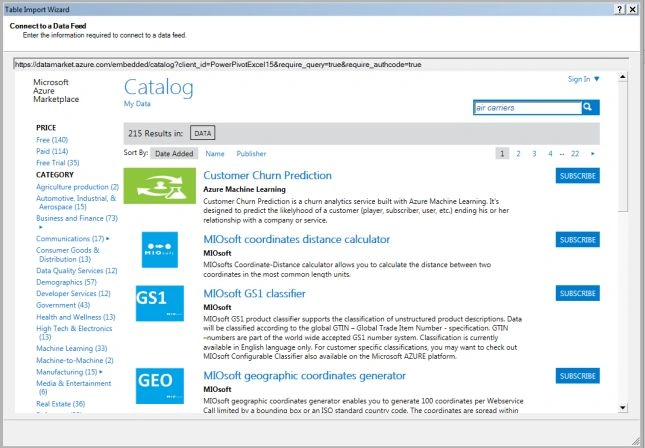
- A new Table Import Wizard window will appear as shown and search for air carriers. You will find one record, US Air Carrier Flight Delays. Next to the result we will find a Subscribe button. Click on it and it will take you to Sign in with a Microsoft Account.
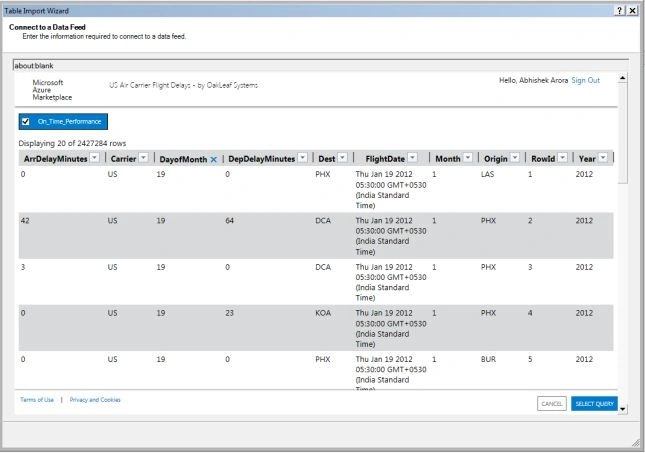
- We will be now able to see the sample data and click on Select Query at the end of the sample data.
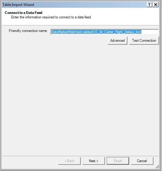
- Type a friendly name for the connection and click Next and click on Finish.
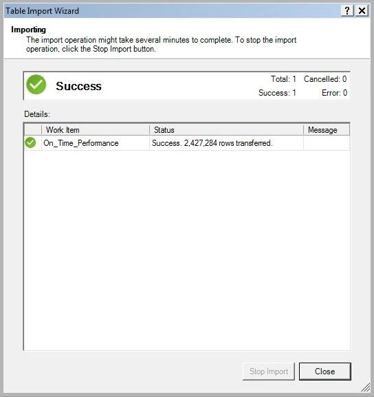
- The import process will be started.
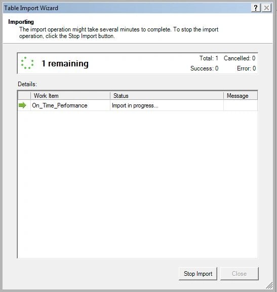
Note: The import process may take some time since it will fetch more than 2.4 million rows.
Step 2
Use the following to create a Clustered Chart:
- Create a Power View Report in Excel from the Insert ribbon tab.
-
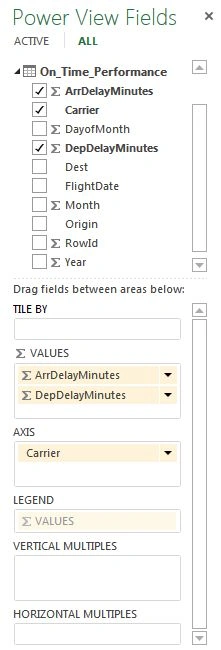
Click on the On_Time_Performance table from the Power View Fields and check the Carrier box that shows the list of the carrier's abbreviations.
-
Check the ArrDelayMinutes box that displays the aggregate number per carrier.
-
Change the Bar Chart type from the Design ribbon tab and make it as a Clustered Bar and resize the chart to make it easier to understand.
-
From the Power View Fields list, drag DepDelayMinutes to the Values box under ArrDelayMinutes.
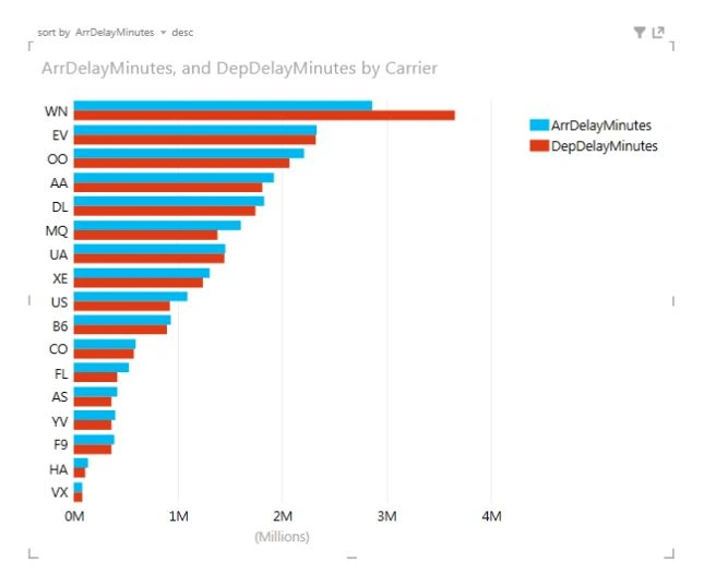
Now we will be able to see that some carriers have better on-time arrivals whereas other carriers have better on-time departures.
Changing the Sort order
-
Hover over the chart in the upper-left corner to see the sort by option and then click on Carrier. That makes it sorted by ArrDelayMinutes.
-
Next to ArrDelayMinutes we will see an asc option, click on it and it will make it sorted in descending order instead of ascending. Now clearly WN has the largest numbers.
Change aggregate from Sum to an Average
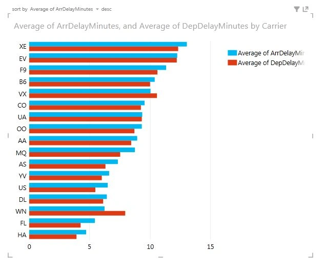
- Go to the Power View Fields option and click on the arrow next to the ArrDelayMinutes and change it from Sum to Average.
- Do the same with the DepDelayMinutes and change it from Sum to Average.
- Again resort the chart by ArrDelayMinutes in descending order.
Now what we will see is XE is at the top instead of WN.
Step 3
Now we must get Airline Carrier Abbreviation data.
Nobody knows the carrier abbreviations, what airline is AI. So to overcome this problem we will find the carrier abbreviations.
- Go to Airline 2 Letter Codes that will provide a full list of two-letter airline codes.
- Select the data available in two columns and copy it.
- Create a new worksheet in Excel and type AirlineCode in the cell A1 and AirlineName in the cell B1 and paste the data in the cell A2.
- Select the data and format the data as a table using (Ctrl + T) or from the Home ribbon tab select Format as Table under the Style group.
- Rename the table to Airlines.
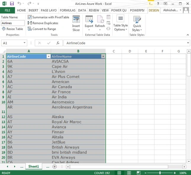
- Now go back to the Power View sheet and you will see the Airlines table is already there in the Power View Fields list.
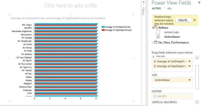
- Make sure the bar chart is selected and remove Carrier from the Axis box and add an AirlinesName box from the Airlines table.
- Now the chart will display the airline names but we will notice that all the values are the same. In the Power View Fields a message is displayed "Relationships between tables may be needed".
Step 4
Uset the following to create a relationship:
- Click on the create button near the message.
- The create relationship window will appear. Under the Table option select On_Time_Performance table and under Column (Foreign) select Carrier.
- Similarly under Related Table select Airlines table and under Related Column (Primary) select AirlineCode.
- Click OK. That now creates the relationship between the two tables on AirlineCode and Carrier fields.
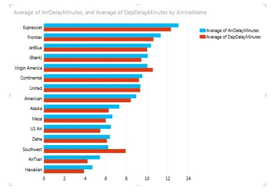
- Sort the chart again in descending order using the ArrDelayMinutes field. We will now see the numbers are no longer the same and instead of XE we will see the name of the airline. So XE is the code for ExpressJet.
Filter the Chart
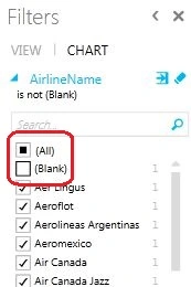
- Select the airlines bar chart and in the filters area click on the Chart and select AirlineName and check on the (All) box and uncheck the (Blank) box.
Step 5
Use the following to change the layout of the chart:
-
Click on the chart.
-
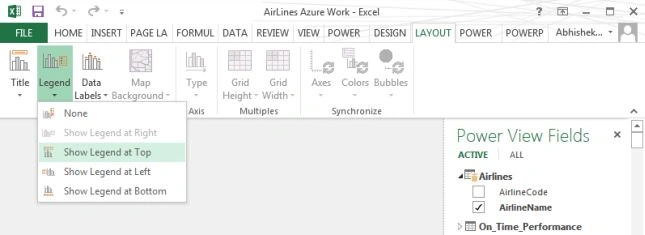
From the Layout ribbon tab select the Legend option and select Show Legend at Top.
Creating another chart
Make some space to start another visualization.
- From the Power View Fields list, open the On_Time_Perofrmance table and select the Origin box and also check the DepDelayMinutes box.
- From the Values field, click the arrow next to DepDelayMinutes and change it to Average from Sum.
- You will notice the number has many decimal places. Click on the Average of DepDelayMinutes column and from the Design tab select the Decrease Decimal option under the Number group. Now the number has two decimal places.
- Select the Stacked Bar from under Bar Chart option, from the Design ribbon tab.
- Hover over the chart to see sort by in the upper left corner and click origin. Now the chart is sorted by DepDelayMinutes and also click on the asc field that will now make the sorting in descending order.
Now we will notice some more abbreviations that doesn't make sense because we don't know most of the airport codes.
Step 6: Get Airport codes data
Nobody knows the airport code abbreviations. Now let's solve this problem.
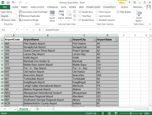
- Go to Airport Codes and copy the four column data-Code, Name, City and State.
- Add a new blank worksheet in Excel and paste the data in the cell A1.
- Rename the columns as given below:
- Code = AirportCode
- Name = AirportName
- City = AirportCity
- State = AirportState
- Select the table and Format the data as a table ( Ctrl + T ) and name the table Airports.
Step 7
Go back to the Power View sheet in Excel and we will be able to see the Airports table.
Select the Column chart and remove Origin from the Axis box and select AirportName box from the Airports table. Again we will see the values are the same and a message "Relationships between tables may be needed."
Creating Relationship between tables
-
Click on the Create button next to the error and a new Create Relationship window will appear. Create a relationship between the Origin field from the On_Time_Performance with the AirportCode field from the Airports table.
-
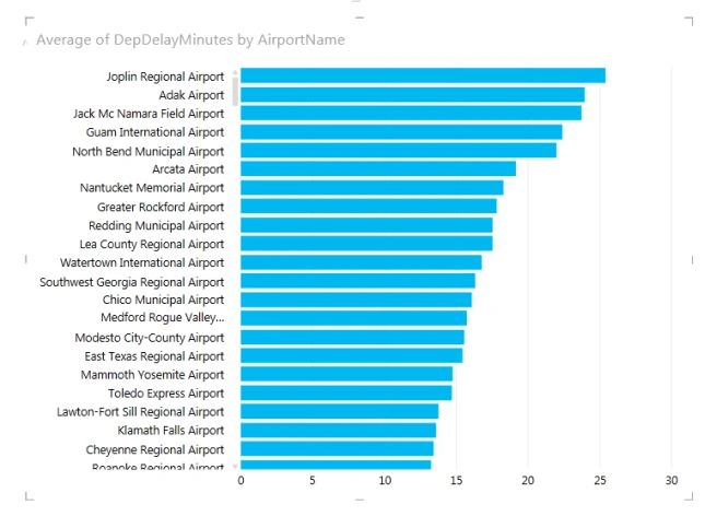
Sort the chart in descending order by Average of DepDelayMinutes.
Step 8
Use the following procedure to create a MAP:
-
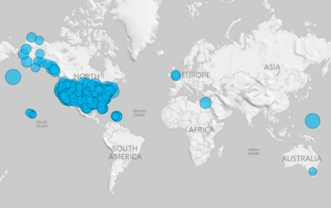
Select the airport chart and click on the Design tab and select the Map option.
-
You may find that the AirportName is in the Color box and are displayed in various colors. If so, drag the AirportName to the Location box.
-
The Map is now filled with too many dots.
Filter the Map
-
Select the map and click on the Map option in the Filters Area.
-
Click Average of DepDelayMinutes and we will be able to see the scroll bar ranging from 0 to 25.37 (minutes).
-
Now drag the left side of the scroll bar from 0 to 15. That means we will only be displaying delays greater than 15 minutes. We can also do this using the Advanced filter mode by clicking on the icon next to the Average of DepDelayMinutes that displays us the Show items for which the value: is greater than or equal to option. So type 15 into the TextBox and click apply filter.
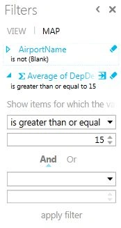
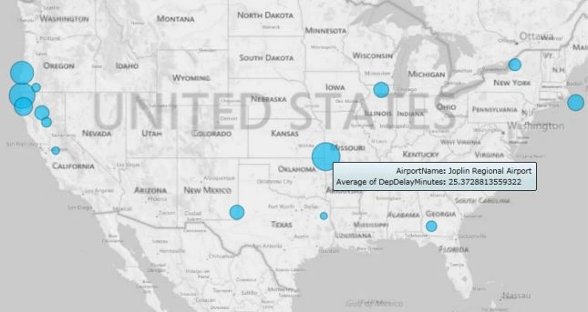
- Now we will be able to see fewer results than before.
- If we hover our mouse over any of the dots then we will be able to see the Average departure delays in minutes.
Summary
It is very easy to customize various types of visualizations in our report to present the data the way we want and make our data easy to read and understand. Using Power BI we can get data from a wide range of data sources and can represent our data in many ways.
Tom MohanPosted Mar 4, 2015, 5:35 AM
Nice
Rahul Kumar SaxenaPosted Mar 3, 2015, 12:11 AM
Good Show..
Gaurav KumarPosted Mar 3, 2015, 12:06 AM
Can we add Power BI using kingsoftwriter??