

What are Custom Controls
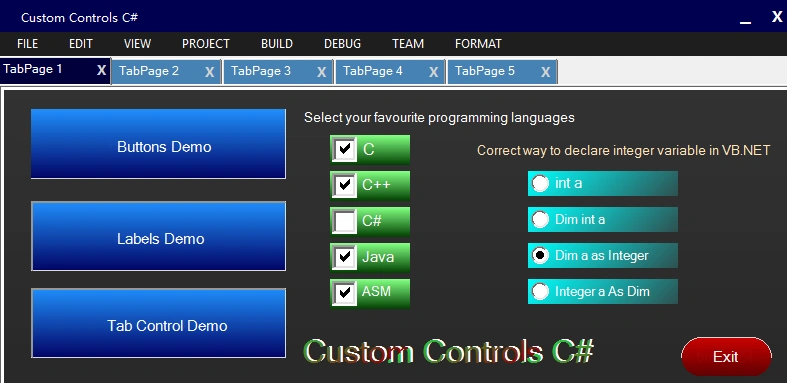
Well Custom Controls are nothing but just graphics. It is used to improve performance of your created application. Look Visual Studio, you can see MenuStrip different from basic controls in system. It looks better than just simple controls in .NET or any language.
So how to create custom controls
It is simple, just call graphics method and draw shapes correspond to the controls.
Consider I want to create a custom button, you know button is a rectangle in system,so just fill rectangle using that buttons co-ordinates (x,y,width,height) with LinearGradientBrush or SolidBrush in Paint() method in C#. C# provides ClientRectangle method to get all co-ordinates of the controls in which rectangle is used. There are many components in which rectangle is used like Button, Panel, CheckBox, TabControl, etc.
In this article I created sub classes with super classes of Button, Labels etc, so that I can drag and drop created custom controls into my form.
Requirements
- Visual Studio Professional 2013
- .NET Framework 4.5 or higher
Download the source code.
Start
Step 1: Start Visual Studio and create new Windows Forms Application in C#.
Step 2: Now go to Project, then Add Class
In opened dialog enter class name ButtonZ if you are creating a custom button or enter class name as you wish, just change class name in codes.
Step 3:
Copy and paste the following defined custom controls code into your created class code. If you created a class ButtonZ then copy and paste the following ButtonZ code.
Step 4: Now run your form and exit.
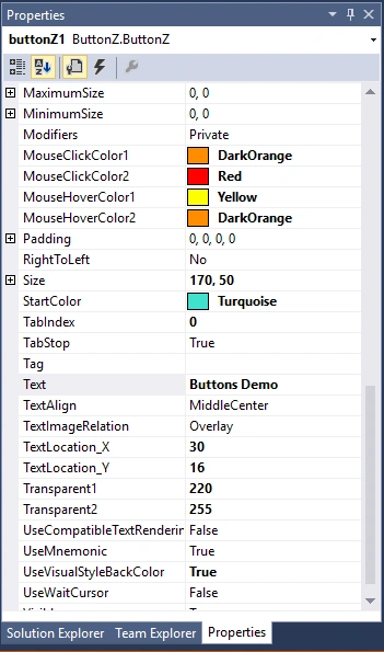
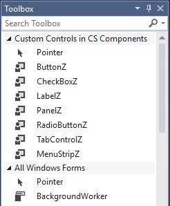
In ToolBox, you can see created ButtonZ controls as shown in above image 3. Drag and Drop ButtonZ into your form like basic controls and change values in Properties as shown in above image 2 like StartColor, EndColor, TextLocation_X, TextLocation_Y, Transparent1, Trnsparent2, etc.
In ToolBox, you can see created ButtonZ controls as shown in above image 3. Drag and Drop ButtonZ into your form like basic controls and change values in Properties as shown in above image 2 like StartColor, EndColor, TextLocation_X, TextLocation_Y, Transparent1, Trnsparent2, etc.
Step 5: Run your form.
Download the source code to view all custom controls.
Also to see Cutom Windows Form.
Dont know how to customize windows form in C# ?
Watch video for how to create custom controls in C# using following codes
C# Custom Controls Codes:
Custom Button:
A different shaped buttons like Rectangular,RoundRectangular,Circular etc.

Class Name: ButtonZ
- using System;
- using System.Collections.Generic;
- using System.Text;
- using System.Drawing;
- using System.Data;
- using System.Windows.Forms;
- using System.Drawing.Drawing2D;
- namespace Custom_Controls_in_CS
- {
- public class ButtonZ : System.Windows.Forms.Button
- {
- Color clr1, clr2;
- private Color color1 = Color.DodgerBlue;
- private Color color2 = Color.MidnightBlue;
- private Color m_hovercolor1 = Color.Turquoise;
- private Color m_hovercolor2 = Color.DarkSlateGray;
- private int color1Transparent = 250;
- private int color2Transparent = 250;
- private Color clickcolor1 = Color.Yellow;
- private Color clickcolor2 = Color.Red;
- private int angle = 90;
- private int textX = 100;
- private int textY = 25;
- private String text = "";
- public Color buttonborder_1 = Color.FromArgb(220, 220, 220);
- public Color buttonborder_2 = Color.FromArgb(150, 150, 150);
- public Boolean showButtonText = true;
- public int borderWidth = 2;
- public Color borderColor = Color.Transparent;
- public enum ButtonsShapes
- {
- Rect,
- RoundRect,
- Circle
- }
- ButtonsShapes buttonShape;
- public ButtonsShapes ButtonShape
- {
- get { return buttonShape; }
- set
- {
- buttonShape = value; Invalidate();
- }
- }
- public String ButtonText
- {
- get { return text; }
- set { text = value; Invalidate(); }
- }
- public int BorderWidth
- {
- get { return borderWidth; }
- set { borderWidth = value; Invalidate(); }
- }
- void SetBorderColor(Color bdrColor)
- {
- int red = bdrColor.R - 40;
- int green = bdrColor.G - 40;
- int blue = bdrColor.B - 40;
- if (red < 0)
- red = 0;
- if (green < 0)
- green = 0;
- if (blue < 0)
- blue = 0;
- buttonborder_1 = Color.FromArgb(red, green, blue);
- buttonborder_2 = bdrColor;
- }
- public Color BorderColor
- {
- get { return borderColor; }
- set
- {
- borderColor = value;
- if (borderColor == Color.Transparent)
- {
- buttonborder_1 = Color.FromArgb(220, 220, 220);
- buttonborder_2 = Color.FromArgb(150, 150, 150);
- }
- else
- {
- SetBorderColor(borderColor);
- }
- }
- }
- public Color StartColor
- {
- get { return color1; }
- set { color1 = value; Invalidate(); }
- }
- public Color EndColor
- {
- get { return color2; }
- set { color2 = value; Invalidate(); }
- }
- public Color MouseHoverColor1
- {
- get { return m_hovercolor1; }
- set { m_hovercolor1 = value; Invalidate(); }
- }
- public Color MouseHoverColor2
- {
- get { return m_hovercolor2; }
- set { m_hovercolor2 = value; Invalidate(); }
- }
- public Color MouseClickColor1
- {
- get { return clickcolor1; }
- set { clickcolor1 = value; Invalidate(); }
- }
- public Color MouseClickColor2
- {
- get { return clickcolor2; }
- set { clickcolor2 = value; Invalidate(); }
- }
- public int Transparent1
- {
- get { return color1Transparent; }
- set
- {
- color1Transparent = value;
- if (color1Transparent > 255)
- {
- color1Transparent = 255;
- Invalidate();
- }
- else
- Invalidate();
- }
- }
- public int Transparent2
- {
- get { return color2Transparent; }
- set
- {
- color2Transparent = value;
- if (color2Transparent > 255)
- {
- color2Transparent = 255;
- Invalidate();
- }
- else
- Invalidate();
- }
- }
- public int GradientAngle
- {
- get { return angle; }
- set { angle = value; Invalidate(); }
- }
- public int TextLocation_X
- {
- get { return textX; }
- set { textX = value; Invalidate(); }
- }
- public int TextLocation_Y
- {
- get { return textY; }
- set { textY = value; Invalidate(); }
- }
- public Boolean ShowButtontext
- {
- get { return showButtonText; }
- set { showButtonText = value; Invalidate(); }
- }
- public ButtonZ()
- {
- this.Size = new Size(100, 40);
- this.BackColor = Color.Transparent;
- this.FlatStyle = FlatStyle.Flat;
- this.FlatAppearance.BorderSize = 0;
- this.FlatAppearance.MouseOverBackColor = Color.Transparent;
- this.FlatAppearance.MouseDownBackColor = Color.Transparent;
- text = this.Text;
- }
- //method mouse enter
- protected override void OnMouseEnter(EventArgs e)
- {
- base.OnMouseEnter(e);
- clr1 = color1;
- clr2 = color2;
- color1 = m_hovercolor1;
- color2 = m_hovercolor2;
- }
- //method mouse leave
- protected override void OnMouseLeave(EventArgs e)
- {
- base.OnMouseLeave(e);
- color1 = clr1;
- color2 = clr2;
- SetBorderColor(borderColor);
- }
- protected override void OnMouseDown(MouseEventArgs mevent)
- {
- base.OnMouseDown(mevent);
- color1 = clickcolor1;
- color2 = clickcolor2;
- int red = borderColor.R - 40;
- int green = borderColor.G - 40;
- int blue = borderColor.B - 40;
- if (red < 0)
- red = 0;
- if (green < 0)
- green = 0;
- if (blue < 0)
- blue = 0;
- buttonborder_2 = Color.FromArgb(red, green, blue);
- buttonborder_1 = borderColor;
- this.Invalidate();
- }
- protected override void OnMouseUp(MouseEventArgs mevent)
- {
- base.OnMouseUp(mevent);
- OnMouseLeave(mevent);
- color1 = clr1;
- color2 = clr2;
- SetBorderColor(borderColor);
- this.Invalidate();
- }
- protected override void OnLostFocus(EventArgs e)
- {
- base.OnLostFocus(e);
- color1 = clr1;
- color2 = clr2;
- this.Invalidate();
- }
- protected override void OnResize(EventArgs e)
- {
- base.OnResize(e);
- textX = (int)((this.Width / 3) - 1);
- textY = (int)((this.Height / 3) + 5);
- }
- //draw circular button function
- void DrawCircularButton(Graphics g)
- {
- Color c1 = Color.FromArgb(color1Transparent, color1);
- Color c2 = Color.FromArgb(color2Transparent, color2);
- Brush b = new System.Drawing.Drawing2D.LinearGradientBrush(ClientRectangle, c1, c2, angle);
- g.FillEllipse(b, 5, 5, this.Width - 10, this.Height - 10);
- for (int i = 0; i < borderWidth; i++)
- {
- g.DrawArc(new Pen(new SolidBrush(buttonborder_1)), 5 + i, 5, this.Width - 10, this.Height - 10, 120, 180);
- g.DrawArc(new Pen(new SolidBrush(buttonborder_2)), 5, 5, this.Width - (10 + i), this.Height - 10, 300, 180);
- }
- if (showButtonText)
- {
- Point p = new Point(textX, textY);
- SolidBrush frcolor = new SolidBrush(this.ForeColor);
- g.DrawString(text, this.Font, frcolor, p);
- }
- b.Dispose();
- }
- //draw rectangular button function
- void DrawRectangularButton(Graphics g)
- {
- Color c1 = Color.FromArgb(color1Transparent, color1);
- Color c2 = Color.FromArgb(color2Transparent, color2);
- Brush b = new System.Drawing.Drawing2D.LinearGradientBrush(ClientRectangle, c1, c2, angle);
- g.FillRectangle(b, 0, 0, this.Width, this.Height);
- for (int i = 0; i < borderWidth; i++)
- {
- g.DrawLine(new Pen(new SolidBrush(buttonborder_1)), this.Width - i, 0, this.Width - i, this.Height);
- g.DrawLine(new Pen(new SolidBrush(buttonborder_1)), 0, this.Height - i, this.Width, this.Height - i);
- g.DrawLine(new Pen(new SolidBrush(buttonborder_2)), 0 + i, 0, 0 + i, this.Height);
- g.DrawLine(new Pen(new SolidBrush(buttonborder_2)), 0, 0 + i, this.Width, i);
- }
- if (showButtonText)
- {
- Point p = new Point(textX, textY);
- SolidBrush frcolor = new SolidBrush(this.ForeColor);
- g.DrawString(text, this.Font, frcolor, p);
- }
- b.Dispose();
- }
- //draw round rectangular button function
- void DrawRoundRectangularButton(Graphics g)
- {
- Color c1 = Color.FromArgb(color1Transparent, color1);
- Color c2 = Color.FromArgb(color2Transparent, color2);
- Brush b = new System.Drawing.Drawing2D.LinearGradientBrush(ClientRectangle, c1, c2, angle);
- Region region = new System.Drawing.Region(new Rectangle(5, 5, this.Width, this.Height));
- GraphicsPath grp = new GraphicsPath();
- grp.AddArc(5, 5, 40, 40, 180, 90);
- grp.AddLine(25, 5, this.Width - 25, 5);
- grp.AddArc(this.Width - 45, 5, 40, 40, 270, 90);
- grp.AddLine(this.Width - 5, 25, this.Width - 5, this.Height - 25);
- grp.AddArc(this.Width - 45, this.Height - 45, 40, 40, 0, 90);
- grp.AddLine(25, this.Height - 5, this.Width - 25, this.Height - 5);
- grp.AddArc(5, this.Height - 45, 40, 40, 90, 90);
- grp.AddLine(5, 25, 5, this.Height - 25);
- region.Intersect(grp);
- g.FillRegion(b, region);
- for (int i = 0; i < borderWidth; i++)
- {
- g.DrawArc(new Pen(buttonborder_1), 5 + i, 5 + i, 40, 40, 180, 90);
- g.DrawLine(new Pen(buttonborder_1), 25, 5 + i, this.Width - 25, 5 + i);
- g.DrawArc(new Pen(buttonborder_1), this.Width - 45 - i, 5 + i, 40, 40, 270, 90);
- g.DrawLine(new Pen(buttonborder_1), 5 + i, 25, 5 + i, this.Height - 25);
- g.DrawLine(new Pen(buttonborder_2), this.Width - 5 - i, 25, this.Width - 5 - i, this.Height - 25);
- g.DrawArc(new Pen(buttonborder_2), this.Width - 45 - i, this.Height - 45 - i, 40, 40, 0, 90);
- g.DrawLine(new Pen(buttonborder_2), 25, this.Height - 5 - i, this.Width - 25, this.Height - 5 - i);
- g.DrawArc(new Pen(buttonborder_2), 5 + i, this.Height - 45 - i, 40, 40, 90, 90);
- }
- if (showButtonText)
- {
- Point p = new Point(textX, textY);
- SolidBrush frcolor = new SolidBrush(this.ForeColor);
- g.DrawString(text, this.Font, frcolor, p);
- }
- b.Dispose();
- }
- protected override void OnPaint(PaintEventArgs e)
- {
- base.OnPaint(e);
- switch (buttonShape)
- {
- case ButtonsShapes.Circle:
- this.DrawCircularButton(e.Graphics);
- break;
- case ButtonsShapes.Rect:
- this.DrawRectangularButton(e.Graphics);
- break;
- case ButtonsShapes.RoundRect:
- this.DrawRoundRectangularButton(e.Graphics);
- break;
- }
- }
- }
- }
Custom Label

Class Name: LabelZ
- using System;
- using System.Collections.Generic;
- using System.Text;
- using System.Drawing;
- using System.Data;
- using System.Drawing.Drawing2D;
- using System.Windows.Forms;
- namespace LabelZ
- {
- public class LabelZ : System.Windows.Forms.Label
- {
- private Color color1 = Color.LightGreen;
- private Color color2 = Color.DarkBlue;
- private int color1Transparent = 150;
- private int color2Transparent = 150;
- private int angle = 90;
- private String text = "MyLabelX";
- //Create Properties
- public String DisplayText
- {
- get { return text; }
- set { text = value; Invalidate(); }
- }
- public Color StartColor
- {
- get { return color1; }
- set { color1 = value; Invalidate(); }
- }
- public Color EndColor
- {
- get { return color2; }
- set { color2 = value; Invalidate(); }
- }
- public int Transparent1
- {
- get { return color1Transparent; }
- set
- {
- color1Transparent = value;
- if (color1Transparent > 255)
- {
- color1Transparent = 255;
- Invalidate();
- }
- else
- Invalidate();
- }
- }
- public int Transparent2
- {
- get { return color2Transparent; }
- set
- {
- color2Transparent = value;
- if (color2Transparent > 255)
- {
- color2Transparent = 255;
- Invalidate();
- }
- else
- Invalidate();
- }
- }
- public int GradientAngle
- {
- get { return angle; }
- set { angle = value; Invalidate(); }
- }
- public LabelZ()
- {
- this.ForeColor = Color.Transparent;
- }
- protected override void OnPaint(PaintEventArgs e)
- {
- base.OnPaint(e);
- this.Text = text;
- Color c1 = Color.FromArgb(color1Transparent, color1);
- Color c2 = Color.FromArgb(color2Transparent, color2);
- //draw a string of text label
- Brush b = new System.Drawing.Drawing2D.LinearGradientBrush(new Rectangle(0, 0, 50, 50), c1, c2, angle);
- e.Graphics.DrawString(this.Text, this.Font, b, new Point(0, 0));
- }
- }
- }
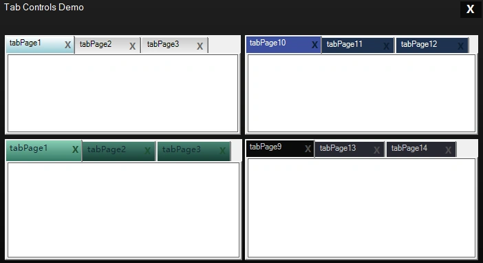
Custom TabControl
Class Name: TabControlZ
- using System;
- using System.Collections.Generic;
- using System.Text;
- using System.Drawing;
- using System.Windows.Forms;
- using System.Drawing.Drawing2D;
- namespace TabControlZ
- {
- public class TabControlZ : System.Windows.Forms.TabControl
- {
- private Color nonactive_color1 = Color.LightGreen;
- private Color nonactive_color2 = Color.DarkBlue;
- private Color active_color1 = Color.Yellow;
- private Color active_color2 = Color.DarkOrange;
- public Color forecolor = Color.Navy;
- private int color1Transparent = 150;
- private int color2Transparent = 150;
- private int angle = 90;
- private Color closebuttoncolor = Color.Red;
- //Create Properties to read values
- public Color ActiveTabStartColor
- {
- get { return active_color1; }
- set { active_color1 = value; Invalidate(); }
- }
- public Color ActiveTabEndColor
- {
- get { return active_color2; }
- set { active_color2 = value; Invalidate(); }
- }
- public Color NonActiveTabStartColor
- {
- get { return nonactive_color1; }
- set { nonactive_color1 = value; Invalidate(); }
- }
- public Color NonActiveTabEndColor
- {
- get { return nonactive_color2; }
- set { nonactive_color2 = value; Invalidate(); }
- }
- public int Transparent1
- {
- get { return color1Transparent; }
- set
- {
- color1Transparent = value;
- if (color1Transparent > 255)
- {
- color1Transparent = 255;
- Invalidate();
- }
- else
- Invalidate();
- }
- }
- public int Transparent2
- {
- get { return color2Transparent; }
- set
- {
- color2Transparent = value;
- if (color2Transparent > 255)
- {
- color2Transparent = 255;
- Invalidate();
- }
- else
- Invalidate();
- }
- }
- public int GradientAngle
- {
- get { return angle; }
- set { angle = value; Invalidate(); }
- }
- public Color TextColor
- {
- get { return forecolor; }
- set { forecolor = value; Invalidate(); }
- }
- public Color CloseButtonColor
- {
- get { return closebuttoncolor; }
- set { closebuttoncolor = value; Invalidate(); }
- }
- public TabControlZ()
- {
- this.DrawMode = TabDrawMode.OwnerDrawFixed;
- this.Padding = new System.Drawing.Point(22, 4);
- }
- protected override void OnPaint(PaintEventArgs pe)
- {
- base.OnPaint(pe);
- }
- //method for drawing tab items
- protected override void OnDrawItem(DrawItemEventArgs e)
- {
- base.OnDrawItem(e);
- Rectangle rc = GetTabRect(e.Index);
- //if tab is selected
- if (this.SelectedTab == this.TabPages[e.Index])
- {
- Color c1 = Color.FromArgb(color1Transparent, active_color1);
- Color c2 = Color.FromArgb(color2Transparent, active_color2);
- using (LinearGradientBrush br = new LinearGradientBrush(rc, c1, c2, angle))
- {
- e.Graphics.FillRectangle(br, rc);
- }
- }
- else
- {
- Color c1 = Color.FromArgb(color1Transparent, nonactive_color1);
- Color c2 = Color.FromArgb(color2Transparent, nonactive_color2);
- using (LinearGradientBrush br = new LinearGradientBrush(rc, c1, c2, angle))
- {
- e.Graphics.FillRectangle(br, rc);
- }
- }
- this.TabPages[e.Index].BorderStyle = BorderStyle.FixedSingle;
- this.TabPages[e.Index].ForeColor = SystemColors.ControlText;
- //draw close button on tabs
- Rectangle paddedBounds = e.Bounds;
- paddedBounds.Inflate(-5, -4);
- e.Graphics.DrawString(this.TabPages[e.Index].Text, this.Font, new SolidBrush(forecolor), paddedBounds);
- Point pad = this.Padding;
- //drawing close button to tab items
- e.Graphics.DrawString("X", new Font("Microsoft YaHei UI", 10, FontStyle.Bold), new SolidBrush(closebuttoncolor), e.Bounds.Right + 1 - 18, e.Bounds.Top + pad.Y-2);
- e.DrawFocusRectangle();
- }
- //action for when mouse click on close button
- protected override void OnMouseDown(MouseEventArgs e)
- {
- base.OnMouseDown(e);
- for (int i = 0; i < this.TabPages.Count; i++)
- {
- Rectangle r = this.GetTabRect(i);
- Rectangle closeButton = new Rectangle(r.Right + 1 - 15, r.Top + 4, 12, 12);
- if (closeButton.Contains(e.Location))
- {
- if (MessageBox.Show("Do you want to Close this Tab ?", "Close or Not", MessageBoxButtons.YesNo, MessageBoxIcon.Question) == DialogResult.Yes)
- {
- this.TabPages.RemoveAt(i);
- break;
- }
- }
- }
- }
- }
- }
Custom MenuStrip

In this MenuStrip, I used Black colors. Change colors in the following code as you wish. In MenuStripZ code, I used MyMenuRenderer Class.
Class Name: MenuStripZ
- using System;
- using System.Collections.Generic;
- using System.Linq;
- using System.Text;
- using System.Drawing;
- using System.Drawing.Drawing2D;
- using System.Windows.Forms;
- namespace Custom_Controls_in_CS
- {
- public class MenuStripZ : MenuStrip
- {
- public MenuStripZ()
- {
- this.Renderer = new MyMenuRenderer();
- }
- }
- public class MyMenuRenderer : ToolStripRenderer
- {
- protected override void OnRenderMenuItemBackground(ToolStripItemRenderEventArgs e)
- {
- base.OnRenderMenuItemBackground(e);
- if (e.Item.Enabled)
- {
- if (e.Item.IsOnDropDown == false && e.Item.Selected)
- {
- var rect = new Rectangle(0, 0, e.Item.Width - 1, e.Item.Height - 1);
- var rect2 = new Rectangle(0, 0, e.Item.Width - 1, e.Item.Height - 1);
- e.Graphics.FillRectangle(new SolidBrush(Color.FromArgb(60, 60, 60)), rect);
- e.Graphics.DrawRectangle(new Pen(new SolidBrush(Color.Black)), rect2);
- e.Item.ForeColor = Color.White;
- }
- else
- {
- e.Item.ForeColor = Color.White;
- }
- if (e.Item.IsOnDropDown && e.Item.Selected)
- {
- var rect = new Rectangle(0, 0, e.Item.Width - 1, e.Item.Height - 1);
- e.Graphics.FillRectangle(new SolidBrush(Color.FromArgb(60, 60, 60)), rect);
- e.Graphics.DrawRectangle(new Pen(new SolidBrush(Color.Black)), rect);
- e.Item.ForeColor = Color.White;
- }
- if ((e.Item as ToolStripMenuItem).DropDown.Visible && e.Item.IsOnDropDown == false)
- {
- var rect = new Rectangle(0, 0, e.Item.Width - 1, e.Item.Height - 1);
- var rect2 = new Rectangle(0, 0, e.Item.Width - 1, e.Item.Height - 1);
- e.Graphics.FillRectangle(new SolidBrush(Color.FromArgb(20, 20, 20)), rect);
- e.Graphics.DrawRectangle(new Pen(new SolidBrush(Color.Black)), rect2);
- e.Item.ForeColor = Color.White;
- }
- }
- }
- protected override void OnRenderSeparator(ToolStripSeparatorRenderEventArgs e)
- {
- base.OnRenderSeparator(e);
- var DarkLine = new SolidBrush(Color.FromArgb(30, 30, 30));
- var rect = new Rectangle(30, 3, e.Item.Width - 30, 1);
- e.Graphics.FillRectangle(DarkLine, rect);
- }
- protected override void OnRenderItemCheck(ToolStripItemImageRenderEventArgs e)
- {
- base.OnRenderItemCheck(e);
- if (e.Item.Selected)
- {
- var rect = new Rectangle(4, 2, 18, 18);
- var rect2 = new Rectangle(5, 3, 16, 16);
- SolidBrush b = new SolidBrush(Color.Black);
- SolidBrush b2 = new SolidBrush(Color.FromArgb(220, 220, 220));
- e.Graphics.FillRectangle(b, rect);
- e.Graphics.FillRectangle(b2, rect2);
- e.Graphics.DrawImage(e.Image, new Point(5, 3));
- }
- else
- {
- var rect = new Rectangle(4, 2, 18, 18);
- var rect2 = new Rectangle(5, 3, 16, 16);
- SolidBrush b = new SolidBrush(Color.White);
- SolidBrush b2 = new SolidBrush(Color.FromArgb(255, 80, 90, 90));
- e.Graphics.FillRectangle(b, rect);
- e.Graphics.FillRectangle(b2, rect2);
- e.Graphics.DrawImage(e.Image, new Point(5, 3));
- }
- }
- protected override void OnRenderImageMargin(ToolStripRenderEventArgs e)
- {
- base.OnRenderImageMargin(e);
- var rect = new Rectangle(0, 0, e.ToolStrip.Width, e.ToolStrip.Height);
- e.Graphics.FillRectangle(new SolidBrush(Color.FromArgb(20, 20, 20)), rect);
- var DarkLine = new SolidBrush(Color.FromArgb(20, 20, 20));
- var rect3 = new Rectangle(0, 0, 26, e.AffectedBounds.Height);
- e.Graphics.FillRectangle(DarkLine, rect3);
- e.Graphics.DrawLine(new Pen(new SolidBrush(Color.FromArgb(20, 20, 20))), 28, 0, 28, e.AffectedBounds.Height);
- var rect2 = new Rectangle(0, 0, e.ToolStrip.Width - 1, e.ToolStrip.Height - 1);
- e.Graphics.DrawRectangle(new Pen(new SolidBrush(Color.Black)), rect2);
- }
- }
- }
Custom Panel
Class Name: PanelZ
Class Name: PanelZ
- using System;
- using System.Collections.Generic;
- using System.Text;
- using System.Drawing;
- using System.Data;
- using System.Windows.Forms;
- namespace PanelZ
- {
- public class PanelZ : System.Windows.Forms.Panel
- {
- private Color color1 = Color.SteelBlue;
- private Color color2 = Color.DarkBlue;
- private int color1Transparent = 150;
- private int color2Transparent = 150;
- private int angle = 90;
- //Create Properties
- public Color StartColor
- {
- get { return color1; }
- set { color1 = value; Invalidate(); }
- }
- public Color EndColor
- {
- get { return color2; }
- set { color2 = value; Invalidate(); }
- }
- public int Transparent1
- {
- get { return color1Transparent; }
- set
- {
- color1Transparent = value;
- if (color1Transparent > 255)
- {
- color1Transparent = 255;
- Invalidate();
- }
- else
- Invalidate();
- }
- }
- public int Transparent2
- {
- get { return color2Transparent; }
- set
- {
- color2Transparent = value;
- if (color2Transparent > 255)
- {
- color2Transparent = 255;
- Invalidate();
- }
- else
- Invalidate();
- }
- }
- public int GradientAngle
- {
- get { return angle; }
- set { angle = value; Invalidate(); }
- }
- public PanelZ()
- {
- }
- protected override void OnPaint(PaintEventArgs e)
- {
- base.OnPaint(e);
- Color c1 = Color.FromArgb(color1Transparent, color1);
- Color c2 = Color.FromArgb(color2Transparent, color2);
- Brush b = new System.Drawing.Drawing2D.LinearGradientBrush(ClientRectangle, c1, c2, angle);
- //fill rectangle with panel size
- e.Graphics.FillRectangle(b, ClientRectangle);
- b.Dispose();
- }
- }
- }
Custom CheckBox & RadioButton
For customize CheckBox & RadioButton,we will use same code as ButtonZ code only to use ControlPaint.DrawCheckBox() & ControlPaint.DrawRadioButton() methods.
- ControlPaint.DrawCheckBox(e.Graphics, rc, this.Checked ? ButtonState.Checked : ButtonState.Normal);
- ControlPaint.DrawRadioButton(e.Graphics, rc, this.Checked ? ButtonState.Checked : ButtonState.Normal);
Fawaz ChughtaiPosted Feb 26, 2021, 3:33 AM
"Well Custom Controls are nothing but just graphics" now thats the worst definition i found on internet for custom controls. its a whole new level of possibilities, not just graphic
Dennis TaylorPosted Aug 19, 2019, 1:40 PM
Another useless tutorial here on C# Corner. All you have told anyone is to copy and paste code. Not ONE word on how anything works.
ALI LONBARPosted Apr 8, 2019, 12:07 AM
Is it even for self-control?
karthik UPosted Oct 5, 2018, 12:53 AM
Very useful article...
Nilesh ShahPosted Feb 13, 2017, 5:47 PM
Good explanation for creating custom controls
pavankumar BottaPosted May 21, 2016, 11:22 AM
Nice article...
Mohammed AshrafPosted May 11, 2016, 7:59 AM
Good article...
Pritam ZopePosted Mar 15, 2016, 10:39 AM
In MenuStripZ code remove else part if you are getting trouble in it,remove lines 46-49,remove this part else { e.Item.ForeColor = Color.White; }
Sr KarthigaPosted Feb 8, 2016, 8:48 AM
Good one
Ehsan SajjadPosted Feb 8, 2016, 7:26 AM
Nice
Pritam ZopePosted Dec 26, 2015, 4:10 AM
Watch video how to create Custom Controls in Visual Studio using C#. https://www.youtube.com/watch?v=CFL3I3oMok4
Humayun Kabir MamunPosted Dec 23, 2015, 3:03 AM
Nice...
Mysura ReddyPosted Dec 23, 2015, 1:47 AM
Nice article sir.. but when we try to resize the button.. the button text position remains same.. button text not working like normal button control. please check that
Pritam ZopePosted Dec 22, 2015, 11:09 AM
Thanks...
Ankur MistryPosted Dec 22, 2015, 10:01 AM
Nice share
Kiranteja JallepalliPosted Dec 22, 2015, 8:57 AM
nice article..,keep posting
Santhakumar MunuswamyPosted Dec 22, 2015, 8:55 AM
Welcome
Santhakumar MunuswamyPosted Dec 22, 2015, 8:55 AM
Good Start